I Love Pizza Graphic Design: Ideas That Sell Real Merch
Pizza is one of the most saturated novelty themes in merchandise design, which means an "I love pizza" graphic either sells consistently or disappears entirely, with very little in between. The difference is almost never drawing ability. It is concept specificity, typographic craft, and production discipline. This is a practitioner's guide to designing pizza-themed graphics that survive contact with an actual print run and an actual buyer.
Quick Answer: Successful I love pizza graphic design works because it commits to one specific joke or visual idea, uses typography as the primary design element rather than clip art, and is built for the printing method it will be produced with. Generic slice illustrations with a script font fail because thousands of identical designs already exist.
Why Most Pizza Designs Fail Before They Are Printed
Walk through any print-on-demand marketplace and search the theme. You will find an enormous volume of near-identical work: a triangular slice with three pepperoni circles, a heart shape, a brush script, and a distressed texture overlay. That design fails not because it is badly executed but because it is indistinguishable. A buyer scrolling a grid makes a decision in under two seconds, and the only designs that survive that filter are the ones that are visibly different at thumbnail size.
The second common failure is technical. A graphic that looks fine on screen at 100 percent frequently falls apart on fabric. Thin strokes disappear in screen printing. Subtle gradients band badly in direct-to-garment output. Tight negative space fills in on textured cotton. Designs with twelve colors are economically impossible to screen print at small volumes. None of this is visible in the design file, and all of it determines whether the product is sellable.
The third failure is legal, and it is the one that ends accounts. Pizza-themed design invites parody of existing chains, riffs on movie quotes, and reuse of recognizable mascots. Those are trademark and copyright exposures, and marketplaces remove listings and suspend sellers over them routinely. Original concepts are not just ethically correct here; they are the only commercially durable option.
The fourth failure is conceptual vagueness. "I love pizza" as a bare statement is not a concept, it is a category. The designs that sell attach that sentiment to something specific: a particular behavior, a particular argument, a particular identity. Specificity is what makes someone feel seen enough to buy. If you want a broader frame for why specificity drives design effectiveness across every category, the structural analysis of what makes design examples work applies directly to novelty merchandise.
Concept Directions That Actually Differentiate
Here are concept territories that consistently outperform the generic slice-and-script approach, with the reason each one works.
- The specific opinion. Designs that stake out a position, such as a topping preference or a regional style loyalty, work because they give the wearer something to signal. Neutral enthusiasm signals nothing.
- Typographic-only treatments. Removing illustration entirely and treating the phrase as a pure lettering problem instantly separates you from the illustration-heavy field and puts the competition on craft, where a skilled designer wins.
- Diagram and technical parody. Rendering pizza as an exploded engineering diagram, a taxonomic chart, a periodic table cell, or an anatomical illustration transplants a visual language from another discipline, which is a reliable novelty mechanism.
- Vintage commercial reference. Mid-century advertising, 1970s packaging, or early computer graphics as a visual register, executed accurately rather than approximately, reads as intentional rather than cheap.
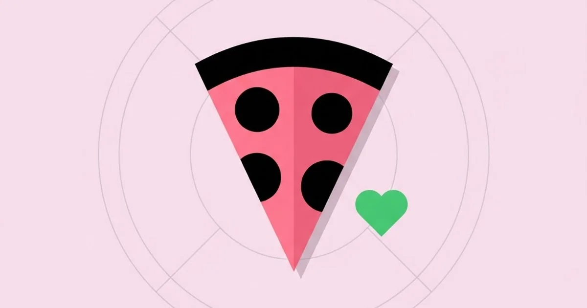
- Geometric reduction. Reducing a slice to pure geometry, a triangle and circles in a strict grid, creates something that works in one color, prints cleanly, and reads as designed rather than doodled.
- Absurd literalism. Taking the phrase completely literally in a visual sense, such as treating it as a formal declaration, a legal document, or a devotional icon, creates a joke structure that survives repetition.
- Cross-category collision. Combining the pizza theme with an unrelated subculture, such as a specific sport, craft, or profession, narrows the audience but dramatically raises conversion within it.
Choosing the Right Production Method
The printing method determines what you are allowed to design, not the other way around. Designing first and choosing production later is the most common cause of expensive reprints.
| Method | Color Handling | Best Design Approach | Key Limitation |
|---|---|---|---|
| Screen printing | Limited spot colors per pass | Bold shapes, flat color, strong contrast | Cost rises sharply with color count |
| Direct-to-garment | Full color, photographic possible | Detailed illustration and subtle tones | Weaker on dark fabric, softer edges |
| Vinyl transfer | Solid single colors, cut shapes | Simple typography and closed shapes | No fine detail or open counters |
| Embroidery | Thread colors, limited palette | Chunky marks, thick strokes, simple icons | Small type and thin lines are impossible |
| Sticker and print | Full color with fine detail | Intricate line work and small type | Requires precise die and bleed setup |
The Craft Details That Separate Amateur From Sellable
Typography carries most of the weight in merchandise design, and it is where amateur work is most visible. Three issues account for the majority of weak pizza graphics. First, default letterspacing on display type, which almost always needs manual kerning at large sizes. Second, mixing too many typefaces, where three or more faces in a small composition reads as uncertainty. Third, using a script face for a phrase that contains words a script handles badly, because scripts were designed for flowing text, not for isolated capitalized statements.
Color is the second craft dimension. A restricted palette of two or three colors reads as more professional than a full-color illustration in almost every merchandise context, and it also prints more cheaply. Choose colors that work on both light and dark garments if you intend to offer both, or commit to a single garment color and design specifically for it. Designing once and hoping it works on every shirt color is how you end up with unsellable variants.
Composition matters more here than in most design work because of the viewing context. A shirt graphic is seen at roughly two meters, moving, at an angle, often partially obscured. Test your design by viewing it at three centimeters wide on a phone. If the concept does not read at that size, it will not read across a room, and it will not read in a marketplace thumbnail either.
Finally, there is the matter of restraint. The strongest merchandise graphics commit to a single idea and eliminate everything that does not serve it. Distressed textures, drop shadows, multiple outlines, and background bursts are almost always compensations for a weak central idea. Remove them and either the idea holds or it does not, which is information you need before you print. This is the same discipline that governs ambitious work at the other end of the spectrum, and the way maximalist design maintains structure under density is a useful counterpoint: even deliberately busy work is organized around a single governing logic.
Common Mistakes and How to Avoid Them
The first mistake is using licensed or trademarked references. Any recognizable chain logo, mascot, slogan, or film quote is a liability. Marketplaces act on takedown requests quickly and do not investigate whether your use was parody. Build original concepts only.
The second mistake is designing at the wrong resolution or color mode. Merchandise graphics need to be built at final print size, typically at 300 dots per inch for raster elements, and in the color mode your printer requires. Upscaling a small file produces soft edges that are obvious on fabric.
The third mistake is ignoring the garment as a design surface. A rectangular composition dropped onto a shirt reads as a sticker. Designs that account for the shape of the print area, the seam positions, and how fabric drapes look considerably more intentional.
The fourth mistake is over-relying on texture overlays to create a vintage feel. A distress texture applied to a clean vector does not make a design look vintage; it makes it look like a clean vector with a texture on it. Authentic period feel comes from letterform choice, color palette, and composition logic.
The fifth mistake is skipping a physical proof. Screen output is backlit and saturated; fabric is reflective and absorbs ink. Ordering one sample before committing to a run catches color shifts, detail loss, and sizing errors that are invisible on a monitor.
The sixth mistake is designing one graphic instead of a small family. A single design is a lottery ticket. Three to five variations on one strong concept, differentiated by color and composition, give you a testable set and make your shop look like a considered collection rather than a random upload.
A Step-by-Step Workflow From Idea to Finished Product
Here is the sequence I would follow to take a pizza-themed concept from nothing to a print-ready, sellable design.
Step one, write twenty concepts before drawing anything. Words, not sketches. Each concept should be a sentence describing a specific idea, not a general theme. Most will be weak, and that is the function of the exercise. Concepts eleven through twenty are typically where the differentiated ideas appear, because the obvious ones are exhausted by then.
Step two, choose three and identify the production method for each. Before any visual work, decide whether each concept is a two-color screen print, a full-color direct-to-garment piece, or an embroidery design. This decision constrains everything downstream and prevents wasted effort.
Step three, build thumbnails at actual thumbnail size. Work at three centimeters wide. Not scaled down at the end, but designed at that size from the start. This forces the hierarchy to be correct and eliminates detail you were going to lose anyway.
Step four, develop the strongest thumbnail at full size with real typography. Set the type properly, kern it manually, and resist adding elements. If the composition feels empty, the type is probably too small rather than the design being under-filled.
Step five, produce the color variants. Build versions for light and dark garments as separate files with adjusted values, not as the same artwork on different backgrounds. A design that works on white rarely works unmodified on black.
Step six, prepare production files correctly. Outline all type, check minimum stroke widths against your method's limits, confirm color mode and resolution, and separate colors if screen printing. Name files clearly, because you will revisit them months later.
Step seven, order a single physical sample. Evaluate it in daylight, at distance, after one wash. Washing reveals whether the print cracks, fades, or shifts. Any design you intend to sell in volume deserves this check.
Step eight, build the family. Once one design proves out, produce three to five siblings using the same construction logic and different content. This is where a novelty design becomes a small product line, and product lines outperform individual designs consistently.
Key Takeaways
- Pizza-themed merchandise succeeds on concept specificity rather than illustration quality, because the generic slice-and-script approach is completely saturated.
- The production method must be chosen before design begins, since screen printing, direct-to-garment, vinyl, and embroidery each impose different hard limits.
- Typography carries most of the weight in merchandise graphics, and manual kerning at display sizes is a visible differentiator between amateur and professional work.
- Designing at thumbnail size from the start forces correct hierarchy and eliminates detail that would be lost in the real viewing context anyway.
- Never use trademarked chain logos, mascots, or film quotes, because marketplace takedowns are fast and account suspensions follow repeat reports.
Frequently Asked Questions
What makes a pizza t-shirt design actually sell?
A specific idea rather than a general sentiment. Designs that take a position, reference a particular behavior, or collide the theme with another subculture give buyers something to signal. Generic enthusiasm plus a slice illustration competes against thousands of near-identical listings and loses on visibility alone.
Can I reference a famous pizza chain in my design?
No. Chain names, logos, mascots, and slogans are protected trademarks, and parody defenses rarely survive a marketplace takedown process that is automated and fast. Build original concepts. The commercial upside of a reference is small compared to the risk of losing a seller account.
How many colors should a merch design use?
Two or three for screen printing, since cost scales with each additional screen. Full color is viable for direct-to-garment and stickers, but restricted palettes read as more intentional regardless of method. Limiting color also forces stronger shape and hierarchy decisions.
What file format do print-on-demand services need?
Most require a high-resolution PNG with a transparent background, built at final print dimensions, typically around 300 dots per inch. Check each platform's specification individually, since print area dimensions and resolution requirements vary. Always outline fonts before exporting to avoid substitution errors.
Should I use vector or raster for merchandise graphics?
Vector is preferable for typography, geometric work, and anything destined for screen printing, vinyl, or embroidery, because it scales without loss and separates cleanly. Raster is appropriate for painterly or photographic illustration on direct-to-garment. Many designs sensibly combine both.
How do I test a design before printing a full run?
Order one physical sample and evaluate it in daylight, from two meters, and again after a wash cycle. Washing exposes cracking, fading, and hand feel problems that never appear on screen. Also view the digital file at thumbnail size to check marketplace visibility.
Conclusion
The decision that determines whether a pizza graphic sells is made before any drawing happens: whether you commit to one specific, differentiated idea or settle for a general expression of enthusiasm. The saturated end of this category is full of competent execution attached to no idea at all, and competent execution is not a competitive advantage when ten thousand listings share it.
Your next step is the twenty-concept exercise in writing, with no sketching allowed, followed by choosing a production method before you open a design application. If you want to sharpen the craft side of the execution afterwards, study how the field's most influential designers handled typography and reduction and apply that same discipline to a single-joke shirt graphic.