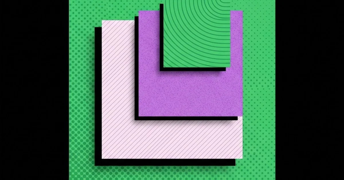
Graphic Design Textures: How to Use Them Without Clutter
Texture is the fastest way to make flat work feel considered, and the fastest way to make it look amateur. Graphic design textures are surface treatments — grain, paper fibre, halftone, hatching, risograph misregistration, scanned imperfection — applied over or within a composition to add tactile depth and material character. The professional use of texture is almost always quieter than beginners expect: it is felt before it is noticed, and if a viewer's first comment is about the texture, it is too strong.
Quick Answer: Use graphic design textures at low opacity over large flat areas, keep them off small text, and limit yourself to one texture family per project. Grain and paper add warmth, halftone adds print character, and hatching adds depth. Always test texture at final output size, never zoomed in.
What Texture Does to a Composition
Texture performs three distinct jobs, and knowing which one you are hiring it for determines how you apply it. The first job is material suggestion: paper fibre, card stock, newsprint, or fabric grain implies a physical object, which carries connotations of craft, heritage, and tangibility. The second is visual noise management: a light grain over a large flat colour field prevents banding and gives the eye somewhere to rest, which is why almost every high-end digital poster has grain you never consciously register. The third is period and process signalling: halftone dots read as printed matter, risograph misregistration reads as small-run independent publishing, engraved hatching reads as currency, certificates, and heritage.
Key terms worth separating. Grain is fine, randomly distributed noise. Pattern is a repeating motif with visible structure. Halftone is a regular dot grid that simulates tone through dot size. Hatching is directional line work creating tonal density. Overlay texture is a raster layer applied above artwork using a blend mode. Embedded texture is texture built into the artwork itself, such as a distressed vector shape. The distinction matters because overlay textures are non-destructive and adjustable, while embedded textures are locked into the geometry and far harder to revise late in a project.
There is a hierarchy question here too. Texture is a background-layer citizen. It should support the focal element, never compete with it. A useful test: squint at the composition until detail disappears. If the texture is still visible as a distinct element in the blur, it is too strong. This is the same discipline that governs every other supporting element in a layout, and it flows directly from the way simple geometric forms establish structure in a composition — the structure leads, the surface treatment follows.
Finally, texture is not a fix for weak composition. If a layout feels empty, the problem is usually spacing, hierarchy, or scale contrast. Adding grain to a badly structured poster produces a grainy badly structured poster. Solve structure first, then consider whether texture adds anything.
The Main Texture Families and When to Use Each
Most professional texture work draws from a surprisingly small set of families. Pick one per project and commit.
- Fine grain and noise. The default. Use at very low opacity across the full canvas to prevent gradient banding and add subtle warmth. Works with nearly any style and is the only texture family that is genuinely safe on modern digital work.
- Paper and card fibre. Scanned or simulated stock surface. Best for editorial, packaging concepts, and anything wanting a handmade or heritage association. Requires a light touch — visible fibre at full strength reads as a stock photo of paper rather than as printed material.
- Halftone dots. A regular dot grid, ideally at a consistent angle. Strong period signal for comics, newsprint, and pop-cultural work. Extremely sensitive to scale: get the dot pitch wrong for the output size and it turns into moiré or mud.
- Risograph and misregistration. Slight offset between colour layers, with the characteristic ink texture. Signals small-run independent print. Only convincing when the palette is limited to two or three flat spot-like colours.
- Hatching and engraving. Directional line work. Adds tonal depth without photographic imagery, and scales as vector. Ideal for labels, editorial illustration, and anything requiring a formal or crafted tone.
- Distress and erosion. Broken edges, ink bleed, scratches. The most overused and most dated-looking family. Use sparingly, at low coverage, and never on body text.
- Geometric pattern fills. Repeating structured motifs. Technically a pattern rather than a texture, but functionally similar. Best used to differentiate zones or sections rather than as an all-over treatment.
The discipline rule: one family per project. Mixing halftone with paper fibre with distress edges produces visual sludge, because each family implies a different production process and the viewer's eye cannot reconcile them.
Texture Choice by Output Medium
The same texture behaves completely differently across media. This table maps practical settings to output type.
| Output Medium | Best Texture Family | Typical Strength | Main Technical Risk |
|---|---|---|---|
| Large-format print poster | Paper fibre or fine grain | Low, subtle at viewing distance | Texture disappearing entirely at scale |
| Offset print editorial | Halftone or hatching | Moderate, tuned to line screen | Moiré from mismatched dot pitch |
| Packaging and labels | Hatching, engraving, embossed grain | Low to moderate | Fine detail lost in flexographic printing |
| Web and app backgrounds | Fine grain only | Very low | File weight and mobile rendering cost |
| Social and short-form video | Fine grain or subtle paper | Very low | Compression turning texture into blocky artefacts |
The row that catches people out most is social and video. Platform compression treats fine random noise as high-frequency detail and destroys it, often producing visible blocking. If your work will be recompressed, either keep texture extremely subtle or bake it into larger-scale structures that survive compression.
Technique: How Professionals Actually Apply Texture
This is practitioner method rather than cited research, and the value is in the specificity.
Work non-destructively. Texture goes on its own layer above the artwork, set to a blend mode, with opacity controlled and a mask attached. Never flatten texture into artwork until final export. Nine times out of ten the client asks to dial it back, and a flattened texture means rebuilding.
Blend mode selection. Multiply darkens and is right for paper fibre and ink textures on light backgrounds. Screen lightens and suits grain on dark backgrounds. Overlay and soft light preserve mid-tones and are the usual choice for general grain. Start with soft light, because it is the most forgiving, then move to overlay if you need more presence.
Opacity discipline. Set the texture strength where you think it looks right, then reduce it by roughly a third. Texture is judged at full size on the final medium, not at 200 percent on your monitor, and almost everyone over-applies when zoomed in.
Mask away from type. Body copy and small text should sit on clean ground. Texture running through 10pt type destroys legibility and, in print, interacts badly with the halftone screen. Mask a soft clearing behind text blocks, or place text on a flat panel.
Match texture scale to output scale. A grain that looks perfect on a business card is invisible on a poster; a poster grain looks like gravel on a card. Recalculate texture scale for every output size rather than reusing one file everywhere.
Colour the texture, do not leave it grey. Neutral grey grain over a coloured field desaturates it. Tint the texture toward the underlying hue, or toward a warm or cool shift you want, so it integrates rather than sitting on top.
Vector where possible. Halftone and hatching built as vector scale cleanly and keep file sizes manageable. Raster textures need to be supplied at final output resolution, which is where most print failures originate. Choosing durable, rule-based construction over one-off assets is the same trade-off discussed in choosing design interventions that survive after handover: reproducible beats bespoke when other people have to work with your files.
Common Mistakes and How to Avoid Them
Judging texture zoomed in. The most common error. Always evaluate at 100 percent of final size, and for print, evaluate on a proof. Screen zoom flatters texture enormously.
Mixing texture families. Paper fibre plus halftone plus distress implies three incompatible production processes. Pick one and let it define the material story.
Texture over small type. Legibility loss is immediate and, in print, the interaction between texture and the halftone screen can make text look broken. Keep text on clean ground.
Insufficient resolution for print. A raster texture sourced at screen resolution and scaled up to poster size becomes a soft, blocky mess. Source textures at or above final output requirements from the start.
Uniform full-bleed texture with no variation. Real materials vary. A perfectly even overlay reads as a filter rather than a surface. Introduce gentle density variation with a mask.
Ignoring accessibility. Texture behind text reduces effective contrast even when the measured values look acceptable. Test contrast with the texture in place, not against the base colour alone.
Forgetting file weight on web. A full-page raster texture can dwarf the rest of a page's assets. Use a small tiling texture, a CSS-generated noise pattern, or an optimised SVG rather than a large image.
Walkthrough: Adding Texture to a Two-Colour Poster
Here is the full sequence for a real, constrained job: an A2 event poster printed in two spot colours on uncoated stock.
Step one — finish the composition flat. Complete type, hierarchy, and layout with no texture at all. If it does not work flat, texture will not rescue it. Print a small proof and check it at arm's length.
Step two — choose the family from the production reality. Two spot colours on uncoated stock already produces natural ink absorption and a slightly soft edge. That suggests supporting the material story rather than fighting it: light paper fibre plus subtle halftone in the tonal areas. Distress or grunge would be wrong here because the stock already provides imperfection.
Step three — build the halftone as vector. Convert the tonal area to a halftone dot pattern at a pitch appropriate for the press and stock. Uncoated paper spreads ink, so a coarser dot than you would use on coated stock keeps the tone from filling in. Discuss this with the printer before finalising — printers will tell you their comfortable line screen if you ask.
Step four — add paper fibre as an overlay. Place the fibre texture on its own layer, set to multiply, tinted slightly toward the darker of the two spot colours rather than neutral grey. Reduce opacity until it is barely perceptible at full size.
Step five — mask the type areas. Create a soft mask clearing the texture from behind the headline and all body information. Keep the clearing shape organic rather than a visible rectangle so it does not read as a panel.
Step six — vary the density. Paint gentle variation into the texture mask so the surface feels uneven in a natural way — slightly heavier toward edges, lighter in the optical centre. This is the step that separates a texture from a filter.
Step seven — proof at size. Print an A2 proof, or at minimum tile a full-size section across sheets. Check whether the texture reads at viewing distance, whether the halftone is holding, and whether the type is clean. Expect to reduce texture strength after this step; almost everyone does.
Step eight — prepare separations properly. Confirm the texture sits on the correct spot colour plates, that nothing has silently converted to process colour, and that overprint settings are intentional. Texture problems in print are usually separation problems, not design problems.
Follow that sequence and the poster will feel material rather than filtered — which is the entire point of using texture in the first place.
Key Takeaways
- Texture is a supporting element; if a viewer notices it before the message, the strength is wrong.
- Limit a project to one texture family, because mixing families implies incompatible production processes and produces visual sludge.
- Always evaluate texture at final output size on the final medium, never zoomed in on screen.
- Keep texture off small type and tint it toward the underlying colour so it integrates instead of sitting on top.
- Build texture non-destructively on masked overlay layers, and prefer vector halftone and hatching for scalable, print-safe results.
Frequently Asked Questions
What are graphic design textures used for?
Textures add tactile depth, suggest a physical material, prevent flat colour from banding, and signal a production process such as newsprint or risograph printing. Used correctly they make digital work feel considered and material without drawing attention to themselves as a separate design element.
How strong should a texture overlay be?
Weaker than instinct suggests. Set the strength that looks right while working, then reduce it by around a third and judge at final output size. Texture evaluated at high zoom always appears weaker than it will be in reality, which is why over-application is so common.
Which blend mode is best for texture?
Soft light is the most forgiving general choice. Multiply works for paper fibre and ink textures over light backgrounds, screen for grain over dark backgrounds, and overlay when you need stronger presence. Test several, because the correct answer depends on the underlying colour values.
Can I use textures on website backgrounds?
Yes, but only fine grain, kept very subtle, and delivered efficiently. Use a small tiling image, an optimised SVG, or a CSS-generated pattern rather than a large raster file. Also verify text contrast with the texture applied, since surface noise reduces effective legibility.
Why does my texture look bad when printed?
Usually resolution or separation. Raster textures supplied below final output resolution turn soft and blocky, and halftone pitch mismatched to the press line screen creates moiré. Confirm resolution, discuss line screen with your printer, and check that texture sits on the intended colour plates.
Should textures be vector or raster?
Prefer vector for halftone, hatching, and geometric patterns, because they scale cleanly and keep files manageable. Raster suits organic grain and scanned paper fibre, where randomness is the point. When using raster, source at or above final output resolution rather than scaling up.
How do I stop texture harming readability?
Mask the texture away from text areas using a soft organic clearing, keep body copy on flat ground, and measure contrast with the texture visible rather than against the base colour. Small type and surface noise are fundamentally incompatible, especially in print.
Conclusion
The single most important decision about texture is whether the composition already works without it. Texture is an amplifier, not a repair tool: it makes a well-structured layout feel material and a poorly structured one feel muddy. Finish the work flat, prove the hierarchy, then introduce one texture family at a strength you have to look for rather than one you cannot miss.
Your next step is to take your most recent textured piece, turn the texture layer off entirely, and honestly assess whether the composition holds. If it does not, fix the structure before touching the overlay again — and ground that structural work in the core design principles that govern form, scale and contrast, because surface treatment can only ever be as good as the framework underneath it.