Grunge Graphic Design: How to Use Texture Without a Mess
Most grunge design that fails does so for the same reason: the designer treated texture as the design instead of as a finish applied to a design that already worked. Grunge graphic design is a visual language built on distress, imperfection and analogue artefacts such as torn paper, photocopy degradation, halftone dots, ink bleed and hand-made marks, used deliberately to signal authenticity, rebellion or age. The style is unforgiving. A clean layout tolerates sloppy structure because the white space hides it; a grunge layout amplifies every hierarchy mistake you make, because noise competes with your message for the reader's attention.
Quick Answer: Grunge graphic design uses distressed textures, torn edges, halftone patterns and imperfect type to create raw, authentic-feeling work. It succeeds only when built on a disciplined underlying grid with strong contrast and clear hierarchy, then distressed selectively. Texture applied to a weak layout produces visual noise, not attitude.
Where the Style Comes From and Why It Still Works
Grunge as a graphic language emerged from constraint rather than choice. Independent music scenes, zine culture and skate and punk printing worked with photocopiers, rub-down lettering, cheap single-colour printing and physical cut-and-paste layout. The degradation was a by-product of the process: copies of copies lost detail, tape edges showed, registration drifted. When designers later reproduced these artefacts digitally, they were borrowing the visual signature of low-budget independence.
That origin explains why the style still carries meaning. Distress signals something made outside a corporate system, by hand, in a hurry, with conviction. It is why the language remains effective for music, streetwear, craft beverages, tattoo studios, independent film and events, and why it reads as dishonest when applied to a bank or an insurance product. The audience is not decoding texture, they are decoding a claim about who made this and why.
Understanding that claim is what keeps a grunge project from becoming pastiche. Before choosing a single texture, answer what kind of roughness the brand has earned. A twenty-year-old metal label and a new natural wine producer both want authenticity, but one is loud, high-contrast and aggressive, and the other is soft, faded and imperfect in a gentle way. Same family of techniques, entirely different execution. Getting that judgement right is the part of the work a client is genuinely buying, and it sits squarely inside the broader set of duties a designer is accountable for rather than being a decorative afterthought.
The Structural Rules That Make Grunge Readable
Good grunge is disciplined underneath. Work through these in order and the style stops fighting you.
- Build the layout clean first. Set the grid, the type hierarchy and the image placement with no texture at all. If the composition does not work in flat black and white, no amount of distress will rescue it. This single habit fixes the majority of failed grunge work.
- Establish contrast before noise. Distress reduces effective contrast. Start with a stronger value difference between text and background than you think you need, because texture will eat some of it.
- Protect the reading path. Choose one or two zones that stay relatively clean: usually the headline and the critical information such as a date, price or call to action. Texture belongs in the supporting areas.
- Vary texture scale. Combining a fine halftone, a medium paper grain and a large torn edge creates depth. Three textures at the same scale create mud.
- Limit the palette hard. Two or three colours, ideally with one dominant and one aggressive accent. Grunge plus a wide palette reads as chaos rather than attitude.
- Distress unevenly. Real wear concentrates at edges, folds and high-contact areas. Uniform noise across an entire canvas looks like a filter, because it is one.
- Keep one element perfectly clean. A crisp rule, a sharp geometric block or an untouched logo gives the eye a reference point and makes the surrounding distress feel intentional.
The through-line is selective application. Grunge is a contrast technique, and contrast requires something clean to contrast against.
Choosing the Right Distress Technique
Different techniques carry different meanings and different production risks. Match the method to the message rather than reaching for whichever texture pack is nearest.
| Technique | Reads as | Best used for | Main risk |
|---|---|---|---|
| Photocopy degradation | Urgent, DIY, zine culture | Gig posters, flyers, streetwear graphics | Type collapses at small sizes |
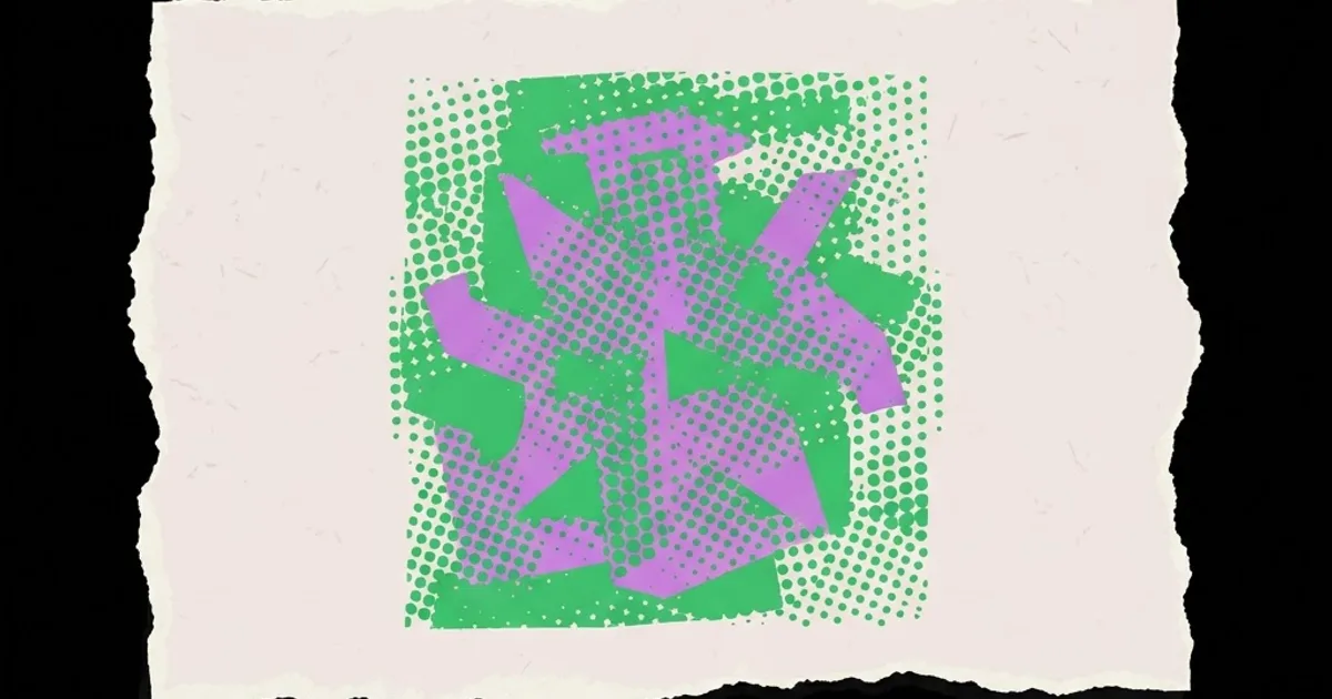
| Halftone and dot screens | Print-native, retro, screen-printed | Merchandise, editorial illustration | Moire patterns when scaled or reprinted |
| Torn and taped paper | Hand-assembled, collage, immediate | Album art, event collateral, zines | Edges look fake if reused repeatedly |
| Ink bleed and stamp texture | Aged, artisanal, hand-made | Labels, packaging, craft products | Fine detail disappears in production |
| Scratched and worn overlays | Used, weathered, durable | Apparel, heritage branding | Uniform application looks like a filter |
Notice how many risks concentrate in production. Grunge is one of the few styles where the file behaves differently from the proof, which is why the production section below matters more here than in most style guides.
What Reviewing Distressed Work Teaches About Legibility
There is no reliable published figure for how much legibility a given texture costs, and quoting one would be invention. What experience does provide is a repeatable diagnostic, offered here as practitioner analysis.
The most useful test is the squint-and-distance check performed at two stages. Look at the clean layout from the distance the piece will actually be viewed, whether that is two metres for a poster or arm's length for a label, and note the order in which elements register. Then apply the texture and repeat the test. If the reading order changes, the texture is doing damage. In practice, the element that most often loses its position is the secondary information layer, such as a venue name or a product descriptor, because it usually sits at a mid-tone weight where noise interferes most.
A second observation concerns type size thresholds. Distress behaves as a subtractive process on letterforms: it removes stroke, closes counters and softens terminals. Small text, tight counters and light weights are therefore the first casualties. The practical workaround used by experienced designers is to distress the background aggressively and the type lightly or not at all, then reintroduce continuity by letting a few texture elements overlap the type edges. The impression is uniform roughness; the reality is that the words are intact.
A third pattern is that grunge work ages badly when the textures are commodity assets used at default settings, because the same packs circulate widely and viewers recognise them subconsciously. Designers who scan their own materials, photograph their own worn surfaces or build their own halftone screens produce work that looks specific rather than downloaded. That difference in effort is exactly the kind of thing worth documenting in your case studies, and it is the sort of concrete evidence that strengthens a design CV that shows judgement rather than tool lists.
Common Grunge Mistakes and What to Do Instead
Applying texture as a full-canvas overlay. A single noise layer across everything flattens the composition and dulls the type. Instead, mask texture to specific zones and vary its opacity by area, concentrating wear where physical wear would occur.
Using distress to hide weak typography. Roughness does not fix bad spacing, it magnifies it, because irregular edges make optical alignment harder to judge. Instead, set the type to a high standard clean, then distress. If you would not be happy with the layout stripped bare, do not proceed.
Ignoring colour mode and print reality. Heavy texture in rich black or across multiple channels creates registration and ink-density problems, and fine halftones can moire against press screens. Instead, discuss line screen and ink limits with the printer before finalising, consider building the artwork as separations for screen print, and request a physical proof.
Reusing the same three texture files on every project. Clients and audiences develop a subtle sense of sameness even without identifying the cause. Instead, build a personal texture library from scans, photocopies, ink tests and photographs, and rotate sources deliberately.
Distressing the logo. Tempting and usually wrong, particularly for a client who needs the mark to work across many contexts. Instead, keep a clean master and create a controlled distressed variant as a secondary asset with documented usage rules.
Forgetting digital scaling. A texture that reads beautifully at poster size becomes grey mush in a social thumbnail. Instead, produce a coarser texture variant for small formats rather than scaling the print artwork down.
Letting the style outrun the brief. If the product is a medical service, grunge is a misread of audience expectation regardless of how well executed it is. Instead, test the claim: would this brand plausibly have been made by hand, on a budget, outside the mainstream? If not, choose another language.
A Worked Example: A Two-Colour Screen-Printed Gig Poster
Here is how the principles apply to a real deliverable, an A2 poster for an independent venue printed in two spot colours on uncoated stock.
Step one, define constraints. Two inks, no halftone overlap between them, uncoated paper that will absorb ink and gain dot, viewing distance of roughly two metres in a corridor with poor lighting. Every later decision follows from these.
Step two, build clean. Set a three-column grid. Band name at the top in a heavy condensed face large enough to read across the corridor. Date and venue in a clear secondary block. Supporting acts in a tertiary block. No texture yet. Print a greyscale copy, tape it to a wall and check the reading order from the actual distance. Adjust sizes until the order is correct without any styling help.
Step three, choose the texture family. For a loud independent gig, photocopy degradation plus a coarse halftone suits the message. Produce the textures physically: print the band name, photocopy it three times, scan the result. That scan now carries genuine irregularity no texture pack will match.
Step four, distress selectively. Apply the coarse halftone to the background field in the second colour. Let the photocopy artefacts appear at the edges of the headline only, where they suggest wear rather than damaging the counters. Leave the date and venue block untouched, because that is the information a passer-by must retain.
Step five, engineer for the press. Convert the halftone to a coarse line screen appropriate for screen printing, keep fine detail above the minimum stroke width the printer specifies, and avoid tight registration between the two inks by designing the overlap as a deliberate offset. Misregistration then reads as part of the style rather than as an error.
Step six, produce format variants. A social post version with coarser texture and a simplified hierarchy, and a small flyer version where the halftone is dropped entirely because it would fill in. Same artwork family, different texture weights, each tuned to its output.
Step seven, proof physically. Look at the printed sheet under the lighting it will live in. Ink gain on uncoated stock will close counters more than the screen suggested, and the correction is almost always to lighten the texture rather than to enlarge the type.
Key Takeaways
- Grunge is a finish applied to a disciplined layout, not a substitute for structure, hierarchy or typographic care.
- Distress is subtractive on letterforms, so texture the background heavily and the type lightly to preserve legibility.
- Uneven, zone-masked wear reads as authentic; uniform full-canvas noise reads as a filter and flattens the composition.
- Self-made textures from scans, photocopies and ink tests produce specificity that commodity texture packs cannot.
- Grunge carries a meaning about independence and hand-made origin, so it misfires on brands whose audience expects institutional trust.
Frequently Asked Questions
What is grunge graphic design in simple terms?
It is a visual style built from deliberate imperfection: torn edges, photocopy degradation, halftone dots, ink bleed, scratches and hand-made marks. It originated in zine, punk and independent music printing, where the artefacts came from cheap production methods, and it now signals authenticity, urgency and work made outside a corporate system.
Is grunge design still relevant?
Yes, particularly for music, streetwear, craft food and drink, events and independent publishing. The style cycles in visibility but never disappears, because the meaning it communicates, that something was made by hand and outside the mainstream, remains valuable to brands positioning themselves against polished corporate competitors.
How do I keep text readable in a distressed layout?
Set the type clean first, use heavier weights and more open counters than usual, and increase contrast beyond what looks necessary. Apply distress to the background and only lightly to headline edges. Keep critical information such as dates, prices and calls to action in an untextured zone.
What fonts work best for grunge design?
Condensed grotesques, heavy slab serifs, stencil faces and authentic hand-lettering hold up well because their strokes survive degradation. Avoid light weights, high-contrast didones and delicate scripts, since distress removes stroke mass and will close thin sections and counters first.
Can grunge design be used in branding?
It can, but keep a clean logo master and treat distressed versions as controlled secondary assets with documented rules. Marks must reproduce at small sizes, in single colour and in embroidery or etching, and heavy distress usually fails at least one of those requirements.
How do I create my own grunge textures?
Photocopy printed shapes repeatedly and scan the result, press inked stamps onto rough paper, photograph weathered walls and worn metal in flat light, or crumple and scan paper. Convert scans to high-contrast greyscale and use them as masks rather than overlays for more control.
Does grunge design cause problems at the printer?
Frequently, if unplanned. Fine halftones can moire, heavy texture raises ink density, and detail fills in on uncoated stock. Discuss line screen, minimum stroke width and ink limits with the printer before finalising artwork, and always request a physical proof rather than approving from screen.
Conclusion
The decision that determines whether grunge work succeeds is made before any texture is applied: commit to building the layout clean, judging it at real viewing distance, and only then adding distress to specific zones. Designers who reverse that order spend their time rescuing legibility instead of building atmosphere. Your next step on the current project is simple. Strip the textures off, print the layout in greyscale, look at it from the distance the audience will, and fix the hierarchy first. If you are assembling this kind of work into a body of evidence for clients, it is worth pairing it with the selection and sequencing advice in structuring a portfolio around decisions rather than aesthetics.