
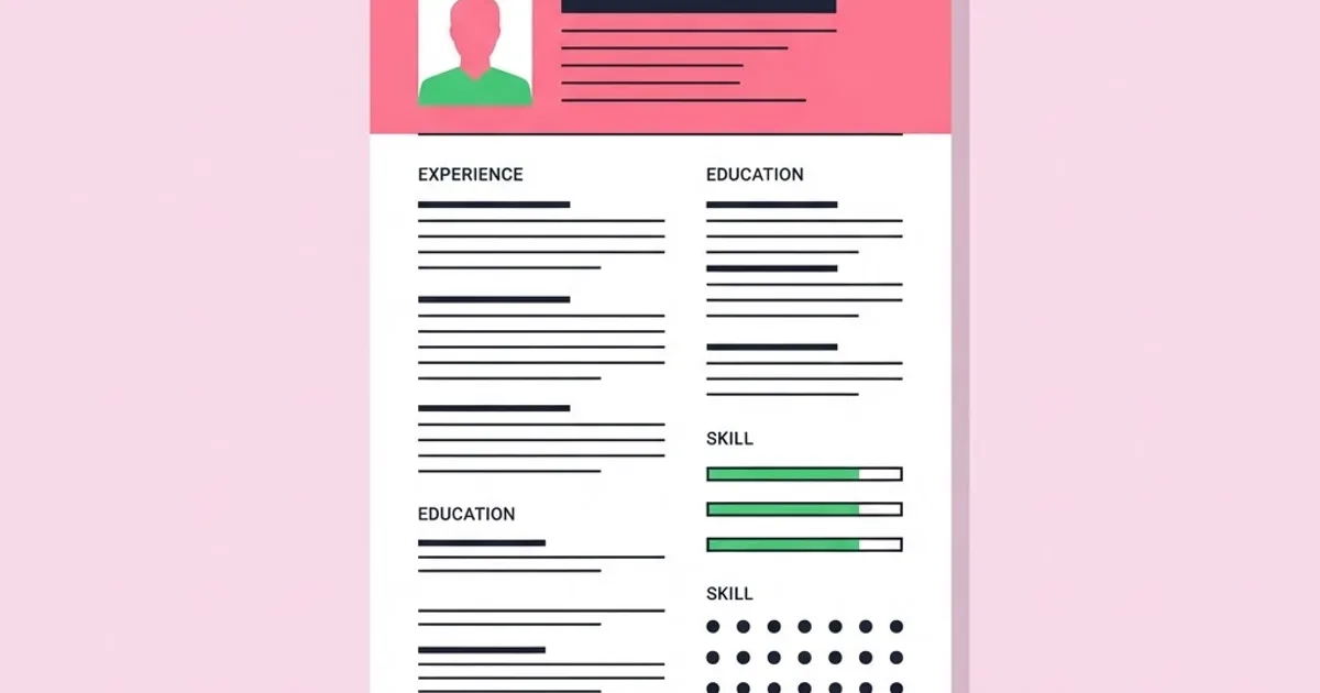
Graphic Designer Resume Sample: Layout, Wording, Proof
A designer's resume is the one document where showing off your layout skills actively works against you. A graphic designer resume is a scannable evidence document whose only job is to get your portfolio opened. It is read twice: once by software that strips your formatting entirely, and once by a human who spends well under a minute on it. Design for both readers and you pass. Design for the awards shelf and you get filtered out by a parser that could not find your job titles inside a two-column PDF with text in image layers.
Quick Answer: A strong graphic designer resume fits one page, uses a single-column layout with standard section headings, and leads with a portfolio link in the header. Each role gets three to five bullets written as action, context and outcome. Skills are listed as plain text, never as rating bars or star graphics.
Why Designer Resumes Get Rejected Before Anyone Judges the Design
Most applications now pass through an applicant tracking system before a human sees them. These systems parse text. They do not interpret visual hierarchy, they frequently mangle multi-column layouts, and they cannot read text that has been converted to outlines or embedded in an image. A designer who exports a beautifully typeset resume with text as vectors has effectively submitted a blank document.
The second filter is human, and it is faster than most applicants believe. A recruiter reading a stack of design applications is looking for four things in the top third of the page: current or most recent title, years of experience, a working portfolio link, and location or work authorisation. If those four are not immediately visible, the document gets set aside regardless of what is further down.
This is why the header is the highest-value real estate on the page. Name, role descriptor, city, email, phone and portfolio URL. Nothing else. No photograph in markets where photos are not standard, no personal statement crammed into the margin, no decorative banner eating the first quarter of the page. The portfolio link should be a short, readable URL and it should be live, because a broken link is the single most common self-inflicted rejection in design hiring. Those same four facts are what your letter should reinforce, which is why the resume and a cover letter that makes one focused argument should be written together rather than separately.
One more structural point: one page is correct up to roughly ten years of experience. Beyond that, two pages are acceptable if the second page carries genuine substance rather than overflow. Nobody has ever been rejected for being concise.
The Section Order That Works, With Sample Wording
Use this order. It front-loads evidence and pushes background material down where it belongs.
- Header. "Jordan Vale — Graphic Designer, Brand and Print. Manchester, UK. jordanvale.design. Email and phone." Six data points, one line each, no graphics.
- Professional summary, two to three lines. Sample: "Graphic designer with five years in-house and agency experience across brand identity, packaging and campaign rollout. Built a template system that cut a marketing team's asset turnaround time by more than half. Comfortable owning work from brief to press-ready artwork."
- Experience, reverse chronological. Job title, company, location, dates on one line. Three to five bullets beneath. Most recent role gets the most bullets; roles older than seven years get one or two.
- Skills, as plain grouped text. Sample: "Tools: Illustrator, InDesign, Photoshop, Figma, After Effects (basic). Production: pre-press, CMYK and spot colour, packaging dielines, large-format. Practice: brand guidelines, design systems, accessibility contrast standards, developer handoff."
- Selected projects, optional but powerful. Two or three lines naming a project, the client or context, and the result. Use this if your best work happened outside your listed jobs.
- Education and credentials. One line each. Move this to the top only if you graduated within the past year.
Notice what is not on the list: references available on request, hobbies, a skills chart with percentage bars, an "about me" paragraph written in the third person, and a colour-coded key. Each of those consumes space that could hold evidence.
Bullet Wording Compared: Weak Versus Strong
Bullets are where most design resumes lose their argument. The failure mode is describing the deliverable instead of the contribution. This comparison shows the same underlying work written both ways.
| Weak bullet | Why it fails | Strong rewrite | What the rewrite proves |
|---|---|---|---|
| Designed brochures and flyers | Lists a deliverable, no context or scale | Produced the print collateral for six product launches a year, working directly with the print vendor on stock and finish | Volume, ownership, production knowledge |
| Responsible for social media graphics | Passive, no outcome | Built a reusable template set that let the social team publish without a designer, freeing roughly a day a week | Systems thinking, measurable impact |
| Worked on rebranding project | Vague role in a group effort | Owned the typographic system and application guidelines for a company-wide rebrand across print and web | Specific scope and responsibility |
| Used Adobe Creative Suite daily | Software use is assumed, not an achievement | Rebuilt legacy artwork files into a linked InDesign master, cutting update time for annual catalogues | Technical depth applied to a business problem |
The formula behind every strong rewrite is the same: what you did, under what constraint or at what scale, with what result. If you genuinely cannot state a result, state the scale. Scale is always available and always more informative than a bare deliverable name.
An Honest Read on Metrics and What to Do Without Them
Resume advice constantly demands quantified achievements, and designers reasonably object that their work is not always measured. Inventing a number is the worst possible response, because interviewers ask follow-up questions and a fabricated figure collapses in ninety seconds. Here is the practitioner position: you almost always have legitimate numbers, they are just not conversion rates.
Legitimate, verifiable quantities available to nearly every designer include the number of brands or product lines supported, the volume of assets produced in a campaign, the number of markets or languages a design was adapted for, print run sizes, the number of stakeholders in an approval chain, the size of the team you coordinated with, and the turnaround time for a recurring deliverable before and after you changed the process. Those are facts you own, and they communicate scale without pretending you had access to sales dashboards you never saw.
Where you do have performance data, use it carefully and attribute it honestly. "Redesigned the email template; open rates are owned by the marketing team and rose over the following quarter" is credible. "Increased revenue by forty percent through design" is not, and experienced hiring managers discount it instantly. Understating slightly and being able to defend every claim is worth far more than an impressive number you cannot explain. This restraint also helps when compensation comes up, because verifiable scope is the strongest evidence in a salary conversation, as covered in what drives real differences in designer pay.
One more honest observation: for design roles specifically, the resume is a gate, not a decider. Nobody gets hired because of a resume. They get hired because the portfolio was strong and the conversation went well. Spend your effort proportionally, which means an afternoon on the resume and considerably longer on the work it points to.
Formatting Mistakes That Quietly Break Your Application
Two-column layouts. Parsers commonly read across columns rather than down them, producing scrambled text. If you must use a sidebar, keep only contact details in it and never job history.
Text as outlines or images. Outlining type for a "clean export" makes the document unreadable to software. Always keep live text and embed the fonts.
Skill rating bars. A bar filled to eighty percent communicates nothing meaningful, cannot be parsed, and invites the question of what the missing twenty percent is. List tools in plain text grouped by category instead.
Unconventional section names. "My Journey" and "What I Bring" defeat keyword matching. Use Experience, Skills, Education. Creativity in headings costs you matches and gains nothing.
Tiny type and cramped leading. Designers shrink text to fit one page. Below roughly nine point, a tired reader simply stops. Cut content instead of shrinking it, and keep margins generous.
Sending the wrong file type. PDF unless the posting specifies otherwise, named with your name and the role. Never send a design-tool source file, and never send a link that requires a login to view.
Leaving the previous application's target in place. Recycled resumes sometimes carry a summary line tailored to a different company. Read the top three lines aloud before every send.
Building It: A Two-Hour Process From Blank Page to Sent
Here is a sequence that produces a genuinely good designer resume in one focused sitting, assuming you already have the raw material.
First thirty minutes: inventory. Open a plain text file and dump every project, responsibility and result you can remember from each role, without editing. Aim for twenty or thirty raw lines. Editing while recalling is what makes resume writing feel impossible, so separate the two activities completely.
Next thirty minutes: select and rewrite. Choose the four bullets per role that best demonstrate range, ownership and production capability. Rewrite each using the action, constraint, result formula. Read each one and ask whether a different designer in a different company could have written the identical sentence. If yes, it is too generic to keep.
Next thirty minutes: build the layout. Single column, one typeface in two or three weights, clear section headings, consistent spacing, generous margins. Restraint here is the point. Your typographic judgement will be visible in the spacing and hierarchy of a plain document, and experienced reviewers notice that far more than they notice decoration.
Final thirty minutes: test and tailor. Copy all the text out of the exported PDF and paste it into a plain text editor. If the order is scrambled or anything is missing, your layout will break in a parser and needs fixing. Check that the portfolio link opens in a private browser window. Then tailor the summary and reorder skills for the specific posting, and keep the untailored master file separate so you never overwrite it.
Before sending, run a final relevance check against the job description. If the posting emphasises packaging and your top bullets are all digital, reorder. Reordering existing true statements to match a role's priorities is the highest-leverage tailoring you can do, and it takes three minutes. Doing this consistently matters most when you are applying locally against a small pool, where the same few employers will see your document more than once and repetition is noticed.
Key Takeaways
- A graphic designer resume is a gate document whose only job is to get the portfolio opened, so clarity beats visual ambition every time.
- Single-column layouts with live text and standard section headings are required for applicant tracking systems to parse the document correctly.
- Write bullets as action, constraint and outcome, and use scale figures such as asset volume or market count when performance data is unavailable.
- Skill rating bars, outlined text and unconventional headings actively reduce your chances and provide no compensating benefit.
- Test every export by copying the text into a plain editor to confirm it reads in the correct order before sending.
Frequently Asked Questions
Should a graphic designer resume be visually designed?
It should be typographically excellent but structurally plain. Demonstrate judgement through spacing, hierarchy and restraint rather than decoration. Heavy visual treatment breaks parsing and signals that you prioritise appearance over communication, which is the opposite of the impression a professional designer wants to create.
How long should a designer resume be?
One page for up to about ten years of experience, two pages beyond that only if the second page contains real substance. Older roles should compress to a single line or be grouped under an earlier career heading, since detail from a decade ago rarely influences a hiring decision.
Do I include a photo on my resume?
Follow local convention. In the UK, US, Canada and Australia, omit the photo. In parts of continental Europe and Asia, a plain professional photo is standard. When in doubt, leave it off, because the space is better spent on evidence and omitting it never causes rejection.
What if I have employment gaps?
State them briefly and factually, such as a freelance period or a career break with a year range. Gaps are common and rarely disqualifying. What raises concern is an unexplained silence in the timeline, because it invites the reader to imagine a worse explanation than the real one.
Should I list every Adobe application I know?
No. Group tools by purpose and list only what you would be comfortable using in a paid deliverable next week. Listing eleven applications at unclear depth reads as padding, while four listed accurately alongside production and practice skills reads as a working professional.
Is a portfolio link enough, or do I need attachments?
A live link is enough and is preferred. Attach a small PDF sample only when the posting explicitly requests one, and keep it under a few megabytes. Large attachments get blocked by mail servers, which means your application silently never arrives.
Conclusion
The decision that matters most is accepting that your resume is not a design piece. It is a routing document. Every minute spent making it visually distinctive is a minute not spent making the evidence inside it specific, and specificity is what actually moves a reader to click your portfolio link. Plain structure, precise bullets, working link.
Your next step is to run the copy-paste parsing test on your current resume today, then fix whatever comes out scrambled. After that, make sure the destination is worth the click by strengthening the case studies behind it using a portfolio structure built around problems and outcomes. Fix the gate, then fix the room behind it.


