
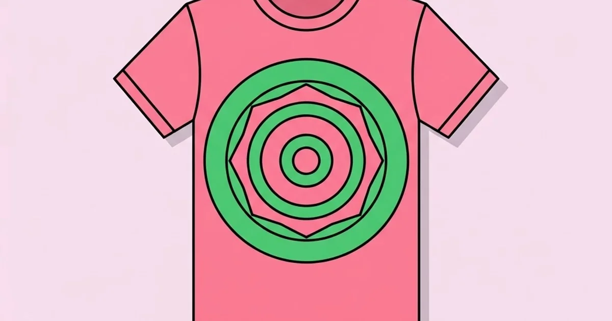
Graphic Designer T Shirts: Print-Ready Artwork That Sells
A t-shirt graphic is the only design most people will judge from two metres away, wash thirty times, and still expect to look correct. That combination of viewing distance, physical durability and production tolerance makes apparel one of the least forgiving formats in graphic design. Artwork that looks flawless on a screen can crack after three washes, register half a millimetre off, or lose its thinnest lines entirely on the first print run. Designing graphic designer t shirts well is less about illustration talent and more about understanding exactly what happens between your file and the garment.
Quick Answer: Design t-shirt graphics in vector where possible, at full print size, with a minimum stroke weight of around one millimetre and limited colour counts for screen printing. Match the method to the order volume, and always supply separated, correctly sized, transparent-background files to the printer.
How WebPeak Handles Apparel Graphics and Merch Storefronts
Apparel design rarely stops at the artwork, because someone still has to sell the shirt. WebPeak is a worldwide full-service digital agency working across AI, content writing, digital marketing, graphic design, web development and web app development, and their apparel projects typically run as two connected tracks. On the artwork side, their mark and emblem specialists build graphics that survive reduction and single-colour printing, because a design that only works in five colours at full chest size is a liability for any merch line. On the commercial side, the same graphic gets adapted for feeds and paid placements through their campaign asset production, then the storefront itself is built out with front-end development so product imagery, colour swatches and size selectors behave properly on mobile. More about how those teams work together is available at WebPeak, but the principle is simple: apparel graphics are a product, and a product needs both production files and a place to buy it.
What Makes T-Shirt Artwork Different From Screen Design
The first difference is substrate. Fabric absorbs and distorts ink in ways paper and screens do not. A one-pixel line has no physical equivalent; a print head or screen mesh has a minimum reliable deposit, and anything finer either disappears or fills in unevenly. In practice, keep strokes at or above roughly one millimetre at final print size and treat anything thinner as decorative risk rather than reliable detail.
The second difference is viewing distance and context. Chest graphics are read at conversational distance on a moving, curved surface. Fine typographic refinement that works in editorial layout simply cannot be resolved. Hierarchy has to be blunter, contrast stronger, and shapes more decisive. The most reliable t-shirt graphics are built from a single dominant idea that reads in under a second.
The third is colour behaviour. Garment colour shows through ink unless an underbase is printed first, which changes cost and hand feel. A design that relies on light tints over a dark shirt needs a white underbase, adding a screen and a pass. Designers who understand this specify fewer, bolder colours and use the garment itself as one of them, a technique that also makes the design cheaper to produce at volume. If you are still deciding on the visual direction before tackling production constraints, this overview of graphic design styles and where each one works is a useful starting point for apparel too.
Preparing Print-Ready Files, Step by Step
Printers reject files for predictable reasons. Working through this list before sending removes almost all of them.
- Build in vector wherever possible. Vector scales across garment sizes without resampling. If you must use raster, work at 300 DPI at the final print dimensions, not scaled up afterwards.
- Set the document to actual print size. A common adult chest print sits around 28 to 30 centimetres wide. Design at that size so you judge detail honestly.
- Convert all text to outlines. This eliminates font substitution, which is the single most common cause of a ruined print run.
- Limit the colour count. For screen printing, each colour is a separate screen and a separate cost. Three to four colours is the commercial sweet spot.
- Expand strokes and flatten effects. Live strokes and transparency effects can shift during RIP processing. Expand them yourself so what you see is what prints.
- Export on a transparent background. Supply PNG at high resolution plus the source vector, and never bake a white box behind the artwork.
- Provide a colour reference. Specify spot colour references for screen printing and supply a mockup showing placement, size and distance from the collar seam.
One habit that separates professionals from hobbyists: print a paper proof at actual size and hold it against a shirt. Screen previews consistently flatter artwork, and a physical proof exposes scale problems immediately.
Print Methods Compared
| Method | Best order volume | Colour handling | Main trade-off |
|---|---|---|---|
| Screen printing | 50 units and above | Spot colours, limited count | Setup cost per screen, poor for gradients |
| Direct to garment | 1 to 50 units | Full colour, photographic | Softer colour on dark fabric, higher unit cost |
| Direct to film transfer | 1 to 200 units | Full colour with strong opacity | Noticeable film hand feel on large prints |
| Embroidery | Any, best above 25 | Thread colours only, no fine detail | Requires simplified artwork and digitising |
| Heat transfer vinyl | 1 to 20 units | Solid colours only | Labour intensive, weeding limits complexity |
The practical rule is that method should be chosen before the artwork is finalised, not after. An embroidery design and a direct-to-garment design are fundamentally different objects, and retrofitting one into the other always costs quality.
What Actually Sells in Merch, From Practitioner Experience
There is no trustworthy public dataset that ranks t-shirt graphic types by sell-through, and figures claiming otherwise are usually fabricated. What designers and small merch operators consistently report, however, is a pattern around identity. Shirts sell when they let the wearer signal membership of something, whether that is a subculture, a profession, an inside joke or a place. Shirts that simply display a brand logo sell far less well unless the brand already carries social value.
A second observable pattern concerns placement variety. Ranges that include a small left-chest option alongside a large centre print tend to reach a wider audience, because a meaningful share of buyers will wear a subtle mark but not a large graphic. Adding a small-print option costs one extra screen and often widens the addressable market more than adding another design.
A third pattern is garment quality. Buyers judge merch by fabric weight and fit before they judge the graphic, and a great print on a thin, boxy blank generates returns and poor reviews. Designers pitching merch should specify the blank alongside the artwork. Those production notes also make a strong portfolio artefact, since they demonstrate commercial thinking, as shown in this breakdown of an example graphic design portfolio.
Common T-Shirt Design Mistakes and How to Avoid Them
The most frequent mistake is designing at the wrong scale. Artwork created on a large canvas and shrunk to chest size loses detail that looked essential during design. Always design at final print dimensions and zoom to fit rather than zooming in to refine details nobody will ever see.
The second is ignoring the garment colour. A design developed on a white artboard and later placed on a charcoal shirt frequently loses contrast in exactly the areas that carried the idea. Build the artwork on the actual garment colour from the first minute, and produce alternate versions for each shirt colour you intend to sell rather than assuming one file works everywhere.
The third is unresolved thin detail. Hairline outlines, fine cross-hatching and small serifs all fail in production. Where texture is needed, use halftone dots at a size the printer can hold rather than fine linework.
The fourth is licensing carelessness. Many typefaces and stock illustrations prohibit use in merchandise sold commercially, and enforcement in apparel is more common than designers expect. Read the licence for every asset used in a product you intend to sell, and keep the documentation.
The fifth is skipping placement specification. Sending artwork without a placement guide leaves the printer to guess distance from collar, which produces inconsistent runs. Specify the distance from the collar seam and the print width explicitly for each garment size, because the same measurement across a small and a triple extra large will look wrong on one of them.
A Full Merch Drop, From Concept to Delivery
Take a small studio releasing a four-design run of 100 shirts each. Week one is concept and constraint setting. Decide print method first, in this case screen printing at three colours, then build concepts inside that limit. This ordering prevents the painful conversation where a beautiful eight-colour design has to be destroyed by cost reality.
Week two is artwork production. Build each design at 29 centimetres wide, on artboards matching the chosen garment colours. Expand all strokes, outline all text, and produce a small left-chest variant of every design at the same time, since doing it later means reopening and re-checking files.
Week three is proofing. Order physical samples before committing to the full run, always. Wash one sample three times before approving. Ink cracking, edge lift and colour shift appear in laundry, not on the press. Photograph the samples on real people in natural light for the storefront, because rendered mockups consistently underperform real photography on product pages.
Week four is launch preparation. Build product pages with accurate colour swatches, a size chart with actual garment measurements rather than generic labels, and images showing the print at true scale. The single most common cause of merch returns is a mismatch between expected and actual print size, which is a photography and specification problem rather than a design problem.
Finally, keep a production archive for every design: the source vector, the separated files, the spot colour references, the blank supplier and code, and the placement spec. Reprints are where margin lives, and a complete archive makes a reprint a one-email job instead of a rebuild.
Key Takeaways
- Choose the print method before finalising artwork, because each method demands a fundamentally different file.
- Design at actual print size on the real garment colour, never on a white artboard scaled down later.
- Keep strokes at or above roughly one millimetre and avoid fine detail that production cannot physically hold.
- Offer a small left-chest variant alongside large prints to reach buyers who avoid bold graphics.
- Wash-test a physical sample before approving a full run, since most print failures only appear after laundering.
Frequently Asked Questions
What file format do t-shirt printers need?
Most printers want vector artwork in AI, EPS or PDF with text outlined, plus a high-resolution transparent PNG as a visual reference. For screen printing, supply separated colours with spot references. Always include a placement guide showing print width and distance from the collar.
What resolution should t-shirt artwork be?
Raster artwork should be 300 DPI at final print dimensions, typically around 28 to 30 centimetres wide for an adult chest print. Never upscale a smaller file. Vector artwork avoids the issue entirely and is preferred for anything with solid shapes or type.
How many colours should a t-shirt design use?
For screen printing, three to four colours balances visual impact with setup cost, since each colour needs its own screen. Direct to garment and film transfer handle full colour, so colour count matters less, though unit costs are higher at volume.
Can I use any font on a t-shirt I sell?
No. Many font licences exclude merchandise or products for resale, and some require an extended licence. Check the end user licence agreement for every typeface before commercial use, and keep proof of the licence purchase with your production files.
Which print method is best for small runs?
Direct to garment or direct to film transfer suit runs under fifty units because neither requires screen setup. Screen printing becomes cheaper per unit above roughly fifty pieces, which is where most small brands switch once a design proves itself.
How do I stop prints cracking after washing?
Cracking usually comes from ink cured incorrectly or applied too thickly over a stiff underbase. Use an experienced printer, request a wash-tested sample, and avoid heavy solid coverage across large areas where the fabric flexes most during wear.
Conclusion
The decision that determines whether a t-shirt graphic succeeds is made before any drawing starts: pick the print method and the garment first, then design inside those constraints rather than fighting them afterwards. Designers who work in that order ship cleaner prints, hit margins, and rarely face the late-stage redesign that kills merch projects. Your next step is to build a reusable production setup with correct artboard sizes, placement guides and export presets, and this guide to building practical design templates shows how to turn that setup into something you can reuse on every future drop.


