Graphic Design Letters: How to Craft Type That Stands Out
Graphic design letters are the smallest units of visual communication, yet they decide whether a logo feels trustworthy, a poster feels urgent, or a headline gets read at all. Graphic design letters are the individual letterforms designers select, modify, or draw from scratch for logos, headlines, signage, and display work, including typefaces, custom lettering, monograms, and wordmarks. Learning to craft them deliberately is one of the fastest ways to make ordinary layouts look professionally designed.
Quick Answer: To craft graphic design letters that stand out, start from the message and context, choose or draw letterforms with a clear personality, control stroke contrast and spacing, test legibility at real sizes, adjust kerning optically rather than numerically, and refine curves with minimal clean anchor points before finalizing the artwork as vector outlines.
What Is the Difference Between Typography, Lettering, and Type Design?
Typography, lettering, and type design are related but distinct disciplines, and confusing them leads to poor decisions. Typography is the arrangement of existing typefaces: selecting fonts, setting size, line spacing, and hierarchy. Lettering is drawing letters for one specific use, such as a logo or poster headline, where each letter can be customized for that exact word. Type design is creating a complete, reusable font, with every character designed to work in any combination.
The distinction matters because each solves different problems. A brand that needs consistent communication across hundreds of documents needs strong typography. A wordmark or a poster headline often benefits from custom lettering, because the designer can tune each letter pair. Building a full typeface is a long specialist project. Designers job hunting in competitive markets often find that lettering skill sets their portfolio apart; the guide to finding graphic design jobs in the Twin Cities explains why typographic craft matters to retail and packaging teams in particular.
A few terms will come up throughout this guide. The baseline is the line letters sit on. The x-height is the height of lowercase letters such as x, and a larger x-height generally improves readability at small sizes. Stroke contrast is the difference between thick and thin parts of a letter. Kerning is adjusting the space between specific letter pairs, while tracking adjusts spacing across a whole word or line. Counters are the enclosed or partially enclosed spaces inside letters like o, e, and a. Overshoot is the slight extension of round letters beyond the baseline and cap height so they appear the same size as flat letters.
Once you understand these components, you stop seeing letters as fixed shapes and start seeing them as adjustable systems you can tune for any context.
What Is the Step-by-Step Process for Crafting Letters?
Crafting letters that stand out follows a repeatable process that professional letterers use regardless of style. Work through these steps in order:
- Define the message and context. Write down the exact word or phrase, where it will appear, its viewing distance, and the feeling it must convey. A bakery sign, a tech wordmark, and a concert poster need very different letters.
- Collect references thoughtfully. Study historical and contemporary letterforms related to the mood, such as sign painting, engraving, geometric modernism, or brush script. Analyze why they work rather than copying them.
- Sketch many thumbnails. Draw small, fast versions of the whole word in different styles. Judge the word's overall shape before detailing individual letters.
- Establish guidelines. Set baseline, x-height, cap height, ascender, and descender lines. Decide on a slant if using italics or script.
- Refine a larger pencil drawing. Develop the best thumbnail at a larger size, focusing on consistent stroke weight, contrast, and letter widths.
- Digitize with clean vectors. Trace in a vector tool using as few anchor points as possible, placing points at the extremes of curves with horizontal or vertical handles for smooth results.
- Space optically. Adjust spacing by eye so the areas between letters feel equal, rather than relying on numerical gaps.
- Test in context. Place the lettering on real mockups at real sizes, print it, view it from a distance, and view it small. Fix whatever fails.
Skipping the thumbnail and guideline stages is the most common reason amateur lettering looks inconsistent. The structure is what lets personality read as intentional.
How Do Letter Styles Compare for Different Uses?
Each letter style carries different associations and practical strengths. The comparison below is based on common design practice rather than measured research.
| Letter Style | Typical Personality | Best Uses | Main Risk |
|---|---|---|---|
| Geometric Sans Serif | Modern, clean, neutral | Tech wordmarks, interfaces, wayfinding | Can feel generic without a distinctive detail |
| High-Contrast Serif | Elegant, editorial, premium | Fashion, luxury packaging, magazine headlines | Thin strokes disappear at small sizes or distance |
| Slab Serif | Sturdy, confident, vintage | Food brands, signage, posters | Can feel heavy in long text |
| Script Lettering | Personal, warm, expressive | Boutique brands, invitations, packaging accents | Legibility drops quickly with complex connections |
| Display or Decorative | Bold, themed, attention-seeking | Event posters, entertainment, short headlines | Dates quickly and overwhelms layouts if overused |
Choose style by function first and mood second. A beautiful script that nobody can read from across a room is a failed sign, no matter how elegant it looks on screen.
What Do Experienced Letterers Know That Beginners Miss?
This section is practitioner analysis drawn from years of drawing and correcting letterforms, not a statistical study. These are the optical principles that consistently separate polished work from amateur attempts.
First, letters are optical, not mathematical. A perfect circle placed beside a square of the same height looks smaller, which is why round letters overshoot the baseline and cap height slightly. Horizontal strokes usually need to be a little thinner than vertical strokes to look equal in weight. Trust your eyes over your measurements.
Second, the spaces matter as much as the shapes. Counters and the gaps between letters create rhythm. When an open letter such as L or T sits next to a round letter, the gap can look much larger than between two straight letters. Kerning those pairs individually creates the even texture that makes a word feel professionally set.
Third, consistency creates believability. Every letter in a custom word should share the same stroke logic: the same contrast direction, terminal style, and curve tension. One inconsistent letter makes the whole piece feel accidental.
Fourth, context changes everything. Lettering for large signage must survive distance, glare, and visual competition. Designers producing work for intense environments, such as those described in the guide to hiring a graphic designer in Las Vegas, open counters, increase stroke weight, and simplify details so letters stay legible amid bright surrounding signage.
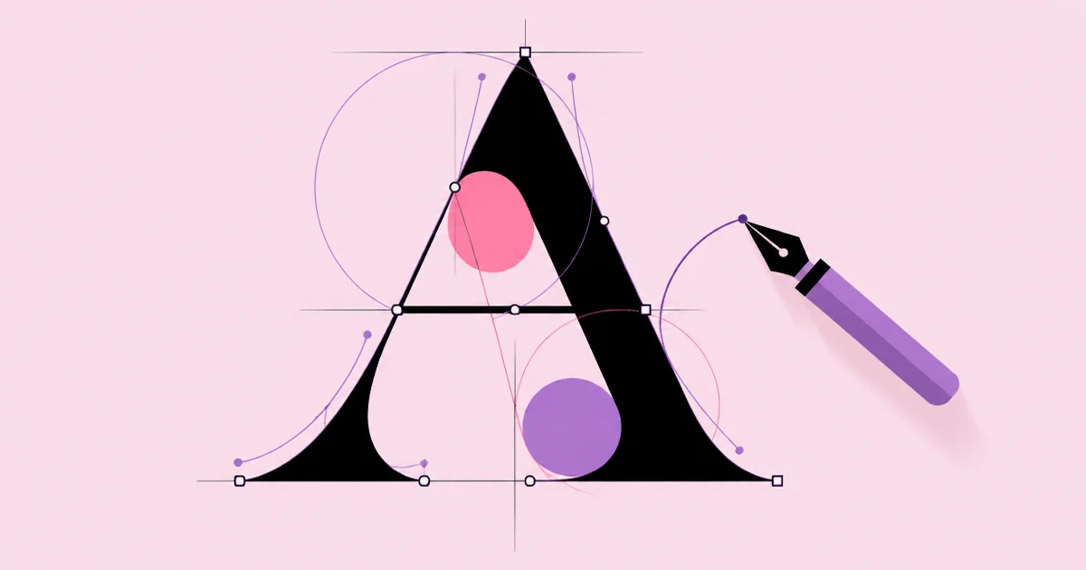
Fifth, fewer anchor points mean smoother curves. Beginners often trace with dozens of points, producing lumpy outlines. Experienced letterers place points at curve extremes and adjust handles, producing cleaner, more scalable artwork.
Finally, licensing matters. If you modify an existing font for a logo, check the font's license to confirm modification and logo use are permitted. Drawing letters from scratch avoids that issue entirely and creates a more ownable mark.
Common Mistakes When Designing Letters and How to Avoid Them
The first mistake is choosing style before understanding the message. Designers often pick a trendy script or geometric sans because it looks good in isolation. Avoid this by writing a one-sentence description of the feeling and context first, then selecting a style that serves it.
The second mistake is uneven stroke weight. Inconsistent thickness makes letters look wobbly. Establish a consistent stroke rule early and check every letter against it.
The third mistake is relying on default spacing. Default font spacing is designed for text sizes, not large headlines. At display sizes, spacing usually needs tightening and pair-by-pair kerning. Flip the word upside down to judge spacing without reading it; this reveals uneven gaps quickly.
The fourth mistake is overcomplicating details. Excessive swashes, textures, and ornaments reduce legibility and scale poorly. Remove every detail that does not support the message, then test whether the word still reads at its smallest intended size.
The fifth mistake is stretching or squashing fonts. Distorting a typeface horizontally or vertically breaks its carefully balanced proportions. Use a condensed or extended family instead, or draw custom proportions properly.
The sixth mistake is never testing small. A logo that looks great at billboard size may collapse at favicon or social avatar size. Create a simplified version or monogram for small applications.
The seventh mistake is ignoring contrast with the background. Light, thin letters on busy images become invisible. Check contrast, add weight, or simplify the background behind the lettering.
A Practical Lettering Project Walkthrough
Here is a realistic project showing the process applied. A small coffee roaster needs a custom wordmark for bags, a storefront sign, and social media.
Step 1: Brief. The roaster wants to feel warm, crafted, and confident, not rustic cliché and not corporate. The wordmark must work on a kraft paper bag, a painted window, and a tiny circular avatar.
Step 2: References. The designer gathers references from mid-century sign painting and sturdy slab serifs, noting how rounded terminals feel friendly while firm slabs feel reliable.
Step 3: Thumbnails. The designer sketches more than twenty small versions of the name, testing all caps, mixed case, slight upward slant, and connected letters. Three directions are selected for refinement.
Step 4: Refinement. The strongest direction, a medium-weight slab with softly rounded slab ends, is drawn larger on guidelines. The designer narrows wide letters to balance the word and adds subtle overshoot to round letters.
Step 5: Digitization. The drawing is traced with minimal anchor points. Curves are checked at high zoom, then viewed at actual size to confirm smoothness.
Step 6: Spacing and testing. The designer kerns problem pairs, prints the wordmark at bag size and avatar size, and tapes a large print to a window to check from across the street. Thin slab ends are thickened slightly for the window version.
Step 7: System. A compact monogram is drawn from the first letter for small uses, and the final artwork is delivered in vector formats with a short usage guide.
Use this checklist for your own lettering:
- Message, feeling, and contexts are written down before sketching.
- Guidelines and a consistent stroke rule are established.
- Curves use minimal, well-placed anchor points.
- Spacing is adjusted optically, including upside-down checks.
- Artwork is tested at the smallest and largest real sizes.
Key Takeaways
- Typography arranges existing fonts, lettering draws letters for one use, and type design builds complete reusable typefaces.
- Letterforms must be adjusted optically, including overshoot and thinner horizontals, because mathematically equal shapes look unequal.
- Even spacing between letters is as important as the letter shapes themselves and requires pair-by-pair kerning at display sizes.
- Consistent stroke logic across every letter is what makes custom lettering feel intentional and professionally crafted.
- Testing lettering at its smallest and largest real sizes reveals legibility problems that screen previews routinely hide.
Frequently Asked Questions
What are graphic design letters?
Graphic design letters are the letterforms designers use to communicate visually, including selected typefaces, modified fonts, and custom hand-drawn lettering. They appear in logos, headlines, posters, packaging, and signage. Good letter design balances personality with legibility, so the message reads clearly while the style reinforces the intended mood and brand.
What is the difference between a font and lettering?
A font is a complete set of characters designed to work in any combination and reused across many projects. Lettering is drawn for one specific word or phrase, so each letter can be customized for its neighbors and context. Lettering offers uniqueness, while fonts offer consistency, flexibility, and speed.
Which software is best for creating custom letters?
Vector software such as Adobe Illustrator, Affinity Designer, or similar tools works well for custom lettering because outlines scale cleanly. Many letterers sketch on paper or a tablet first, then trace in vector. For building full typefaces, dedicated font editors are used. The skill matters more than the specific tool.
How do I make letters more readable at small sizes?
To improve readability at small sizes, use a larger x-height, open counters, moderate stroke contrast, and slightly looser spacing. Avoid thin hairlines and intricate details that disappear. Create a simplified version or monogram for very small uses, and always test by printing or viewing the letters at actual size.
Can I modify an existing font for a logo?
You can often modify an existing font for a logo, but first check the font's license, because some licenses restrict modification or logo use. Careful modifications, such as custom ligatures or adjusted terminals, can make a mark more distinctive. Drawing letters from scratch gives full ownership and avoids licensing uncertainty.
How long does it take to learn hand lettering?
Learning basic hand lettering can take a few months of regular practice, while developing professional consistency usually takes much longer. Progress comes from studying letter structure, drawing guidelines, practicing spacing, and analyzing strong examples. Short daily sessions focused on one letter group or principle build skill faster than occasional long sessions.
Conclusion
The most important insight about graphic design letters is that standout lettering comes from disciplined optical judgment, not decoration: consistent strokes, even spacing, and relentless testing at real sizes. Personality only reads as quality when that structure is in place. Your next step is to choose one word you use often, sketch twenty thumbnails, and refine the best one through the full process above, then see how strong typographic portfolios help designers get hired in this guide to graphic design jobs in Washington DC.