
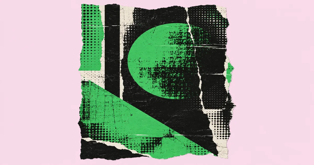
Graphic Design Grunge: A Practical Visual Style Guide
A distressed poster can feel urgent and handmade, or it can look like someone dropped a texture over an unfinished layout. The difference is usually hierarchy, not the amount of dirt. Graphic design grunge is a visual style that uses distressed surfaces, irregular typography, rough edges, and layered imagery to create a deliberately imperfect appearance. This guide treats that appearance as a controllable design system, with practical decisions for choosing, building, and checking it.
Quick Answer: Build grunge design on a clean, readable layout, then introduce controlled wear through texture, typography, imagery, and color. Choose distress that supports the message, protect essential information, and test at the final viewing size. Keep effects editable so you can adapt the design across print and digital formats.
What Makes Graphic Design Grunge Different from Random Distress?
Grunge becomes a design style when its imperfections follow a consistent visual logic.
That logic should come from the subject. A fictional underground music event might use photocopier noise and torn paper; a survival game might use scratched metal and weathered paint. Those materials imply different worlds. For interactive applications, the gaming graphics production guide provides broader context for planning assets beyond a single promotional image.
Texture is the visible character of a surface, such as paper fibers or concrete grain. Distress is apparent damage or wear, including missing ink and chipped edges. Layering combines elements to suggest depth or accumulated history. Hierarchy determines what people notice first, second, and last. These terms describe separate controls, not interchangeable effects.
Grunge also differs from simply using dark colors. A pale, sun-faded composition can feel heavily weathered, while a black layout can remain pristine. Likewise, rough typography alone does not create a convincing system if the photography, spacing, and supporting graphics communicate something entirely different.
I start with a short material brief: what is this surface, how was it marked, and what caused the wear? The answers keep choices coherent. Folded paper suggests creases and edge damage; scraped paint suggests exposed layers. You do not need physical realism everywhere, but you do need a believable relationship between marks. That relationship gives the work character without making every element compete for attention.
How Do You Build a Controlled Grunge Composition?
Build the information structure first, then add imperfections in a deliberate sequence.
The order matters because texture can disguise weak spacing and poor emphasis during design. Starting clean makes those problems visible before effects complicate your judgment.
- Define the message. Write down the primary action and the essential information. Separate atmosphere from facts that must remain immediately readable, such as an event date, product name, or navigation label.
- Create a clean layout. Establish margins, alignment, image placement, and type sizes without distress. Confirm that the composition works in grayscale and at its intended size before adding decorative layers.
- Choose a material family. Select related textures, such as paper grain, toner breakup, and torn edges. Avoid mixing unrelated surfaces unless the concept specifically calls for collage or material contrast.
- Assign texture roles. Use one dominant surface, one supporting wear pattern, and restrained accents. Keep the strongest texture away from dense copy so the image has both activity and rest.
- Distress selectively. Apply masks to large display lettering, image borders, or background blocks. Preserve small text and essential symbols. Adjust damage around individual letters rather than accepting the mask everywhere.
- Review without effects. Temporarily hide the texture group. If the hierarchy collapses, fix the layout rather than adding another overlay. Restore the effects and compare the reading order again.
Save a clean version alongside the textured master. It gives you a reliable fallback for small placements and makes later changes less fragile.
Which Textures, Typefaces, and Colors Work Together?
The strongest combinations pair expressive surfaces with typography and color that preserve separation.
Choose type by structure before choosing it by damage. Wide counters, recognizable silhouettes, and enough weight to survive masking are useful for display text. Supporting copy usually benefits from a cleaner face. The table below offers starting points, not fixed rules or evidence of audience preference.
| Visual direction | Surface treatment | Type approach | Main safeguard |
|---|---|---|---|
| Photocopied flyer | Toner noise and paper grain | Bold condensed headline | Keep small copy solid |
| Weathered industrial | Scraped paint and oxidation | Sturdy sans serif | Separate text from busy marks |
| Handmade collage | Torn paper and visible seams | Expressive display with neutral support | Limit competing alignments |
| Faded editorial | Soft grain and worn ink | Readable serif with restrained wear | Protect fine letter details |
For color, begin with a background, a primary text color, and an accent. Off-white, charcoal, and a muted warm accent can suggest aged print, but any palette needs testing against its actual texture. A nominally dark background may contain bright scratches that interfere with pale lettering.
Avoid relying on color alone to distinguish actions or categories. Use labels, shape, spacing, or weight as additional signals. Check contrast where text actually sits, including lighter and darker patches, rather than sampling an untextured corner of the canvas.
When Is Grunge the Right Strategic Choice?
Grunge is appropriate when visible wear supports the message rather than undermining trust or usability.
Practitioner analysis: I evaluate this style through message fit, reading conditions, and production demands. This is design judgment, not a claim about measured audience behavior. Roughness can suggest resistance, physicality, age, or improvisation, but those associations depend on context. They should be checked with the people responsible for the brief.
For a project about repaired objects, visible abrasion may reinforce the subject. For instructions that people must scan quickly, the same abrasion can become an obstacle. The useful question is not whether grunge looks impressive; it is whether the design communicates the intended character while leaving the task easy to complete.
When reviewing concepts, ask for both the hero composition and a constrained application, such as a small social graphic or dense information panel. This reveals whether the style is a reusable system or a single attractive mockup. If you need independent help assessing that distinction, this guide to hiring a design consultant can help structure the engagement.
I also look for restraint. A designer who can explain why an area remains clean usually has better control than one who applies equal distress everywhere. Request a short rationale connecting surface choices to the brief, plus an editable file demonstration. Neither guarantees success, but together they make the design process easier to evaluate and maintain.
What Common Mistakes Make Grunge Design Hard to Read?
The most damaging mistakes are uniform texture, weakened letterforms, and effects that ignore output conditions.
Covering every area equally. An overlay across the entire page makes headlines, backgrounds, and fine print fight at the same intensity. Mask the texture locally. Leave quiet space around the main message, and concentrate heavier marks where they support movement or framing.
Destroying letter recognition. Distress can close counters, erase crossbars, or make neighboring characters merge. Examine the actual words, not just the font preview. Reduce damage on ambiguous letters and keep practical details, including addresses and instructions, in clean type.
Using undersized texture assets. Enlarging a small raster image can produce blurry smears instead of convincing grain. Check effective resolution at placed size. Use a larger original, capture your own surface, or rebuild the effect with scalable shapes when appropriate.
Confusing low contrast with atmosphere. Faded color does not excuse unreadable information. Place copy on a quieter panel, change its value, or reduce local texture. For digital work, check applicable accessibility requirements and test the rendered result, not only the source palette.
Ignoring asset permissions and reversibility. A texture found online is not automatically licensed for commercial use. Record the source and permitted uses, including any font restrictions. Keep masks, adjustment layers, and original assets intact. Flatten only delivery copies when required, so corrections do not force you to rebuild the composition. Name those copies clearly to prevent them from replacing your editable master.
How Can You Produce a Grunge Event Poster Step by Step?
A reliable walkthrough moves from a clean information layout to controlled distress and format-specific checks.
Consider a hypothetical community repair workshop that needs a printed poster and a mobile announcement. The goal is to suggest hands-on making without making registration details difficult to find. This is an illustrative scenario, not a report about a named client.
Prepare the content and files. Confirm the event name, venue, schedule, registration method, and required marks. Ask the printer for dimensions, bleed, color expectations, and delivery settings. Create separate artboards for print and mobile rather than assuming one crop will serve both.
Build the clean composition. Give the event name the strongest emphasis, place a tool photograph beneath it, and group the practical details together. Use a sturdy display face for the headline and a clean text face for the details. Check the reading order before introducing any wear.
Create the material treatment. Photograph paper or another suitable surface under even light. Correct perspective, remove distracting shadows, and prepare a tonal version. Place it above the background using a mask. Test a blending mode, then adjust opacity and local coverage rather than relying on the preset alone.
Add selective damage. Apply subtle breakup to the headline and a rough edge to the photograph. Keep the information group clean. If you include a QR code, preserve its required quiet zone and test the final printed code with actual devices.
Check and deliver. Print a proof at intended size and inspect the mobile version on a phone. Look for filled letter counters, disappearing grain, awkward crops, and insufficient separation. Export to the agreed specifications, review the exported files, and package the editable master with licensed assets and notes describing which elements should remain undistressed.
Key Takeaways
Effective grunge design depends on controlled contrast between rough expression and clear information.
- Start with a readable layout that works before texture is added.
- Choose related materials so wear feels intentional rather than randomly collected.
- Keep small text, functional symbols, and essential actions clean and recognizable.
- Use editable masks and licensed assets to simplify adaptation and correction.
- Test exported artwork at real viewing sizes and under its intended production conditions.
Frequently Asked Questions
These answers address practical decisions that often arise when building a grunge style.
Is grunge design always dark?
Grunge design does not require a dark palette. Light paper, faded pastels, washed-out photography, and worn ink can produce a convincing distressed appearance. The defining feature is controlled imperfection, not black backgrounds. Choose colors for the message, then preserve enough separation between text, images, and textured surfaces.
Which software should I use for grunge design?
Use software that supports the assets and outputs your project needs. Raster editors are useful for surface manipulation and photographic masks, while vector and layout tools help manage typography and multipage structure. A combined workflow often works well, provided placed images retain sufficient resolution and effects remain editable.
Can grunge typography remain accessible?
Grunge typography can remain readable when distress is limited and tested. Reserve stronger effects for large, short headlines, and use clean lettering for instructions and longer passages. For digital interfaces, check relevant accessibility requirements, preserve meaningful text where possible, and verify contrast against the actual background rather than a flat sample.
How can I make original grunge textures?
You can make original grunge textures by scanning or photographing surfaces you have permission to capture. Paper, worn cardboard, and dry brush marks offer useful starting points. Use even lighting, retain a high-quality original, and create separate tonal variations so one source can produce multiple controlled effects without obvious repetition.
Will the same grunge artwork work in print and online?
The same visual system can work across print and online, but individual assets usually need adaptation. Fine grain may disappear on a phone, while heavy distress may fill in during printing. Adjust scale, cropping, and local texture for each format, then inspect exported files and obtain a print proof when practical.
How much texture is too much?
Texture is excessive when it competes with the message or prevents comfortable reading. Hide the effects and compare how quickly you can find the main information. Then restore them selectively. If viewers struggle to identify a headline, instruction, or action, simplify the surrounding marks before changing the entire composition.
Conclusion
The most important decision is where the design can be rough and where it must stay clear.
Make that boundary explicit before choosing textures or distressed fonts. It will guide the visual hierarchy, keep adaptations coherent, and make feedback more useful. Your next step is to build one representative composition and proof it at its intended size. For printed work, use the print production checklist and guidance to support that review, so the character you designed survives the move from screen to finished piece.


