Graphic Design Game Design: Building a Better Player UX
A player can understand your combat system and still lose because the warning disappeared into the scenery. That is not simply a styling problem; it is a communication failure. Graphic design in game design is the practice of organizing visual information so players can understand choices, act confidently, and recognize outcomes. The goal is not to decorate the game, but to make its rules readable without flattening its personality.
Quick Answer: Graphic design improves game design by making actions, priorities, and feedback easy to understand. Start with the player’s next decision, establish a consistent visual hierarchy, and test interfaces during actual play. Treat typography, icons, color, spacing, and motion as a coordinated communication system rather than separate decorative assets.
What Does Graphic Design Actually Do in Game Design?
Graphic design translates game rules and player states into visual signals people can interpret while playing. It shapes interface typography, icons, navigation, status displays, and informational layouts. Its success depends on whether players notice the right information at the right moment, not whether an isolated screen looks impressive in a portfolio.
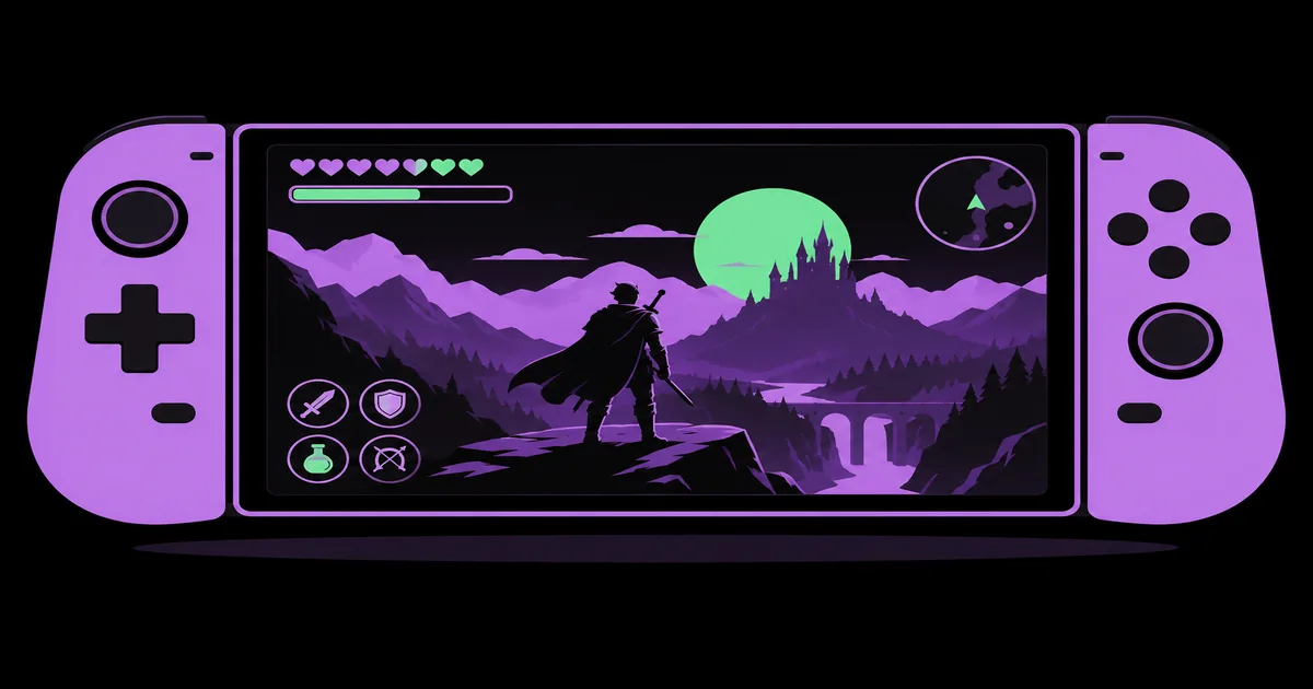
User interface, or UI, means the controls and displays players interact with. User experience, or UX, describes the broader experience of understanding and using the game. A heads-up display, or HUD, presents information during play. For the asset-production side of this relationship, see our practical guide to graphic design for gaming.
Game design determines systems such as resource costs, progression, and failure conditions. Graphic design makes those systems visible. If an ability requires energy, the designer must communicate its cost, availability, selected state, and activation result. A beautiful symbol that fails to distinguish those states leaves the player guessing about a rule the game already knows.
The boundaries overlap, so ownership needs discussion. An interface artist may create the visual language while a UX designer maps navigation and an engineer implements behavior. In a smaller team, one person may cover all three. The essential agreement is that every visual state corresponds to an actual gameplay state, including interruptions and errors.
Build the Interface Around a Repeatable Decision Workflow
A reliable workflow begins with player decisions and ends with implemented behavior, not a folder of approved mockups.
- Identify the immediate decision. Describe what the player needs to decide in a specific situation. In combat, that might be whether to attack, defend, or retreat. In an inventory, it might be which item to equip. Avoid starting with a vague request to make the screen exciting.
- List the information required. Separate essential signals from useful context and optional detail. Health may need continuous visibility, while an item’s crafting history can wait for inspection. This step prevents every stakeholder’s favorite feature from becoming another permanent element competing for the player’s attention.
- Map states before styling. Document available, selected, focused, pressed, unavailable, and loading states where applicable. Explain why an action is unavailable. A controller focus ring and an equipped-item marker communicate different things, even when they appear on the same inventory card.
- Prototype hierarchy with plain assets. Use simple blocks, provisional icons, and readable text to establish order. Check whether players can locate the primary action without a verbal explanation. If the layout fails with neutral styling, adding texture and atmospheric lighting usually makes diagnosis harder.
- Validate in the running game. Review the interface against bright scenery, dark scenes, camera movement, and demanding encounters. Confirm that visual feedback matches actual timing. A polished prototype cannot reveal every problem caused by animation, input handling, localization, or changing gameplay values.
Keep the resulting decisions in a lightweight specification so revisions change the system deliberately rather than creating unrelated exceptions screen by screen.
Match Visual Hierarchy to Each Game Surface
Different interface surfaces need different information priorities because players use them under different levels of pressure.
A combat HUD supports brief glances, while a settings screen supports comparison and careful adjustment. Reusing typography and color roles helps consistency, but reusing the same density everywhere does not. Establish a shared visual language, then adapt its emphasis to the task and viewing conditions.
| Surface | Primary player need | Design priority | Useful validation task |
|---|---|---|---|
| Combat HUD | Recognize immediate danger | Distinct critical states | Notice low health during movement |
| Inventory | Compare available choices | Stable labels and alignment | Equip an item and explain its effect |
| World map | Choose a destination | Clear symbol categories | Distinguish objectives from optional locations |
| Settings | Adjust behavior confidently | Readable controls and descriptions | Change an option and restore it |
| Rewards screen | Understand what changed | Visible gains and next action | Identify the reward and continue |
Typography should follow the same logic. Reserve expressive display lettering for places where players have time to read it. Use sturdy text forms for changing numbers, compact labels, and instructions. Test fonts at their rendered size, with the actual outline, shadow, and background treatment; an attractive type specimen says little about in-game legibility.
Color roles also need consistency. If a color signals danger in combat, avoid casually using it for a harmless confirmation elsewhere. Pair important color differences with labels, shapes, patterns, or position. The interface should remain understandable when color distinctions are difficult to perceive.
Practitioner Analysis: Balance Atmosphere Against Reliable Feedback
Practitioner analysis: atmosphere should influence presentation without making essential information unreliable or difficult to retrieve.
This is a design judgment, not a claim based on measured outcomes. I prioritize dependable state communication before decorative integration. A distressed survival interface can feel fragile, but its focus indicator should not be ambiguous. A magical menu can animate theatrically, but players still need to know when an input has registered and when another action becomes available.
The useful distinction is between intentional uncertainty and accidental confusion. A horror game may deliberately conceal an enemy’s location. It should not accidentally conceal whether the pause menu is open. Decide which uncertainties belong to the rules, then protect the interface signals that help players operate those rules. Otherwise, visual atmosphere becomes an excuse for inconsistent feedback.
When ownership is unclear, outside review can help separate visual problems from interaction problems. Our guide to hiring a graphic design consultant explains how to define a useful advisory scope. For game work, specify deliverables such as a state audit, hierarchy review, or component-system critique rather than asking for a general opinion about whether the interface looks professional.
My practical review sequence is simple: inspect the unstyled interaction, add the visual system, then compare behavior under pressure. If styling makes the action harder to recognize, revise the treatment before adding more explanation. Instructions should clarify the game, not compensate for avoidable ambiguity in its controls.
Common Interface Mistakes and How to Avoid Them
Most recurring interface mistakes come from reviewing appearance separately from gameplay, accessibility, and implementation constraints.
Designing only for ideal screenshots. A transparent panel may look elegant over an empty landscape and become unreadable over particles or foliage. Test with representative worst-case backgrounds. Where necessary, use a controlled backing layer, local shading, or a stronger silhouette instead of relying on a text shadow to rescue every possible scene.
Using icons without enough context. Familiarity inside the studio does not guarantee player understanding. Abstract status effects and uncommon actions often need labels or accessible descriptions. Introduce symbols consistently, explain them where players can inspect them, and avoid assigning visually similar icons to actions with very different consequences. Test recognition before removing supporting text.
Treating accessibility as a final palette pass. Color alternatives cannot fix tiny text, unclear focus, or information communicated only through animation. Plan adjustable text where feasible, visible navigation focus, sufficient contrast, and alternatives to color-only meaning. Consider reduced motion and subtitle presentation early enough that layouts can accommodate them without becoming crowded or inconsistent.
Delivering assets without behavior specifications. An exported button does not explain its input area, scaling rules, disabled reason, or focus transition. Include state diagrams or annotated examples, define content overflow behavior, and review the result in-engine. Avoid approving one static composition as if it were proof that an entire interactive component works.
Implementation Walkthrough: Make a Healing Action Understandable
A healing-item interface is a useful test case because it combines urgency, resources, input, and feedback in one interaction.
Start with the rule. In this hypothetical action game, the player carries a limited supply of healing items and cannot use one during certain animations. Write those constraints down first. The interface needs to show the remaining quantity, the assigned input, availability, and the reason an attempted use might fail.
Build the component. Place the item symbol, quantity, and input prompt in a stable arrangement near related survival information. Give the quantity enough space to change without shifting the whole group. Define normal, focused where relevant, empty, temporarily blocked, and successfully activated states before introducing ornamental detail or screen effects.
Specify the response. When activation succeeds, update the quantity when the game actually consumes the item, not merely when the button is pressed. Show the health change in its existing display. When activation fails, provide a concise explanation appropriate to the situation without covering the encounter or depending only on sound.
Test realistic conditions. Try the component during camera movement, against varied backgrounds, and with the supported input methods. Check text scaling and longer localized labels. Ask a player to explain why healing is unavailable. Their explanation can reveal whether the interface communicates the rule or merely displays an unexplained muted icon.
Close the implementation loop. Record issues as observable problems: the count disappears on bright scenes, the blocked state resembles the empty state, or the prompt shows the wrong input. Assign each issue to layout, artwork, logic, or content. Recheck the corrected component in the same situation before extending its pattern elsewhere.
Key Takeaways
Better player UX comes from a consistent relationship between game rules and visible feedback.
- Begin with the player’s immediate decision, then select the information needed to support it.
- Define component states and input behavior before investing heavily in decorative polish.
- Adapt visual hierarchy to each surface while keeping shared meanings consistent.
- Test readability, accessibility, and feedback inside the game rather than only in mockups.
- Document implementation rules so the delivered experience matches the intended visual system.
Frequently Asked Questions
These answers clarify practical boundaries and priorities when planning graphic design for a game interface.
Is graphic design the same as game design?
Graphic design and game design are different but closely connected disciplines. Game design establishes rules, challenges, progression, and player choices. Graphic design communicates those systems through visual organization. They overlap whenever a visual decision changes what players notice, understand, or believe they can do next.
Do small games need a dedicated UI designer?
Small games need deliberate UI design, but not always a dedicated UI specialist. The staffing decision depends on interface complexity, team skills, and production scope. A compact game may assign the work to a generalist, provided someone owns interaction states, accessibility checks, implementation review, and consistency across screens.
Which software should I use for game interfaces?
Use tools that support your team’s asset pipeline and implementation needs. Vector tools suit scalable symbols and interface shapes, while raster tools support textured artwork. Layout and prototyping tools help explore flows. The deciding factor is whether assets, states, and specifications transfer reliably into your chosen game engine.
How can I tell whether a HUD is too busy?
A HUD is too busy when competing elements obscure the information needed for the current decision. Give a player a specific task and observe where they look or hesitate. Review persistent elements individually: information that is useful only occasionally may belong in a contextual display or an inspection view.
Should every game use minimalist interface design?
Every game needs clear hierarchy, but not every game needs a minimalist interface. Strategy and simulation games may require substantial information on screen. The aim is appropriate density, not emptiness. Group related content, establish reading order, and allow deeper inspection so complexity remains understandable rather than visually undifferentiated.
When should accessibility testing begin?
Accessibility testing should begin while interaction patterns and layouts are still flexible. Early checks can reveal problems with text size, focus visibility, color dependence, motion, and input assumptions. Continue testing after implementation because engine rendering, animation, and real gameplay conditions can introduce barriers that static design files do not reveal.
Conclusion
The most important decision is to organize the interface around the player’s next meaningful action, not around a preferred visual effect.
That choice gives typography, icons, layout, and feedback a shared purpose. If outside production support is necessary, our guide to choosing the right design partner offers a framework for evaluating fit. Your next step is to prototype one high-pressure interaction with all its states, then test whether a player can recognize the available action and explain the result without coaching.