Best Graphic Design Apps for Mac: A Practitioner Guide
The graphic design apps for Mac that are worth your money are rarely the ones with the loudest marketing, and the right stack depends almost entirely on what you ship rather than what looks impressive in a tutorial. Graphic design apps for Mac are the vector, raster, layout, interface and type tools that run natively on macOS and form a designer's daily working environment. Choosing well means fewer file conversions, fewer production disasters at handoff, and hours per week that stop disappearing into fighting your own toolchain.
Quick Answer: Pick Mac design apps by output type, not popularity. Use a vector tool for logos and illustration, a raster editor for photography, a dedicated layout application for multi-page print, and an interface tool for screens. Most designers need three apps, not ten, and file compatibility with collaborators matters more than any single feature.
How to Choose a Mac Design Stack That Actually Fits Your Work
The first question is not "which app is best" but "what leaves my machine". A designer producing packaging that goes to an offset printer has fundamentally different requirements from one shipping screens to an engineering team. Colour management, bleed handling, spot colour support and preflight matter enormously to the first person and not at all to the second. Build the stack backwards from the final artefact.
The second question is collaboration. Design files are rarely a solo artefact. If your printer, your developer or your client's internal team cannot open, comment on, or extract assets from your files, the tool is costing you time regardless of how good it feels to use. Native format lock-in is the single most expensive hidden cost in a design stack, and it only becomes visible under deadline pressure.
Third is the pricing model, which has diverged sharply. Subscription suites offer breadth and universal compatibility at a recurring cost. One-time-purchase applications offer excellent value and strong macOS integration but sometimes weaker interchange. Browser-based collaborative tools offer unmatched multiplayer workflows but require connectivity and hand over file custody. None of these is wrong; the mismatch happens when a freelancer pays enterprise subscription rates for features they never touch.
Fourth, and least discussed: your tool should make the fundamentals easy to execute precisely. Type scales, baseline grids, optical alignment, contrast checking and consistent spacing are what separate professional output from amateur output, and an app that fights you on those is a bad app for design regardless of its feature list. If your compositions feel flat no matter which software you open, the problem is usually not the tool — it is worth revisiting how emphasis and hierarchy are constructed before buying anything new, because no application supplies judgment.
The Categories Every Mac Designer Needs to Cover
Rather than listing products, cover these five functional categories and choose one tool per category. Adding a second tool in a category you already cover is how software budgets balloon without output improving.
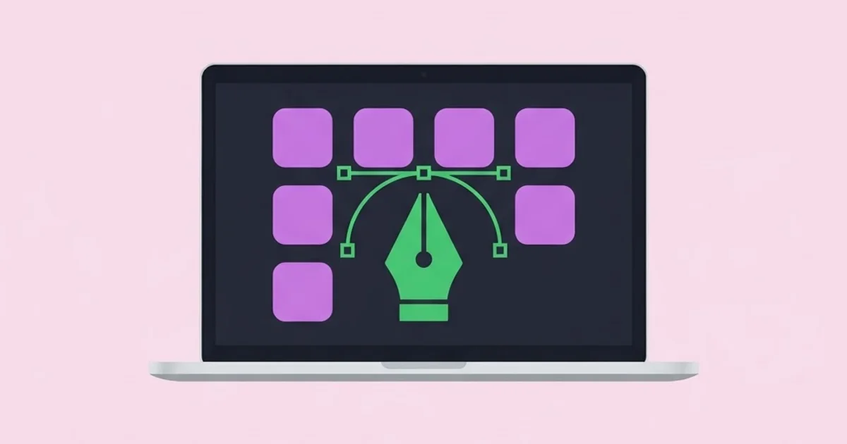
- Vector drawing. Logos, icons, illustration, anything that must scale infinitely or reproduce in one colour. Non-negotiable for identity work. Look for precise boolean operations, a reliable pen tool, path effects and clean export.
- Raster and photo editing. Retouching, compositing, texture work, colour correction. Needed by anyone touching photography. Look for non-destructive adjustment layers, solid masking and reliable colour profile handling.
- Multi-page layout. Brochures, magazines, books, catalogues, reports. Requires master pages, paragraph and character styles, linked text flow, and print-grade preflight and export. Never lay out a forty-page document in a vector tool.
- Interface and product design. Screens, components, prototypes, design systems. Requires component instances, auto-layout behaviour, shared libraries and developer handoff with usable specifications.
- Type, asset and colour management. A font manager, an asset organiser and a contrast checker. These are small, cheap and disproportionately valuable, and almost every designer skips them for far too long.
Cover all five and you have a complete professional environment. Most working designers genuinely use three of these daily and touch the other two occasionally.
Mac Design App Categories Compared
This table compares the categories on the criteria that actually drive purchasing regret: what they are for, what they are bad at, and the practical cost of getting the choice wrong.
| Category | Primary output | Must-have capabilities | Common misuse | Cost of choosing wrong |
|---|---|---|---|---|
| Vector drawing | Logos, icons, illustration, signage artwork | Precise paths, boolean operations, spot colour, clean SVG and PDF export | Building long multi-page documents in it | Unusable artwork at print, broken scaling, painful revisions |
| Raster editing | Photography, retouching, composites, textures | Non-destructive layers, masking, colour profiles, high-bit-depth support | Designing logos as pixel images | Identity assets that cannot scale or print cleanly |
| Multi-page layout | Brochures, magazines, reports, books | Master pages, text styles, linked flow, preflight, bleed and crop export | Replacing it with a presentation tool | Reflow chaos on edits and rejected print files |
| Interface design | App and web screens, design systems | Components, responsive layout rules, shared libraries, developer handoff | Using it for print production artwork | Colour and resolution failures in physical output |
| Type and asset management | Font activation, libraries, contrast checks | Per-project activation, tagging, accessibility contrast validation | Ignoring it until a font conflict breaks a deadline | Missing fonts at handoff and inaccessible colour choices |
What a Decade of Mac Toolchains Teaches You
The most valuable lesson I can pass on is that switching tools almost never fixes a workflow problem. Designers who feel slow usually have a file organisation problem, a decision-making problem, or an unclear brief — and a new application resets their muscle memory without touching any of those causes. Before buying anything, spend a week logging where your hours actually go. The answer is frequently "revisions caused by unclear approval", which no software solves.
The second observation concerns hardware and file discipline on macOS specifically. Design files grow fast, and the single highest-impact habit is a strict, boring folder convention with version numbers in filenames and linked assets kept relative to the document. Cloud sync services that silently offload files break linked assets in layout documents at the worst possible moment. Keep active project assets local and archive deliberately.
Third, invest in the boring categories. A font manager that activates only the fonts a project needs prevents the single most common production failure in the industry: missing fonts on another machine. A contrast checker prevents accessibility failures that are expensive to retrofit. Neither is exciting and both pay for themselves in a single avoided incident.
Fourth, take export seriously as a skill. Knowing exactly which format, colour space, compression and resolution each destination requires is a professional competency, not an afterthought. Web needs one thing, offset printing another, large-format signage another again, and embroidery another. Getting this wrong is how good design becomes a bad deliverable.
Finally, the tools change and the fundamentals do not. Designers who invest their learning time in typography, composition and colour theory stay valuable across every software transition, while those who invest primarily in tool-specific shortcuts have to rebuild their advantage every few years. Following a well-run design publication that covers craft rather than software releases is a more durable learning investment than any individual application tutorial series.
I am deliberately not quoting subscription prices or market share figures here, because both change frequently and vary by region and licence type. Check current pricing directly with each vendor before committing, and always take the trial period seriously by running one real project through it rather than a test file.
Mistakes Designers Make When Building a Mac Stack
Buying breadth before depth. Owning five applications you use at twenty percent capacity is worse than owning two you know completely. Fluency compounds: keyboard-driven, muscle-memory speed in one vector tool outperforms surface familiarity with three.
Ignoring what collaborators can open. Choosing a tool your printer cannot preflight or your developer cannot inspect shifts your cost onto other people, who will route around you. Confirm interchange before committing, and test an actual handoff, not a hypothetical one.
Designing print work in screen tools. Screen-first applications frequently lack proper colour separation, spot colour handling, bleed and preflight. The file looks perfect on the display and fails at the press. If print is in your output mix, keep a real layout application.
Skipping colour management entirely. Working without a consistent profile setup and without calibrating the display means every colour decision is a guess. This is a one-afternoon fix that most designers postpone for years and then blame on their printer.
Letting the tool dictate the design. Every application has defaults and effects that are easy to reach, which is exactly why work made with them looks generic. Default gradients, default shadows, default corner radii and default type pairings all signal that the software made the decision. Set your own type scale and palette at the start of every project.
Never archiving. Live projects, completed projects and source assets should not share one folder. Without archiving, machines fill up, searches slow down, and old versions get reopened by mistake. Archive at the moment a project closes, not when the disk warns you.
Setting Up a Professional Mac Design Environment
Step one — audit your actual output. List everything you produced in the last six months by destination: web, app, offset print, digital print, large format, social, video. Percentages by volume determine the stack. Designers routinely discover they have been paying for capabilities they used twice.
Step two — choose one tool per category and commit. Trial each candidate with a genuine paying project, not a practice file, because real projects expose the friction that demos hide. Give each trial a full week before judging.
Step three — set up colour management once, properly. Calibrate the display, set a consistent working profile across all applications, and document the profile your printer expects. Write it down in your project template so you never have to remember it.
Step four — build project templates. A template per output type with your grid, type scale, colour swatches, export presets and layer structure already in place removes dozens of small decisions per project and enforces consistency across your own work.
Step five — install a font manager and clean your library. Deactivate everything, then activate per project. This single change eliminates the most common handoff failure and noticeably speeds up application launch times on a Mac with a bloated font library.
Step six — define a folder and naming convention. Project, phase, version, date. Links folder relative to the document. Exports in a dated subfolder. Boring, unglamorous, and the difference between finding a file in ten seconds and losing an afternoon.
Step seven — script the repetitive parts. Batch renaming, resizing, format conversion and archive compression can all be automated with built-in macOS tooling. Two hours spent here typically returns itself within a month.
Step eight — set a backup with a real restore test. Local plus offsite, and then actually restore a file to verify it works. A backup you have never tested is a hypothesis, not a backup, and design source files are irreplaceable.
Key Takeaways
- Choose Mac design apps backwards from the final output destination, because print, screen and large-format work impose completely different technical requirements.
- Most professional designers need one tool per functional category — vector, raster, layout, interface and asset management — not a large collection of overlapping applications.
- File interchange with printers, developers and clients is a bigger practical constraint than any individual feature comparison.
- A font manager, calibrated display and consistent colour profile prevent the most common and most expensive production failures.
- Switching software rarely fixes a workflow problem, which is usually caused by unclear briefs, weak file discipline, or undefined approval processes.
Frequently Asked Questions
Do I need a subscription suite to work professionally on a Mac?
Not necessarily. Many freelancers and small studios work entirely on one-time-purchase applications with excellent results. The deciding factor is who you exchange files with: agencies, printers and larger in-house teams often standardise on subscription formats, and being unable to open incoming files creates friction that outweighs the savings.
Which app should a complete beginner learn first?
Start with a vector drawing tool. Vector work teaches precise construction, path logic, colour discipline and scalable thinking, and those skills transfer directly into layout and interface design. Raster editing is easier to pick up later, whereas weak vector fundamentals show in every piece of identity work you produce.
Can I do print design in an interface design tool?
You can produce the visual, but you should not produce the final artwork. Interface tools commonly lack proper colour separation, spot colour support, bleed setup and preflight checking. For anything going to a commercial press, build the final file in a dedicated layout or vector application with print-grade export.
How much does Mac hardware matter for design work?
Less than most people assume for vector and layout work, and considerably more for large raster composites, high-resolution photography and motion. Memory and fast storage usually improve daily experience more than raw processor speed. A calibrated display improves output quality more than any other hardware upgrade.
Are free design apps good enough for client work?
Several free and open-source tools are genuinely capable, particularly for vector work and basic raster editing. The usual limitations are colour management depth, professional print export and interchange with industry file formats. They are a reasonable starting point and a poor fit for high-volume commercial print production.
How often should I change my design toolchain?
Rarely, and only for a specific unmet need rather than novelty. Fluency is a significant productivity asset that resets with every switch. A sensible rule is to reassess annually, change only when a concrete workflow problem persists after you have ruled out process causes, and never switch mid-project.
Conclusion
The most important decision in assembling graphic design apps for Mac is deciding what you will not buy. A focused stack of three applications you know fluently, supported by a font manager and proper colour management, beats a sprawling collection of partially learned tools every time. Audit your last six months of output, map it to the five functional categories, and remove anything that does not earn its place. Your next concrete step is to run one real client project through a single trial application this month rather than reading another comparison article — and if you want a genuine test of whether your fundamentals have improved alongside your tooling, enter a piece into one of the design competitions worth your time, where the judging is on craft rather than software.