Emphasis in Graphic Design: How to Control Where Eyes Go
Most weak layouts are not weak because the type is ugly or the colors are wrong. They are weak because everything on the page is shouting at the same volume. Emphasis in graphic design is the deliberate use of contrast, scale, placement, color, and isolation to make one element register before all others, so a viewer's attention lands where you intended within the first half-second of looking. It is the difference between a poster that communicates and a poster that merely decorates.
Quick Answer: Emphasis in graphic design is the principle of making one element visually dominant so it is seen first. Designers create it through contrast in size, weight, color, position, and surrounding white space. Effective emphasis requires a strict hierarchy: one primary focal point, a clear secondary, and everything else deliberately quieted down.
What Emphasis Actually Means in a Layout
Emphasis is the applied answer to a single question: if a viewer only looks at this design for one second, what do they take away? Everything else in the composition exists to support that answer. In design theory emphasis is sometimes called dominance or focal point, and it sits alongside balance, contrast, rhythm, and unity as one of the core organizing principles. In practice it is the principle that most directly affects whether the design works commercially.
The key terms are worth separating because they get conflated constantly. Contrast is the raw difference between two elements: dark against light, big against small, condensed against wide. Emphasis is what you do with that contrast. Contrast is the tool; emphasis is the outcome. You can have enormous contrast across a page and still have zero emphasis if every element is equally contrasted against every other. Hierarchy is the ranked sequence that emphasis creates: first this, then that, then the small print.
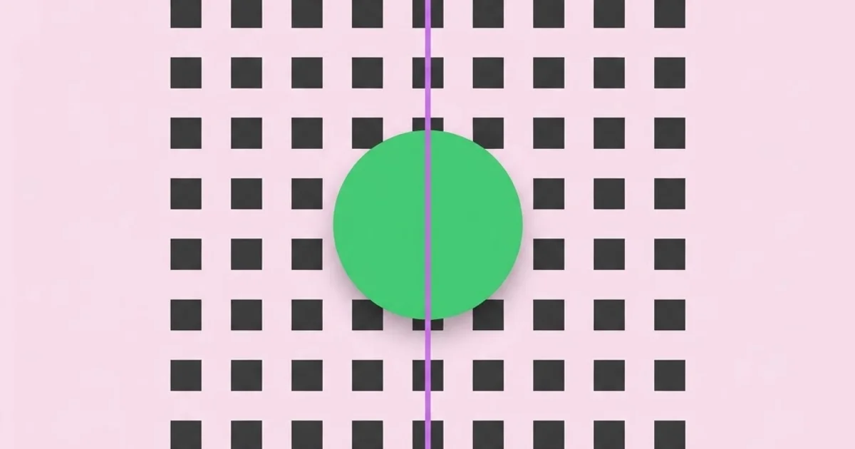
The mechanism is rooted in how vision works. The human eye is drawn to whatever breaks a pattern. If you place eleven identical circles in a grid and enlarge one, the enlarged one is found almost instantly, without conscious searching. This is called preattentive processing, and it operates on a narrow set of features: size, color, orientation, position, enclosure, and motion. Emphasis is the craft of choosing which of those features to break, and breaking exactly one of them cleanly rather than five of them halfway. Studying how the most influential names in design history handled a single focal point on a poster teaches this faster than any textbook diagram, because their work had to function at forty feet in a train station.
The most common professional failure is emphasis inflation. A client asks for the headline to be bigger, then the badge to be brighter, then the button to pulse. Each request is reasonable alone. Together they cancel out. When five things are emphasized, nothing is. The designer's job at that point is not to comply but to reframe: ask which single element the business genuinely needs the viewer to act on, then argue for suppressing the rest.
The Six Mechanisms Designers Use to Create Emphasis
There are only a handful of levers that reliably produce emphasis. Knowing them as a discrete list makes critique faster, because you can name exactly which lever a layout is failing to pull.
- Scale. The bluntest and most reliable lever. Make the focal element substantially larger than its neighbors. Substantially is the operative word: a ten percent size increase reads as a mistake, not a decision. Aim for a ratio that is obviously intentional, often two to three times the body size for a primary headline.
- Color. A single saturated accent against a restrained field pulls the eye immediately. This is why brand systems reserve one bright color exclusively for calls to action. The moment that color also appears in decorative dividers, the emphasis evaporates.
- Isolation and white space. Surrounding an element with generous empty space is often more powerful than enlarging it. Isolation signals importance in the same way a single object on a gallery pedestal does. This is the most underused lever among junior designers, who tend to fill space rather than protect it.
- Placement. Optical center, roughly slightly above geometric center, carries more weight than true center. Top-left carries weight in left-to-right reading cultures because it is where scanning begins. Intersections of a compositional grid are natural resting points.
- Weight and style contrast. Shifting one word from regular to bold, or from a sans to a contrasting display face, creates emphasis at the typographic level without disturbing the layout geometry.
- Direction and leading lines. Arrows, gaze direction in illustration, converging rules, or the diagonal of a photograph can funnel attention toward a focal point that is itself understated.
The professional discipline is to pick one dominant lever and use a second only as reinforcement. A headline that is larger, bolder, in the accent color, underlined, and isolated is not five times more emphatic. It is loud and amateurish, because the viewer senses the desperation. One strong lever plus one supporting lever is the working formula.
Emphasis Techniques Compared by Use Case
Different mediums reward different levers. A technique that dominates on a printed poster can fail on a mobile screen where the viewport clips the composition. The table below maps the practical trade-offs.
| Technique | Strength of Effect | Best Medium | Main Risk |
|---|---|---|---|
| Scale contrast | Very high | Posters, editorial spreads, hero sections | Breaks responsive layouts if not fluid |
| Accent color | High | Interfaces, packaging, calls to action | Fails for color-blind users if used alone |
| Isolation and white space | High | Luxury branding, landing pages, print ads | Reads as unfinished to inexperienced clients |
| Type weight shift | Moderate | Long-form text, documentation, reports | Loses force if overused across paragraphs |
| Placement and grid position | Moderate | Editorial, dashboards, grids | Culture and reading-direction dependent |
| Leading lines and direction | Situational | Photography-led campaigns, illustration | Can lead the eye off the canvas entirely |
What Practitioner Experience Says About Emphasis in the Wild
There is no honest single percentage that captures how much emphasis improves conversion, because the effect is entirely dependent on what was there before. What can be said from repeated client work is more useful than a borrowed number: the layouts that get rejected in review are almost never rejected for lack of decoration. They are rejected because the stakeholder could not find the thing they cared about.
A reliable diagnostic used in studios is the squint test. Step back from the screen, half-close your eyes until detail dissolves, and observe what remains legible as a shape. If two or more elements survive the squint at equal strength, the emphasis is unresolved. If nothing survives, the design has no focal point at all. This takes five seconds and catches more problems than an hour of pixel adjustment.
A second field-tested method is the five-second recall test. Show the layout to someone unfamiliar with the project for five seconds, remove it, and ask what they remember. If the answer is not the element you intended as primary, the emphasis has failed regardless of how refined the craft is. Running this on three people is enough to expose a broken hierarchy. Both tests are free and require no software, which matters because emphasis problems are structural and cannot be fixed by switching tools. That said, the workflow does get faster when your setup supports rapid duplication and comparison of variants, which is worth considering when you evaluate which design applications actually earn a place on your machine.
Accessibility is the other practitioner concern that pure aesthetics misses. Emphasis built solely on hue fails for viewers with color vision deficiency, and emphasis built solely on a faint gray shift fails on low-quality displays in bright rooms. The professional standard is redundant encoding: if color carries the emphasis, back it with weight, size, an icon, or position so the hierarchy survives when the color signal is removed. Convert your layout to grayscale before shipping. If the hierarchy collapses, it was never robust.
Common Emphasis Mistakes and How to Avoid Them
The mistakes below appear in portfolio reviews with remarkable consistency, and each has a specific corrective.
Mistake one: competing focal points. Two elements sized and colored identically will split attention. The fix is not to shrink both but to commit: one stays, the other drops a full step in the hierarchy through reduced size, reduced weight, or a muted color.
Mistake two: emphasizing the wrong element. Designers frequently emphasize whatever is most visually interesting rather than whatever is most important to the viewer's decision. A beautiful product photograph can easily outshout the price and the purchase button. Start every layout by writing down, in words, the one message that must land, then verify the visual hierarchy matches that sentence.
Mistake three: insufficient contrast ratio between levels. A hierarchy of 18px, 17px, and 16px is not a hierarchy. Use a typographic scale with meaningful jumps so each level is unmistakably distinct. A common ratio-based scale gives clear separation without arbitrary guessing.
Mistake four: decoration masquerading as emphasis. Drop shadows, glows, and outlines are frequently applied in an attempt to make an element pop when the real problem is that the surroundings are too busy. Removing noise almost always beats adding effects.
Mistake five: ignoring the fold and the viewport. A focal point engineered on a wide desktop canvas can be pushed entirely off-screen on a phone. Emphasis must be verified at every breakpoint, not designed once at one width.
Mistake six: emphasis without a path. Getting the eye to the focal point is only half the job. The viewer then needs a clear second and third stop. A design with a strong headline and then an undifferentiated wall of equal-weight content strands the reader immediately after capturing them.
A Practical Walkthrough: Building Emphasis Into a Layout
Here is the sequence used to construct a hierarchy deliberately rather than discovering one by accident. Assume a product landing page as the scenario.
Step one: write the hierarchy in plain text before opening any design tool. List every element and assign it a rank from one to three. Rank one is the single most important item, typically the value proposition headline. Rank two is the action, usually the button. Rank three is supporting evidence. If more than one item claims rank one, resolve the argument at this stage, in writing, where it is cheap.
Step two: build the entire layout in a single color and a single type size. This forces you to solve structure, spacing, and grouping before any emphasis is applied. Most hierarchy problems are actually grouping problems and become obvious when styling is stripped away.
Step three: apply exactly one lever to the rank-one element. Usually scale. Increase it until it is unambiguously dominant, then stop. Do not add color yet.
Step four: apply one lever to rank two, deliberately weaker than rank one. The accent color is often best reserved here, for the button, because the headline already has scale. This creates two distinct emphasis channels rather than two competing versions of the same channel.
Step five: actively suppress everything else. Reduce legal text, secondary links, and navigation to a lower contrast level. Suppression is as much a part of emphasis as amplification, and it is the step most often skipped.
Step six: protect the focal point with space. Add margin around rank one until it has visible breathing room. Resist the instinct to fill that space with a badge or an illustration.
Step seven: run the squint test, the grayscale test, and the five-second recall test. Fix whatever fails. Then check the smallest breakpoint and repeat.
Step eight: review one day later. Fresh eyes catch emphasis failures that fatigue hides. This single habit prevents more rework than any technique on this list.
Key Takeaways
- Emphasis is the deliberate creation of a single dominant element, and it is produced by breaking a visual pattern rather than by adding decoration.
- Scale, color, isolation, placement, weight, and direction are the six reliable levers; one dominant lever plus one supporting lever is the working formula.
- Emphasis inflation, where multiple elements are all amplified, destroys hierarchy and is the most common cause of flat, ineffective layouts.
- The squint test, the grayscale test, and the five-second recall test verify emphasis in seconds and require no software or budget.
- Suppressing secondary elements is as important as amplifying the primary one, and it is the step most designers skip under client pressure.
Frequently Asked Questions
What is emphasis in graphic design in simple terms?
Emphasis is the principle of making one element stand out so viewers notice it first. Designers achieve it by breaking visual patterns through larger size, a distinct accent color, surrounding white space, or prominent placement. It establishes what the audience should read first and controls the order in which the rest of the design is absorbed.
What is the difference between emphasis and contrast?
Contrast is the raw visual difference between two elements, such as dark against light or large against small. Emphasis is the result you create by applying contrast strategically to one element. Contrast is the tool, emphasis is the outcome. A design can have heavy contrast everywhere and still lack emphasis entirely.
How many focal points should a design have?
One primary focal point, supported by a clearly weaker secondary and tertiary level. Two elements of equal visual weight split attention and cancel each other out. Complex layouts such as dashboards may contain several zones, but each zone should still resolve to a single dominant element within its own boundaries.
Can white space create emphasis on its own?
Yes, and it is frequently more effective than enlarging an element. Isolating an item with generous empty space signals importance the way a single object on a pedestal does. Luxury and editorial design rely heavily on this technique because it conveys confidence rather than volume.
How do I test whether my emphasis is working?
Use the squint test by half-closing your eyes until only major shapes remain visible. Whatever still reads clearly is your actual focal point. Follow it with a five-second recall test on someone unfamiliar with the project, then convert the design to grayscale to confirm the hierarchy survives without color.
Does emphasis work differently on mobile screens?
Significantly. A focal point placed confidently on a wide desktop canvas can be pushed below the fold or cropped entirely on a phone. Emphasis must be verified independently at each breakpoint, and scale-based emphasis needs fluid type sizing so the dominance ratio between levels is preserved at every width.
Conclusion
The single most important decision in any layout is choosing what to sacrifice. Emphasis is not created by making one thing louder; it is created by accepting that most elements must become quieter so one can be heard. Designers who internalize that trade-off produce work that communicates instantly, and those who resist it produce work that is technically clean and functionally invisible.
Your next step is concrete: take the last layout you finished, write down in one sentence the message it was supposed to deliver, then run the squint test. If the element that survives is not the one in your sentence, rebuild the hierarchy using the eight-step walkthrough above. If you want a place to document and pressure-test decisions like this over time, starting a design blog of your own is the most effective way to sharpen the reasoning behind your visual choices.