Dirt Bike Graphics Designer: Custom Kits That Sell
A dirt bike graphics designer turns a rider's identity, sponsor needs, and motorcycle plastics into a printable kit that wraps cleanly around complex curves. The job is not just decorating a bike; it is product design, brand design, prepress, and motorsport problem-solving happening on one irregular template. A good designer knows where mud collects, where boots rub, where number plates need instant readability, and where seams will punish artwork that looked perfect on a flat screen.
Quick Answer: Dirt Bike Graphics Designer: Custom Kits That Sell is about practical graphic design decisions that connect audience needs, visual hierarchy, production realities, and measurable communication value. The fastest way to improve is to define the job of the design, build around constraints, and test whether the result remains clear in real use.
What does a dirt bike graphics designer actually do?
The key terms matter because they shape every decision. Plastics are the fenders, shrouds, side panels, fork guards, and number plates that receive decals. A template is the production drawing that maps those parts at full size. Bleed is extra artwork beyond the cut line. Safe area is the zone where logos, numbers, and sponsor marks should stay to avoid trimming or edge lift. Laminate is the protective film that keeps ink from being destroyed by roost, fuel splash, washing, and repeated contact.
Designers who come from general branding often underestimate fit. Unlike a poster, a dirt bike kit is bent, heated, pressed, and abused. Lines that align on the template can jump visually once installed because the panel curves. That is why experienced designers build broad motion shapes, avoid placing critical details on tight compound curves, and proof the kit as a system rather than as separate stickers. For broader career context, the same production discipline connects to graphic design career demand, especially in niche markets where design judgment and technical output overlap.
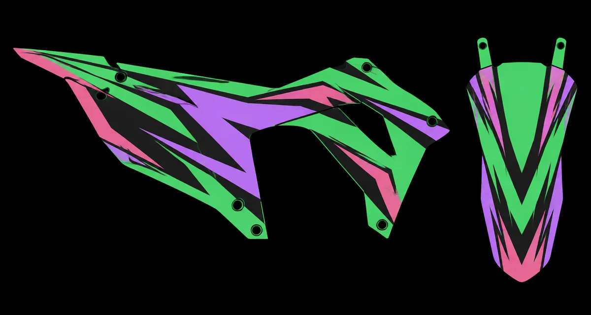
The designer also acts as a translator between rider taste and manufacturing reality. A client may ask for an aggressive factory look, but that request has to become a hierarchy of number visibility, team colors, sponsor contrast, brand placement, and install-friendly shape breaks. The best outcome looks loud at track speed but remains controlled when viewed up close. That balance separates professional kits from random lightning shapes pasted over a template.
A production-ready workflow for custom motocross graphics
A reliable workflow protects the designer, printer, installer, and rider from expensive surprises. The process starts with confirming the exact bike make, model, year, and aftermarket plastics, because a wrong template can ruin the job before any design work begins. Ask for photos of the bike if plastics are modified or mixed between years. Also collect race number, class colors, sponsor list, preferred style, and any existing logos in vector format where possible.
A practical sequence looks like this:
- Confirm the template: Match model year, plastic brand, tank shape, and number plate configuration before quoting final art.
- Build the visual direction: Choose one dominant motion language, such as angular factory panels, retro blocks, or clean sponsor-focused race graphics.
- Place critical information: Put numbers, rider name, and primary sponsor marks in safe zones with strong contrast.
- Extend art through bleed: Push shapes beyond cut paths so small trimming shifts never reveal blank edges.
- Proof as installed: Review the kit in panel groups, checking where left and right shrouds meet the seat, tank, and side plates.
- Prepare production files: Outline text, embed or package artwork, separate cut paths, and name files so the printer cannot confuse versions.
The most valuable habit is version control. Use dated or numbered proof files and never send a printer an ambiguous folder named final. If the client requests changes after approval, create a fresh proof and record what changed. This protects the relationship when a sponsor logo is swapped, a number changes, or a rider decides the kit needs more contrast the night before printing.
Proofing should include scale checks. On-screen previews make everything look legible because the viewer is inches away from a monitor. A number that feels bold on a laptop may disappear when a rider passes at speed or when mud covers the plate edges. Print small cropped tests for sponsor stacks and number outlines when the design uses close-value colors. The test can reveal whether pink over purple, green over black, or black over dark accent panels will hold up under real track conditions.
Which design decisions affect print durability and readability?
Durability and readability depend on choices made long before the file reaches the printer. Designers cannot control every install condition, but they can avoid layouts that make failure more likely. Thin stripes at the edge, tiny sponsor marks on flex points, and complex art around bolt holes all increase risk. The table below shows how common decisions affect the finished kit.
| Design decision | Practical impact | Better approach |
|---|---|---|
| Critical logos near cut lines | Small trimming shifts can clip sponsor marks | Keep important content inside safe areas |
| Thin outlines on race numbers | Numbers lose contrast at distance and in mud | Use bold outlines and strong value separation |
| Busy shroud patterns | Curves distort the artwork after installation | Use larger directional shapes that tolerate bending |
| Unprepared raster logos | Printed marks look soft or pixelated | Request vector artwork or rebuild simple logos cleanly |
A designer should also consider how materials interact with art. Gloss laminate can make colors feel deeper but may show scratches more clearly. Matte laminate can look premium and reduce glare, yet mud and pressure washing may reveal wear differently. Metallic or holographic effects can be striking, but they demand restrained artwork because every reflective surface competes for attention. The safest approach is to design a strong kit first, then use specialty material as an accent rather than as the entire concept.
Readability is not only about race numbers. Sponsor marks need a hierarchy. Primary sponsors deserve clear size, contrast, and isolation. Secondary sponsors can sit in stacks, but they still need room to breathe. If every sponsor is treated as equally important, none of them reads well. Experienced designers explain this early so the client understands that reducing clutter helps every sponsor get more usable visibility.
Practitioner analysis: why niche graphics work rewards specialists
Dirt bike graphics reward specialists because the client is buying confidence, not just artwork. The rider wants to know the kit will fit, the printer wants files that run without repair, and the installer wants decals that behave predictably. A general designer can make something attractive, but a specialist prevents the unglamorous failures: cut paths that do not match, numbers hidden by panel edges, sponsor marks placed where boots grind them away, or colors that collapse under track lighting.
In practice, the strongest kits begin with constraints. Instead of asking what can be added, ask what must survive: the number must read, the main sponsor must be visible, the bike color must work with the plastics, and the shapes must flow from front fender to rear side plate. This is where studying strong graphic design examples helps, because good design is usually the result of disciplined reduction rather than decorative accumulation.
Specialization also improves client communication. Riders often use reference images from factory race teams, energy drink branding, or past kits. The designer needs to identify what they actually like: sharp diagonal motion, high contrast number plates, bold color blocking, or premium restraint. Once the underlying preference is clear, the final kit can feel original rather than like a copy of someone else's bike.
A specialist earns repeat work by making ordering easier. Keep a checklist, a sponsor-upload process, a proof approval record, and a clear revision policy. Riders remember whether the kit arrived right the first time. Printers remember whether your files needed cleanup. Those operational details create the reputation that brings teams, shops, and returning privateers back for the next season.
Common mistakes that make dirt bike graphics look amateur
The most common mistake is treating every panel like a separate poster. A kit should feel like one continuous design wrapped around a machine. When the shroud, side plate, and fender each have unrelated shapes, the bike looks assembled from leftovers. Use a shared angle system, repeated accent rhythm, and consistent line weight so the design moves across the entire bike.
Another mistake is chasing complexity. Many beginner kits have too many spikes, shadows, textures, sponsor boxes, and color changes. Complexity can look exciting on a flat proof but messy on the bike. Remove anything that does not support speed, identity, readability, or sponsor value. If the kit still feels empty, enlarge the best shape instead of adding another decorative layer.
Designers also overlook installation realities. Avoid placing detailed artwork through bolt holes, fuel-cap areas, tight concave curves, or edges that the rider's boots hit constantly. If a sponsor insists on a risky placement, show a proof with a safer alternative and explain why. The goal is not to win an argument; it is to deliver a kit that still looks good after a few rides.
Color misuse is equally damaging. Bright colors need a dark anchor or they become noisy. Dark kits need enough contrast to photograph well. If the bike has colored plastics, the graphics must harmonize with that base instead of pretending it is a blank canvas. Before final approval, view the proof small and from a distance. If the rider's number and main color story still read clearly, the design is probably headed in the right direction.
Implementation walkthrough: from brief to print file
Start with a written brief that captures the bike, rider, sponsors, colors, and intended use. A weekend woods rider may need durable personal branding, while an amateur motocross racer may need number clarity and sponsor visibility above all else. Save all logos in a project folder and separate usable vector files from low-resolution references. If a logo is too poor to print, say so before layout begins.
Next, build the template file with organized layers: cut path locked, bleed visible, safe zones marked, artwork grouped by panel, sponsor assets grouped separately, and notes for specialty materials. Work at final size when possible. Use global colors so a palette adjustment can update the entire kit quickly. Keep live text editable until approval, then outline it in a production copy rather than destroying the editable master.
Create two proof views. The first is a flat production-style proof showing every panel. The second is a presentation proof that groups parts roughly as they appear on the bike. The flat proof catches manufacturing details; the presentation proof helps the rider understand the final look. Ask for one consolidated revision response rather than accepting scattered messages across different channels.
Before export, check the unglamorous details. Expand strokes that must print as shapes. Confirm linked images are embedded or packaged. Remove hidden experiments outside the artboard. Label cut contours according to the printer's naming convention. Convert spot colors only when the printer requests them. Export a print-ready PDF or the native file format your production partner prefers, then archive the editable source with the approved proof.
Finally, document what worked. Keep notes on which plastics fit correctly, which material handled curves well, and which design choices installed cleanly. That library becomes an advantage on future jobs. New designers can build that discipline through portfolio-building fundamentals, using mock motocross kits that show both visual creativity and production thinking.
Key Takeaways
- A dirt bike graphics kit is a physical product, so fit, material, and installation matter as much as visual style.
- Race numbers and main sponsors should stay inside safe zones with strong contrast before decorative details are added.
- The best motocross graphics use one disciplined motion language across every panel instead of isolated sticker designs.
- Production-ready files need clean cut paths, bleed, outlined type copies, organized layers, and unambiguous version names.
- Specialist designers win repeat work by preventing costly fit, proofing, print, and communication mistakes.
Frequently Asked Questions
What skills does a dirt bike graphics designer need?
A dirt bike graphics designer needs layout, branding, vector illustration, prepress, and practical knowledge of motorcycle plastics. The strongest designers understand how decals bend, where riders cause wear, and how to keep numbers and sponsor marks readable after printing, installation, and real track use.
Do dirt bike graphics have to be vector artwork?
The template, cut paths, typography, and most graphic shapes should be vector whenever possible because vector artwork scales cleanly. Photos and textures can be raster, but they must be high resolution at final size. Low-quality raster logos are one of the fastest ways to make a kit look unprofessional.
How much bleed should motocross graphics include?
Bleed requirements depend on the printer and template, so follow the production partner's specification. In practice, extend background shapes and noncritical graphics beyond the cut line enough to tolerate trimming movement. Never place numbers, names, or important sponsor details in the bleed area.
Why do some graphics look good on screen but bad on the bike?
Flat screens hide scale, curvature, glare, and viewing distance. A busy pattern may look exciting in a proof but become unreadable once wrapped around plastics. Designers avoid this by checking small previews, grouping panels visually, and placing details away from complex curves.
Can a beginner build a dirt bike graphics portfolio?
Yes. A beginner can create realistic mock kits using accurate templates, clear sponsor hierarchy, and production notes. The portfolio should show flat layouts, installed-style mockups, and closeups of number plates or shrouds so clients see both style and technical thinking.
What makes a custom kit worth paying for?
A valuable custom kit fits correctly, reflects the rider's identity, protects sponsor visibility, and arrives ready for production. Clients are paying for fewer mistakes as much as for style. Clear proofs, organized files, and practical material knowledge make the design feel professional.
Conclusion
The most important decision in dirt bike graphics design is to treat the kit as installed equipment, not flat decoration. Start with fit, hierarchy, and production constraints, then build the visual attitude around those realities. For the next step, compare your kit proof against examples of design that works and remove anything that weakens readability or installation quality.