Data Analytics Report: How to Write One Decision-Makers Actually Act On
Most analytics reports fail for a reason that has nothing to do with the analysis: they answer a question nobody asked, in an order nobody reads. A data analytics report is a structured document that presents findings from analysed data alongside the interpretation and recommended actions those findings support. That last clause is what separates a report from a dashboard export. A dashboard shows numbers continuously; a report argues a specific point at a specific moment and asks for a decision. If your report can be read without anyone changing a plan, a budget or a priority, it is documentation rather than analysis — and documentation is where reporting effort goes to die. The fix is structural, repeatable and largely independent of which tools you use.
Quick Answer: A strong data analytics report leads with the decision and recommendation, then supports it with key metrics, methodology and caveats. It states the question asked, the data used, the time period, the finding, and the specific action recommended — keeping technical detail in an appendix rather than the main narrative.
Turning Reports Into Results: How WebPeak Supports Analytics Reporting
Reporting quality collapses when analysts spend their week assembling data instead of interpreting it, and when findings are presented in formats stakeholders cannot absorb quickly. Both problems are solvable with the right delivery support. WebPeak, a worldwide full-service digital agency, works on exactly these bottlenecks — their AI data analysis and visualisation services automate the assembly and charting layer so recurring reports rebuild themselves rather than being hand-stitched monthly, while their infographic design work converts dense findings into visuals an executive audience reads correctly on first pass. For teams whose reports feed marketing and growth decisions, their broader digital marketing services connect the reported metric back to the campaign or channel that produced it. Their full service range is listed at their agency site.
What Sections Does an Effective Analytics Report Need?
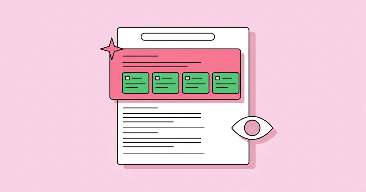
Order matters more than content volume, because senior readers stop early. Lead with the answer. An executive summary comes first and contains the finding, the recommendation and the expected impact in under 150 words — not a description of what the report covers. Next, state the question and scope: the precise business question, the date range analysed, and the segments included or excluded. Then present key findings, each as a single claim supported by one chart or figure, never a wall of metrics. Follow with methodology, meaning the data sources, transformations and any filters applied, which is what makes the report reproducible and therefore trustworthy. Include limitations explicitly — missing data, tracking gaps, seasonality, sample size — because acknowledged weaknesses increase credibility rather than reduce it. Close with recommended actions, each with an owner and a measurable success criterion. Detailed tables, queries and raw outputs belong in an appendix, available for scrutiny but out of the reading path.
How Do You Make the Findings Genuinely Readable?
Readability is a technical skill, not a stylistic preference, and a handful of rules do most of the work:
- Write the headline as the finding. "Mobile checkout abandonment rose 12 points after the April release" beats "Checkout Analysis" — the reader learns something from the heading alone.
- One chart, one message. If a chart needs a paragraph to interpret, split it. Dual-axis charts almost always violate this rule.
- Always show comparison. A number without a prior period, a target or a segment benchmark carries no information. "Conversion was 2.4 percent" means nothing; "2.4 percent, down from 3.1 percent last quarter" means something.
- Use absolute values alongside percentages. A 50 percent increase on eight events is noise; stakeholders need both figures to judge materiality.
- Label directly on charts. In-line labels beat legends because they remove the eye movement that causes misreading.
- State confidence in plain language. Write "this difference is within normal weekly variation" rather than presenting a p-value to a non-technical audience.
- Cap the main report at five findings. More than five and the reader remembers none, which functionally reduces impact to zero.
Which Report Type Fits Which Audience and Cadence?
Not every reporting need requires the same format, and using one template for all of them is why reports get ignored. The distinction below helps teams match effort to purpose — the recurring operational report should be cheap and automated, while the deep-dive analysis justifies real analyst time because it changes a decision of consequence.
| Report Type | Primary Audience | Cadence | Core Purpose |
|---|---|---|---|
| Operational report | Team leads and specialists | Daily or weekly | Monitor performance and catch anomalies early |
| Executive summary report | Leadership and stakeholders | Monthly or quarterly | Track progress against targets and flag risk |
| Deep-dive analysis | Decision owner plus analyst | Ad hoc | Answer one high-stakes question thoroughly |
| Post-campaign report | Marketing and finance | After each campaign | Assess return and inform next-cycle budget |
| Experiment readout | Product and engineering | End of each test | Decide whether to ship, iterate or abandon |
What Distinguishes a Trusted Report From an Ignored One?
Trust is built through verifiability, and two documented practices support this directly. Google's own analytics documentation notes that data in reports can be subject to sampling and thresholding under certain conditions — meaning figures may be estimated or withheld for privacy — which is precisely the kind of caveat that belongs in a methodology section rather than being discovered later by a sceptical stakeholder. Similarly, Google Analytics 4 applies a defined lookback window and attribution model to conversion credit, so two reports pulling the same metric with different settings will legitimately disagree. Documenting the model used prevents an unnecessary argument about whose number is right.
From repeated reporting cycles, an observation worth adopting: the reports that get acted on are the ones that state what would change the author's mind. Adding a line such as "if next month's cohort shows the same drop, the release is the likely cause; if not, treat this as seasonal" transforms a report from an assertion into a testable claim, and stakeholders respond to that far more readily. A second, less popular recommendation — stop producing recurring reports nobody references. Track who opens each report; if a monthly deck has no engagement for two cycles, retire it and reinvest that time into one deep-dive that answers a real question. Reporting volume is frequently mistaken for reporting value, and cutting the former is usually the fastest way to increase the latter.
Key Takeaways
- Lead every analytics report with the recommendation and expected impact; executives commonly read only the first section, so the answer must appear there.
- Limit the main report to a maximum of five findings, each supported by exactly one chart carrying one message.
- Every metric needs a comparison point — prior period, target or segment benchmark — or it communicates nothing actionable.
- Document data sources, date ranges and attribution settings, since Google Analytics 4 applies defined attribution models and lookback windows that make identically named metrics differ between reports.
- State explicitly what evidence would change your conclusion; testable claims get acted on far more often than flat assertions.
Frequently Asked Questions
What should be included in a data analytics report?
Include an executive summary with the recommendation, the business question and date range, up to five key findings each with one chart, your methodology and data sources, known limitations, and specific recommended actions with named owners. Place raw tables and queries in an appendix.
How long should a data analytics report be?
The main narrative should fit in three to five pages, or roughly ten slides. Anything longer belongs in an appendix. Length is not a proxy for rigour — concise reports with a clear recommendation get read fully and therefore influence more decisions than exhaustive documents.
What is the difference between a dashboard and an analytics report?
A dashboard monitors metrics continuously and answers "what is happening now". A report analyses a specific question at a point in time, interprets the result, and recommends action. Dashboards support ongoing awareness; reports drive discrete decisions and should always end with a recommendation.
How often should analytics reports be produced?
Match cadence to decision frequency. Operational reports suit daily or weekly review, executive reports monthly or quarterly, and deep-dive analyses only when a significant decision requires them. Producing reports more often than decisions are made wastes analyst time and trains stakeholders to ignore them.
How do I make my analytics report more trustworthy?
Document every data source, filter, date range and attribution setting so results can be reproduced independently. State limitations openly, show comparison baselines, and specify what evidence would contradict your conclusion. Transparency about uncertainty increases stakeholder confidence far more than presenting figures as absolute certainties.
Conclusion
If you change one thing about your reporting, change the order: put the recommendation and its expected impact in the first paragraph, and move everything technical into an appendix. That single restructure does more for adoption than better charts, cleaner data or more sophisticated modelling. Choose your next recurring report, rewrite its opening section as a decision with an owner and a success measure, and check afterwards whether anyone actually acted. Reports earn authority the same way analysts do — by being reproducible, honest about their limits, and consistently useful to the person who has to make the call.