Best Graphic Design Monitor: What Specs Actually Matter
The most expensive design mistake is not a bad font choice; it is approving colors on a screen that lies to you, then paying for a reprint. The best graphic design monitor is a display that reproduces color accurately and consistently across its whole surface, covers the color space your work is delivered in, shows enough detail for precise work, and can be calibrated so what you see matches what clients and printers get. Marketing specs make every monitor sound professional, so this guide separates the numbers that matter from the ones that do not.
Quick Answer: The best graphic design monitor is a 27-inch or larger IPS or mini-LED display with at least 4K resolution, near-full coverage of the color space you deliver in, a factory calibration report with low Delta E, good uniformity, and support for hardware calibration. Print designers should prioritize Adobe RGB coverage and a matte screen.
What Makes a Monitor Suitable for Graphic Design?
A monitor is suitable for graphic design when it shows color the way it will look in the final medium, from edge to edge, day after day. That requires four properties: color gamut, color accuracy, uniformity, and stability over time. Resolution and size affect comfort and precision, but they are secondary to color.
Color gamut is the range of colors a display can show. sRGB is the baseline for the web, Display P3 is a wider space used by Apple devices and much modern web and app content, and Adobe RGB is wider in cyan and green, which matters for print work. Color accuracy is usually expressed as Delta E, a measure of how far displayed colors drift from their target; values below about 2 are generally treated as hard to distinguish by eye. If you work on Windows, color handling differs from macOS in important ways, and a Windows-specific monitor setup is worth reading alongside this guide.
Uniformity describes whether brightness and color stay consistent across the panel. Many consumer monitors look fine in the center but shift toward warmer or dimmer tones in the corners, which is invisible in games and fatal in photo retouching. Stability means the panel keeps its calibration over months rather than drifting quickly.
The Specs to Check, in Order of Importance
When comparing design monitors, check specifications in this order. If a monitor fails an early item, later strengths rarely make up for it.
- Gamut coverage of your delivery color space. Look for near-complete coverage of sRGB for web work, Display P3 for app and modern screen work, and a high percentage of Adobe RGB for print. Coverage percentages matter more than gamut volume claims, which can exceed 100 percent while still missing important colors.
- Factory calibration with a report. Reputable design monitors ship calibrated with a printed report showing Delta E and uniformity measurements. This tells you the manufacturer actually tested your unit.
- Hardware calibration support. Monitors that store calibration inside their own lookup table, rather than relying only on software adjustments in the computer's graphics output, preserve more tonal gradations and produce smoother gradients.
- Uniformity compensation. Some professional displays include circuitry that evens out brightness and color across the panel. This is one of the clearest differences between design-grade and consumer monitors.
- Panel type. IPS panels offer stable color and wide viewing angles, making them the default choice. Mini-LED adds higher brightness and contrast for HDR work. OLED offers perfect blacks but can have text fringing and burn-in concerns with static interfaces. VA panels shift color at angles and are rarely ideal for design.
- Resolution and pixel density. A 27-inch 4K monitor gives about 163 pixels per inch, while a 27-inch 5K monitor gives about 218, which matches macOS scaling at a crisp two-times setting. Higher density makes type and fine linework easier to judge.
- Screen finish. Matte screens reduce reflections and suit long sessions and print work. Glossy screens look punchier but show reflections of windows and lights.
- Connectivity. USB-C or Thunderbolt with power delivery simplifies laptop setups, while DisplayPort remains reliable for desktops.
Monitor Types Compared for Design Work
Design monitors fall into a few clear tiers, and knowing where a model sits helps you decide whether a higher price buys meaningful improvement for your specific work.
| Monitor Tier | Typical Traits | Best For | Watch Out For |
|---|---|---|---|
| Consumer IPS 4K | Good sRGB coverage, no uniformity compensation | Web, UI, social graphics on a budget | Corner color shifts, oversaturation without an sRGB mode |
| Prosumer design monitors | Factory calibration, wide gamut, some hardware calibration | Freelancers doing web and occasional print | Calibration features vary by model |
| Professional reference displays | Adobe RGB coverage, hardware LUT, uniformity compensation, some with built-in sensors | Print, packaging, photography, color-critical branding | High cost, often lower refresh rates |
| Mini-LED and OLED HDR displays | High brightness or deep blacks, wide P3 gamut | HDR content, motion, modern screen design | Blooming on mini-LED, burn-in risk on OLED |
Brands such as Eizo with its ColorEdge line, BenQ with its SW series, and ASUS with its ProArt line target the prosumer and professional tiers. Model names change often, so evaluate any specific model against the checklist above rather than trusting a series name alone.
Practitioner Analysis: Matching the Monitor to Your Output
The biggest insight from years of calibrating studio screens is that the best monitor is the one that matches your output medium, not the one with the widest gamut. A very wide-gamut display can actually cause problems for web designers if applications or operating systems do not color-manage everything correctly, because untagged sRGB content gets stretched into the wider space and looks oversaturated. A good sRGB emulation mode solves this, and it is the first setting I check on any monitor destined for web and UI work.
For print designers the logic reverses. Paper and ink can reproduce certain cyans and greens that sRGB cannot display, so an Adobe RGB-capable monitor lets you soft-proof those colors instead of guessing. Pair it with a lower brightness target, often somewhere around 80 to 120 candelas per square meter depending on the room, and a D50 white point if your print workflow uses it, and the gap between screen and proof shrinks dramatically.
The computer driving the display matters as well. macOS applies color management system-wide, while Windows handles it app by app in many cases. If you are on a Mac, it is worth reading about pairing a display with the right Mac, since a Mac mini or MacBook Pro with a calibrated external monitor is one of the most reliable design setups available.
Finally, room lighting changes perception more than people expect. A bright window behind the monitor or a warm lamp beside it will make even a perfectly calibrated screen look wrong. A monitor hood, consistent neutral lighting, and a neutral gray desktop background cost little and improve judgment immediately.
Common Monitor Mistakes Designers Make
Most color problems in design studios come from setup errors rather than bad hardware. These are the mistakes I correct most often.
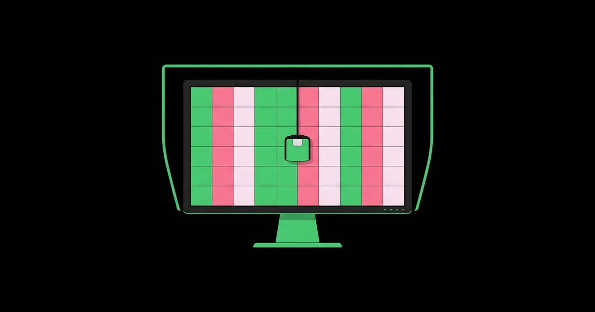
- Never calibrating. Factory calibration drifts. Recalibrate with a hardware colorimeter such as a Calibrite or Datacolor device every few weeks for color-critical work, or at least every few months.
- Running brightness at maximum. Bright screens make prints look dull by comparison, leading to overly dark or oversaturated files. Calibrate to a brightness that suits your room and output.
- Leaving the monitor in a vivid picture mode. Game, movie, or vivid presets boost saturation and contrast. Use the calibrated, sRGB, or user mode your calibration profile was built on.
- Mixing mismatched dual monitors. Two different panels rarely match. Use the accurate one for color decisions and the second for palettes, email, and reference.
- Judging color on a laptop at an angle. Viewing angle changes perceived color, especially on non-IPS panels. Sit square to the screen when approving work.
- Ignoring warm-up time. Many displays need time after power-on to stabilize. Avoid making critical color judgments in the first minutes.
Setting Up a New Design Monitor: A Practical Walkthrough
A new monitor only becomes accurate after a deliberate setup. This is the process I follow for designers, illustrated with a common scenario: a freelance designer who splits time between brand identity for print and websites for the same clients.
Step 1: Position and light the workspace. Place the monitor perpendicular to windows to reduce glare, set the top of the screen at or slightly below eye level, and use neutral, consistent room lighting. Add a hood if the display supports one.
Step 2: Update firmware and install the calibration software. Professional monitors often ship with dedicated calibration apps that write directly to the monitor's hardware lookup table.
Step 3: Create two calibration targets. For this designer, one target uses D65, a web-appropriate brightness, and sRGB gamut emulation for website work. The second uses D50, a lower brightness, and the monitor's native wide gamut for print soft-proofing. Many professional monitors let you switch between saved presets with a button.
Step 4: Validate the calibration. Run the software's validation step and check average and maximum Delta E. Then view a grayscale ramp from black to white; it should look smooth and neutral with no color tints or visible banding.
Step 5: Compare with a physical proof. Print a known reference image through your usual printer or order a proof, then view it under a daylight-balanced lamp beside the screen. Adjust brightness if the screen looks consistently brighter than the paper.
Step 6: Schedule recalibration. Set a recurring calendar reminder and log results so you notice drift over time.
Key Takeaways
- Color gamut coverage of your delivery color space matters more than resolution, refresh rate, or headline contrast numbers.
- Web and UI designers need accurate sRGB or Display P3 with a reliable sRGB emulation mode, while print designers benefit from Adobe RGB coverage.
- Hardware calibration and uniformity compensation are the clearest markers that separate professional design monitors from consumer displays.
- A 27-inch 5K panel at about 218 pixels per inch matches macOS scaling well, while 27-inch 4K at about 163 remains a strong value choice.
- Regular calibration, controlled room lighting, and moderate brightness improve color decisions more than upgrading to a pricier monitor.
Frequently Asked Questions
What size monitor is best for graphic design?
A 27-inch monitor is the most practical size for graphic design because it gives room for artboards and panels without excessive head movement. Designers working on large layouts, packaging, or with many palettes may prefer 32 inches. Pair larger screens with higher resolution so text and fine lines stay sharp.
Is 4K necessary for a graphic design monitor?
4K is not strictly necessary, but it is strongly recommended on 27-inch and larger screens. Higher pixel density makes typography, icons, and thin strokes easier to evaluate and reduces eye strain. At smaller sizes, 1440p can still work well, especially when budget is better spent on color accuracy.
Do I need Adobe RGB coverage as a graphic designer?
You need strong Adobe RGB coverage mainly if you design for print, packaging, or work with photographers who shoot and edit in wide color spaces. Web, app, and social designers deliver in sRGB or Display P3, so accurate coverage of those spaces matters more than Adobe RGB for their daily work.
How often should I calibrate my design monitor?
For color-critical print or photo work, calibrate every two to four weeks. For general web and UI design, calibrating every one to three months is usually enough. Always recalibrate after moving the monitor to a new room, changing lighting significantly, or updating the display's firmware.
Are OLED monitors good for graphic design?
OLED monitors offer excellent contrast, deep blacks, and wide color, which suits HDR and screen-focused design. Their drawbacks for design work include possible burn-in from static toolbars and panels, text fringing on some subpixel layouts, and brightness limits across large bright areas. They are best as a second display or for motion work.
Is a matte or glossy screen better for designers?
A matte screen is usually better for designers because it reduces reflections from windows and lights, which helps with long sessions and accurate color judgment. Glossy screens look more vivid and can appear sharper, but they require carefully controlled lighting. Print designers in particular tend to prefer matte finishes.
Conclusion
The decision that matters most is matching the monitor's color gamut and calibration capability to the medium you deliver in, then keeping it calibrated in a controlled environment. A modest monitor that is set up properly will outperform an expensive one left in its vivid factory mode. Once your display is calibrated, test it with black and white design projects, where any color cast or banding in neutral tones becomes immediately obvious.