Best Display for Graphic Design: What Pros Actually Check
A designer can spend weeks perfecting a brand palette and still watch it fall apart the moment a client opens the file on their phone or the printer pulls the first proof. Most of the time, the culprit is not the designer's eye but the screen they trusted. The best display for graphic design is a monitor that shows color accurately, consistently, and at a sharpness that lets you judge type and detail without guessing, and it is the single piece of hardware that most directly decides whether your work survives contact with the real world.
Quick Answer: The best display for graphic design is a color-accurate IPS or mini-LED monitor that covers close to 100 percent of the color space you deliver in, supports hardware or software calibration, offers good uniformity, and runs at high pixel density. For most designers, a calibrated 27-inch 4K or 5K panel is the practical sweet spot.
What Makes a Display Good for Graphic Design?
A display is good for graphic design when it reproduces color predictably, not when it looks the most vivid in a store. Consumer monitors are often tuned to look punchy, with oversaturated greens and a cool, blue-shifted white point. That looks impressive in a demo but lies to you about what your file actually contains. A design display aims for the opposite: neutral, measurable, repeatable output.
Four terms matter more than any marketing badge. Color gamut is the range of colors the panel can physically show, usually described against standards such as sRGB for the web, DCI-P3 for modern Apple devices and video, and Adobe RGB for print-heavy photography. Delta E is a measure of how far a displayed color drifts from its target; lower is better, and values under about 2 are generally considered hard to see. Uniformity describes whether the corners show the same brightness and tint as the center. Pixel density, measured in pixels per inch, decides how crisp type and fine lines look at a normal viewing distance. The display is also only one half of the system, so if you are still deciding on the computer itself, our guide to choosing a Mac for design work covers how the machine and the screen should be matched.
The practical question to ask is simple: what will my work be viewed on, and can this screen show me that faithfully? A UI designer shipping to phones and laptops lives mostly in sRGB and P3. A packaging designer sending files to an offset printer needs a screen that can be calibrated to a dimmer, warmer target that predicts paper. A display that can do both, and switch between them cleanly, is the one worth paying for.
Which Specs Should You Prioritize, in Order?
The right order of priorities saves money, because the most expensive spec is rarely the one that improves your work most. After years of setting up studio workstations, this is the sequence I use when evaluating any monitor for a designer.
- Gamut coverage that matches your output. Check coverage, not just "volume." A panel that claims over 100 percent of sRGB volume may still miss parts of it. Look for close to full sRGB coverage at minimum and strong DCI-P3 coverage if you design for modern screens.
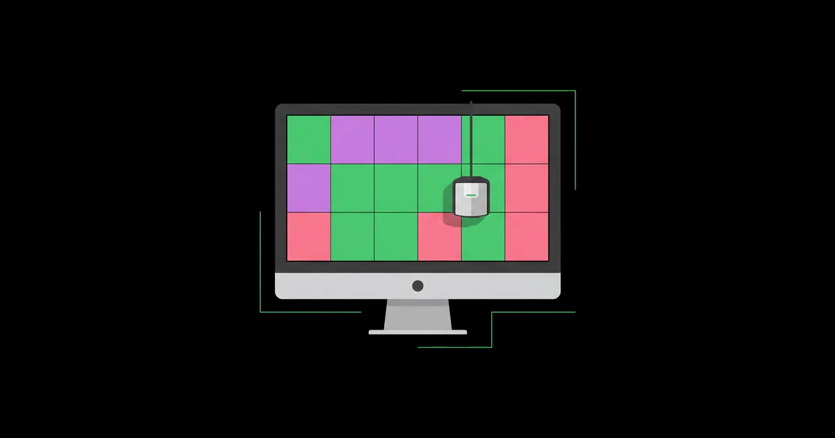
- Calibration support. Hardware calibration, where corrections are written into the monitor's internal lookup table, is the gold standard because it keeps your graphics card output untouched. Software calibration through a colorimeter and an ICC profile is still a huge upgrade over nothing.
- Accurate factory presets. Good design monitors ship with sRGB, Display P3, and Adobe RGB modes that actually clamp the gamut. This lets you preview how your work looks on ordinary screens without re-profiling.
- Uniformity compensation. Larger panels often show brighter or tinted corners. Professional lines include uniformity correction so a gray background looks gray edge to edge.
- Pixel density. On a 27-inch panel, 4K gives roughly 163 pixels per inch and 5K roughly 218. Higher density makes type rendering and icon work far easier to judge.
- Panel type and finish. IPS remains the safe default. Mini-LED offers high brightness for HDR work, while OLED offers deep blacks but carries burn-in risk with static toolbars. Matte or nano-texture finishes reduce glare in bright rooms.
- Connectivity and ergonomics. A single USB-C or Thunderbolt cable with enough power delivery simplifies a laptop setup, and a stand with height and tilt adjustment matters over a long workday.
Refresh rate, gaming response times, and peak HDR brightness rarely change the quality of static design work. They are nice extras, not deciding factors, unless you also edit motion graphics or video.
How Do the Main Display Types Compare?
Each panel technology carries trade-offs, and the right choice depends on what you design and where you work. The table below summarizes how the common categories behave for design work specifically, not for gaming or general office use.
| Display Type | Strengths for Design | Weaknesses | Best Fit |
|---|---|---|---|
| Professional IPS with hardware calibration | Excellent accuracy, uniformity correction, stable over years | Higher price, modest contrast | Print, packaging, brand identity studios |
| Wide-gamut consumer IPS (4K) | Good gamut, sharp text, affordable | Weaker uniformity, software calibration only | Freelancers, web and UI designers |
| 5K Retina-class display | Outstanding text sharpness, clean macOS scaling, P3 color | Limited preset modes, fewer ports | Mac-based UI, typography, and layout work |
| Mini-LED | High brightness, strong HDR, deep contrast | Blooming around bright objects, higher cost | Motion designers and HDR content |
| OLED | Perfect blacks, vivid color, fast response | Burn-in risk from static UI, brightness limits on full white | Mixed creative use with varied content |
Notice that the most impressive-sounding technologies are not automatically the best for flat design work. A well-calibrated IPS panel frequently beats a flashier screen for logo, layout, and print tasks because it is predictable.
What Practitioner Experience Says About Display Choice
The biggest gains come from calibration and environment, not from the price tag. In studio setups I have managed, a mid-range wide-gamut monitor that is calibrated monthly in a room with controlled lighting consistently produced fewer print surprises than an expensive monitor left on its default vivid mode next to a sunny window. The hardware sets a ceiling, but your process decides how close you get to it.
Brightness is the most overlooked variable. Monitors often ship far brighter than paper can ever look, so designers judge a file on a glowing screen and then wonder why the print feels muddy and dark. For print-oriented work, calibrating to a lower luminance, commonly somewhere around 80 to 120 candelas per square meter depending on your room, and a warmer white point gives a far more honest preview. For screen work, a D65 white point matches what most devices target.
The second pattern is that a single screen rarely represents every viewer. Many working designers keep a calibrated primary monitor for decisions and then check the same file on a phone, a cheap laptop, and a tablet before approval. If you sketch or refine work on a tablet, it helps to understand how iPad design apps fit into a desktop workflow so color management stays consistent across devices rather than drifting with every handoff.
Finally, longevity matters. Professional monitors with internal calibration and stabilization tend to hold accuracy longer, while cheaper panels drift and need frequent re-profiling. When you calculate cost per year of reliable use, the gap between a budget monitor and a professional one is smaller than the sticker suggests.
Common Mistakes When Choosing a Design Display
Most display problems are self-inflicted and easy to prevent once you know where they come from. These are the mistakes I see repeatedly when designers upgrade their setup.
- Buying on gamut volume alone. A huge wide-gamut panel without a working sRGB mode makes every web color look oversaturated. If you design for the web, insist on an accurate sRGB clamp.
- Never calibrating. Factory calibration reports are a starting point. Panels drift, and your room lighting is not the factory's. Buy a colorimeter and schedule recalibration.
- Ignoring the room. A window behind or beside the screen changes perceived color through the day. Neutral walls, consistent lighting, and a hood for critical work help more than people expect.
- Running a mixed pair of monitors. Two different screens side by side will never match perfectly. Use the accurate one for color decisions and the second for palettes, references, and chat.
- Choosing a size that forces bad scaling. A 27-inch 1440p screen is fine for many tasks, but text rendering on a Mac looks noticeably softer than on 4K or 5K panels. Match resolution to your operating system's scaling behavior.
- Assuming glossy means accurate. Glossy panels look contrasty, but reflections in a bright room can mislead your judgment of shadows and dark tones.
A Real-World Setup Walkthrough
Here is how I would set up a display for a freelance designer who splits time between brand identity, web graphics, and occasional print collateral. The goal is one trustworthy screen and a repeatable routine.
Step one: define your outputs. List what you deliver most often. In this scenario it is web graphics, social assets, and some print brochures. That means sRGB accuracy is essential, P3 coverage is valuable, and a print-oriented calibration target is needed occasionally.
Step two: shortlist panels. Choose a 27-inch 4K or 5K IPS display with strong sRGB and P3 coverage, factory presets that clamp each gamut, and support for calibration. If budget allows, a professional line with hardware calibration and uniformity correction is the upgrade that pays off most for print work.
Step three: prepare the room. Position the monitor so windows are to the side, not behind or directly in front. Use neutral daylight-balanced bulbs and avoid colored walls immediately around the desk.
Step four: calibrate two targets. Create one profile for screen work at a D65 white point and a comfortable brightness, and a second print-preview profile with lower luminance and a warmer white. Name them clearly so you never forget which one is active.
Step five: set up your software. Make sure your design applications use the monitor profile, set working spaces consistently, and use soft proofing with the printer's profile when preparing print files.
Step six: build a check routine. Before approving any deliverable, view it on the calibrated monitor, then on at least one uncalibrated device such as a phone. Recalibrate on a fixed schedule, monthly for most users, and after any firmware or operating system update that touches color.
This routine takes perhaps an hour to set up and a few minutes each month to maintain, and it eliminates most of the color disputes that eat into client relationships and reprint budgets.
Key Takeaways
- The best display for graphic design is the one that shows your delivery color space accurately and can be calibrated, not the one with the most vivid demo mode.
- Gamut coverage, calibration support, and accurate preset modes matter more than refresh rate or peak HDR brightness for static design work.
- A 27-inch 4K or 5K IPS panel is the practical sweet spot for sharp type rendering and comfortable workspace.
- Room lighting and screen brightness cause as many color problems as the panel itself, especially for print work.
- Calibrating on a schedule and checking files on everyday devices before approval prevents most real-world color surprises.
Frequently Asked Questions
Is a 4K monitor necessary for graphic design?
A 4K monitor is not strictly necessary, but it makes a clear difference. Higher pixel density renders type, icons, and thin strokes more crisply, so you judge detail more accurately. On a 27-inch screen, 4K or 5K is worth it; on a 24-inch screen, 1440p can still be workable for many designers.
What color gamut should a graphic design monitor cover?
A design monitor should cover close to all of sRGB at minimum, because most web and social content lives there. If you design for modern phones and laptops, strong DCI-P3 coverage is valuable. Print and photography specialists benefit from wide Adobe RGB coverage, along with an accurate sRGB mode for web previews.
Do I really need to calibrate a new monitor?
Yes, calibration is worth doing even on a factory-calibrated monitor. Panels drift over time, and your room lighting differs from the factory's test conditions. A colorimeter lets you set a specific white point and brightness, creating a predictable baseline you can trust for client work and print preparation.
Is OLED good for graphic design work?
OLED can be excellent for design because it delivers deep blacks and vivid color. The main caution is burn-in from static elements like toolbars and panels that stay in the same place for hours. If you use OLED, enable panel care features, vary your layout, and still calibrate for accuracy.
Should I choose a matte or glossy screen?
Choose a matte or nano-texture finish if your room has windows or bright overhead lighting, because reflections distort how you see shadows and dark tones. Glossy screens look more contrasty and can feel sharper, but they work best in controlled lighting. For most home studios, a matte finish is the safer choice.
How often should I recalibrate my design display?
Recalibrate a design display about once a month for regular professional use. Recalibrate sooner after operating system updates, graphics driver changes, or moving the monitor to a different room. Professional monitors with built-in sensors can automate this, but a manual monthly routine with a colorimeter works well for most freelancers and small studios.
Conclusion
The most important decision is not which brand to buy but which color space you need to see honestly, and then committing to a calibration routine that keeps the screen telling the truth. Pick a panel that covers your delivery gamut, calibrate it for your room, and verify finished work on everyday devices. Once your display is reliable, the next step is proving that reliability to clients, and studying portfolio samples that show color discipline will help you present work that looks right everywhere it is viewed.