
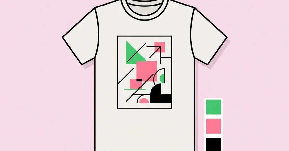
Apparel Graphic Designer: Key Skills, Tools, and Workflow
The fastest way to identify a designer who has never worked in apparel is to watch them hand a print shop a full-colour raster file with soft drop shadows and expect it on a garment next week. Apparel graphic design is the discipline of designing artwork that will be reproduced on fabric through processes such as screen printing, embroidery, direct-to-garment, and heat transfer, each of which imposes hard physical limits that graphics on a screen never face. Fabric stretches, ink builds, thread has thickness, and none of those behaviours are visible in a design file.
Quick Answer: An apparel graphic designer creates artwork for garments while working within production constraints such as ink colour counts, print placement zones, fabric behaviour, and decoration method. The role combines illustration and typography with technical preparation including colour separations, vector artwork, placement specifications, and production-ready file handoff to manufacturers.
What the Role Actually Involves Day to Day
Apparel design splits into two halves that are equally important and very unequally taught. The creative half covers concept, illustration, typography, trend research, and collection cohesion. The technical half covers decoration methods, colour systems, separations, placement standards, and manufacturer communication. Designers who only have the first half produce artwork that either cannot be made or costs too much to make.
The decoration methods define the boundaries. Screen printing pushes ink through a mesh stencil, one screen per colour, which is why colour count drives cost directly and why gradients are difficult. Embroidery stitches thread, which means fine detail below roughly a quarter inch disappears, small text becomes unreadable, and the file must be digitised into stitch instructions rather than simply exported. Direct-to-garment prints ink directly onto fabric like an inkjet, handling photographic artwork well but performing best on cotton and light colours with higher per-unit cost. Heat transfer and vinyl apply pre-cut or printed material to the garment, suiting small runs and names or numbers. Sublimation dyes polyester fibres directly, permitting all-over prints with no hand feel, but only on synthetic light-coloured fabric.
Placement is its own technical language. Standard positions include left chest, full front, centre chest, oversized front, back yoke, full back, sleeve, and hem. Each has conventional dimensions and a measured drop from the collar seam, and these differ between adult and youth sizing, and between styles. A spec sheet that states print width, height, and distance from the high point of the shoulder is not bureaucracy; it is the only thing preventing a run of shirts with the artwork sitting two inches too low.
Colour is where most errors originate. Garment decoration works in ink and thread systems with physical references, not in screen colour, which is why approving a design on an uncalibrated display is genuinely risky. Understanding your own viewing conditions, as covered in this guide to colour-accurate monitors for design work, prevents the common and expensive experience of approving a teal on screen and receiving a green on cotton.
The Skills That Make an Apparel Designer Employable
Ranked by how often they determine whether someone gets hired and kept.
- Vector proficiency. Clean, closed paths, correct stroke handling, expanded type, and logically named layers. Most garment decoration begins with vector artwork, and messy files cost the print shop time they will bill for.
- Colour separation understanding. Knowing spot colour separations, simulated process, and when each applies. You do not always produce the separations yourself, but you must design artwork that can be separated economically.
- Typography and lettering. Apparel graphics are type-heavy, and licensing matters: many font licences restrict use on merchandise for resale. Custom lettering avoids both the licensing problem and the generic look.
- Illustration ability. Distinctive hand-drawn work remains the strongest differentiator in a category saturated with stock imagery and reused templates.
- Production literacy. Ink types, underbase requirements on dark garments, halftone limits, minimum line weights, stitch counts, and fabric behaviour. This knowledge is what turns a designer into a colleague the factory trusts.
- Mockup and presentation craft. Realistic mockups on accurate garment colours, at true scale, so approvals reflect reality rather than an optimistic composite.
- Trend and market awareness. Understanding the customer, the price point, and the seasonal calendar, since apparel design works to production lead times that are far less forgiving than digital deadlines.
- Documentation discipline. Complete tech packs with placements, dimensions, colour references, fabric notes, and decoration method. Documentation quality directly predicts how many production problems you will have.
Decoration Methods Compared
Choose the method before finalising the artwork, because each one changes what the artwork can be.
| Method | Best For | Artwork Constraints | Economic Profile |
|---|---|---|---|
| Screen printing | Medium to large runs, bold graphics | Limited colour count, gradients need halftones | High setup cost, very low unit cost at volume |
| Embroidery | Logos, caps, premium workwear | No fine detail, minimum text size, no gradients | Cost driven by stitch count, durable finish |
| Direct-to-garment | Small runs, photographic artwork | Best on cotton, weaker on dark synthetics | Low setup, high unit cost, poor at volume |
| Heat transfer vinyl | Names, numbers, very small runs | Solid shapes only, limited fine detail | Minimal setup, labour-intensive per unit |
| Sublimation | All-over prints, performance wear | Polyester and light colours only | Moderate setup, no hand feel, vivid results |
| Appliqué and patches | Texture, premium detail, branding | Simple shapes, layered construction | Higher unit cost, strong perceived value |
What Production Experience Teaches That Courses Do Not
A few realities become obvious after your first few production runs, and they are rarely covered in design education.
The first is that colour count is a business decision disguised as a creative one. Each additional screen adds setup cost and registration risk. A four-colour design and a seven-colour design can look similar on screen and differ substantially in unit economics, which matters enormously at a fixed retail price. Experienced apparel designers learn to achieve depth through halftones, overprinting, and using the garment colour itself as a design element rather than by adding screens. Designing the garment colour into the artwork is the single most valuable habit in the discipline.
The second is that fabric is not paper. Knit fabric stretches during printing and returns afterwards, so fine registration between colours is harder than in print. Thin lines can break up, large solid ink areas can feel heavy and crack over time, and the same artwork behaves differently on a lightweight tee than on a heavyweight hoodie. Designs intended for multiple garment weights should be tested on the worst case, not the flagship.
The third is that dark garments require an underbase, a printed white layer beneath the colours so they read correctly. The underbase changes ink build, hand feel, and colour appearance, and it adds a screen. Designers who forget this are repeatedly surprised when a design that looked crisp on white looks muddy and heavy on black.
The fourth reality is scale perception. Artwork viewed at full screen size and artwork on a garment at arm's length are different experiences. Detail that reads beautifully zoomed in vanishes on the shelf. The discipline of checking at true physical size and from realistic viewing distance is the same structural thinking that governs good layout work generally, and it benefits from the same framework described in building layouts with deliberate cohesion, since a garment graphic is a composition that must hold together at a glance.
Mistakes That Cost Apparel Designers Money
Designing without choosing the decoration method. Artwork created in the abstract routinely has to be rebuilt once the method is chosen. Decide first, then design within those limits, and treat the limits as creative constraints rather than obstacles.
Ignoring font licensing for merchandise. Many licences, including several free ones, exclude use on products sold commercially. This is a genuine legal exposure that surfaces after a product sells well, which is the worst possible time. Verify licences at selection and record them.
Submitting raster artwork for screen printing. Low-resolution or unnecessarily rasterised files force the print shop to redraw, which costs time and introduces errors. Supply vector artwork with expanded type, converted strokes, and named colours matching a physical ink system.
Forgetting the underbase on dark garments. Colours printed directly onto dark fabric shift dramatically. Plan for the white underbase in your colour count, your cost estimate, and your expectations about hand feel.
Using detail below production minimums. Hairline strokes, tiny text, and fine gradients fail in screen printing and disappear entirely in embroidery. Confirm minimum line weights and text sizes with the manufacturer before final artwork, since these vary by shop and equipment.
Approving colour from a screen alone. Always request a physical strike-off or a printed sample for anything significant. Ink on cotton does not match pixels on glass, and thread colour cards are the only reliable reference for embroidery.
Neglecting placement specifications. Stating "centre front" without dimensions and a measurement from the shoulder seam guarantees inconsistency across sizes. Provide a measured spec for every size range in the run.
A Complete Apparel Design Workflow
This is the sequence that keeps projects on schedule and out of dispute, from brief to bulk production.
Step one: define the commercial constraints. Establish garment styles, colourways, retail price point, run quantity, decoration budget, and lead time. These determine the maximum viable colour count before a single sketch exists.
Step two: select the decoration method. Match method to quantity, artwork type, and fabric. Large runs of bold graphics point to screen printing; small photographic runs point to direct-to-garment; logos on caps point to embroidery.
Step three: concept within limits. Sketch and explore knowing your ceiling, for example four screens including underbase. Use the garment colour actively as one of your tones to stretch the effective palette without adding cost.
Step four: build production-ready vector artwork. Expand type, convert strokes, close paths, remove stray points, name layers by colour role, and set the artwork at true print size rather than scaling later.
Step five: specify colour physically. Reference an ink matching system for print and a thread colour card for embroidery. Note the garment colour explicitly in the specification, because the same ink appears different on different fabric colours.
Step six: produce a measured tech pack. Include print dimensions, distance from high point of shoulder, placement per size range, decoration method, colour references, fabric and garment style codes, and any special instructions such as soft-hand ink or puff finish.
Step seven: approve a physical sample. Review the strike-off on the actual garment in daylight. Check registration, ink coverage, hand feel, placement measurements, and how the graphic reads at arm's length. Wash-test it before bulk approval if durability matters.
Step eight: document and archive. Save production files, separations, approved sample photographs, and supplier notes together. Repeat orders and colourway extensions become trivial with a good archive and painful without one, which is exactly the kind of operational discipline that distinguishes candidates in remote and freelance design hiring, where nobody can see your process except through the quality of your handoffs.
Key Takeaways
- Apparel graphic design combines creative work with production literacy, and the technical half determines whether artwork can be manufactured economically.
- Decoration method must be chosen before artwork is finalised, because screen printing, embroidery, direct-to-garment, and sublimation impose incompatible constraints.
- Colour count drives cost directly in screen printing, so using garment colour as an active design element is the most valuable economic habit in the discipline.
- Dark garments require a white underbase that adds a screen, changes hand feel, and alters how every colour above it appears.
- A measured tech pack with placement dimensions and physical colour references prevents the majority of production disputes before they occur.
Frequently Asked Questions
What software do apparel graphic designers use?
Vector illustration software is the core tool for screen print artwork and separations, supported by raster software for texture, distressing, and mockups. Embroidery requires digitising software to convert artwork into stitch files, which specialist digitisers often handle on the designer's behalf.
How many colours should a screen printed design use?
Most commercial designs use one to four colours plus an underbase on dark garments. Each additional colour adds a screen, setup cost, and registration risk. Using the garment colour as part of the composition extends the visual palette without increasing the screen count.
What is an underbase in screen printing?
An underbase is a white ink layer printed beneath coloured inks on dark garments so colours appear accurate instead of dull and translucent. It occupies a screen, increases ink build and hand feel, and must be accounted for in both cost estimates and artwork planning.
Can I use any font on merchandise?
No. Many font licences, including several free-for-personal-use licences, exclude commercial merchandise. Check the specific licence terms for products sold at retail, purchase an extended licence where required, or create custom lettering to avoid the restriction entirely.
What is the minimum detail size for embroidery?
Fine detail below roughly a quarter of an inch tends to disappear, and text generally needs to be at least a quarter inch tall to remain legible. Gradients are not possible, so artwork must be simplified into distinct thread colours and solid shapes before digitising.
How do I specify print placement correctly?
Provide print width and height plus the distance from the high point of the shoulder to the top of the design, specified per size range. Vague instructions such as "centre chest" produce inconsistent results across sizes and between production runs at different factories.
Do I need physical samples before production?
Yes for anything of commercial significance. A strike-off reveals registration issues, colour shifts on fabric, ink hand feel, and placement errors that no digital mockup can predict. Wash testing before bulk approval is advisable whenever durability affects returns or reputation.
Conclusion
The decision that defines a successful apparel project happens before any drawing begins: choose the decoration method and the colour budget first, then design inside those limits deliberately. Every expensive apparel failure I have seen traces back to artwork created in ignorance of how it would be manufactured, and no amount of creative quality rescues a design the factory cannot reproduce at the required price. Your next step is to take one existing design and rebuild it for a four-screen limit including an underbase, using the garment colour as an active tone. If you also want to sharpen the visual side of the work, study how restraint and limited ink counts produced some of the strongest graphics ever made in 1950s graphic design and its print constraints.


