
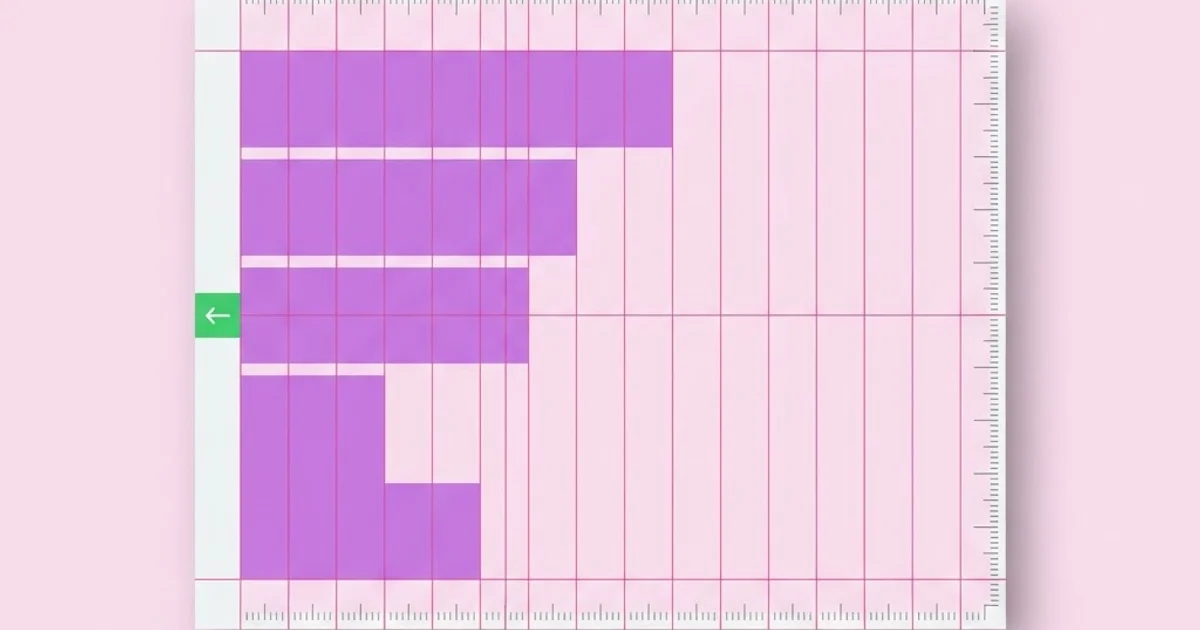
Alignment in Graphic Design: The Rule That Fixes Layouts
When a layout feels wrong but nobody can say why, alignment is the cause roughly nine times out of ten. Alignment in graphic design is the deliberate positioning of elements so their edges, centers, or baselines share common lines, creating visible relationships the eye reads as order. It is the least glamorous principle in the field and the one that produces the largest quality jump per minute spent. A mediocre color palette with perfect alignment reads as professional; a beautiful palette with drifting edges reads as amateur.
Quick Answer: Alignment in graphic design means positioning elements so their edges, centers, or baselines sit on shared invisible lines. It creates order, connects related items, and guides the eye through a layout. Edge alignment is stronger than center alignment, optical alignment beats mathematical alignment, and every element should align to something intentionally.
What Alignment Actually Does in a Layout
Alignment performs two jobs simultaneously, and most designers only consciously use the first. Job one is tidiness: shared edges remove visual noise so the viewer stops noticing the container and starts reading the content. Job two, the more valuable one, is relationship signaling. Elements that share an alignment line are read as belonging to the same group. That means alignment is a grouping tool competing directly with proximity, color, and enclosure, and it is usually the cheapest of the four.
The core vocabulary is worth being precise about. Edge alignment means left, right, top, or bottom edges sharing a line. Center alignment means the midpoints share an axis. Baseline alignment means the invisible line that letters sit on is shared across text blocks, which is different from aligning the bounding boxes of those blocks. Optical alignment means adjusting position so elements look aligned, overriding the mathematical values, which matters constantly for round shapes, punctuation, and italic type.
Here is the rule that eliminates most layout problems: every element on the canvas must align to at least one other element, and that relationship must be a decision you can articulate. If you cannot say what a given element aligns to, it is floating, and floating elements are what make a design look unfinished. This discipline is exactly what powered the systematic work of the grid-driven poster era of the 1970s, where designers had no ability to nudge things later and therefore planned every edge in advance.
One more distinction worth internalizing early: alignment is not the same as symmetry. A strongly asymmetric layout can be perfectly aligned, and a symmetric one can be badly aligned. Symmetry is a compositional choice about balance; alignment is a structural requirement that applies regardless of which balance strategy you pick.
The Six Alignment Rules Professionals Apply Automatically
These are the rules experienced designers stop thinking about consciously because they become reflexes. Learn them explicitly and the reflex forms faster.
- Prefer a hard edge over a center. Left-aligned text against a shared vertical produces a crisp line the eye can track. Centered text produces two ragged edges and no line at all. Reserve centering for short, isolated elements such as a display headline or a single call to action.
- Never mix alignments within a group. A card with a centered heading and left-aligned body text creates two competing axes inside one container. Pick one per group and hold it.
- Align text to baselines, not bounding boxes. Two text blocks whose frames align at the top will still look misaligned because ascender heights differ. Align the first baselines instead.
- Optically correct circles, triangles, and punctuation. A circle mathematically aligned to a square's edge looks slightly inset; push it out by roughly one to two percent of its diameter. Opening quotation marks and hyphens should hang outside the text block, not sit inside it.
- Limit your alignment axes. Most strong layouts use two or three vertical axes and a small set of horizontal ones. Every additional axis weakens the structure, which is why a twelve-column grid with two content axes beats free positioning every time.
- Align to the visual mass, not the file boundary. Logos and icons usually contain built-in padding. Align to where the shape actually reads as beginning, which often means ignoring the bounding box entirely.
Applied together, these six rules resolve the majority of the vague feedback designers receive, notes like "it feels cluttered" or "something is off" almost always resolve to an unresolved axis.
Alignment Types Compared
Different alignment strategies solve different problems. This table summarizes where each one earns its place and where it causes trouble.
| Alignment type | Best used for | Strength of the visual line | Main risk |
|---|---|---|---|
| Left edge | Body copy, forms, lists, dashboards, most Latin-script interfaces | Very strong | Ragged right edge can look uneven with long words |
| Right edge | Numeric columns, captions beside imagery, right-to-left scripts | Strong | Harder to scan for continuous reading |
| Center | Short headlines, single buttons, invitations, title cards | Weak | Creates two ragged edges and no trackable line |
| Justified | Multi-column print with hyphenation control | Strong on both edges | Rivers of white space when the measure is too narrow |
| Baseline | Multi-column text, cards in a grid, mixed type sizes | Strong horizontally | Requires a consistent baseline unit across the system |
| Optical | Icons, circles, punctuation, logotypes | Strongest perceptually | Cannot be automated reliably; needs judgment |
Why Mathematical Alignment Often Looks Wrong
This is where working experience diverges from tool defaults. Design software aligns bounding boxes, but human perception aligns perceived mass. The two disagree constantly, and trusting the software produces subtly wrong results that clients notice without being able to name.
Three cases account for most of the discrepancy. First, curved shapes: a circle whose bounding box matches a square's box appears smaller and slightly inset, because less of its area reaches the edge. The standard correction is to oversize the circle slightly and let it overshoot, the same principle that makes the letter O in a well-drawn typeface extend a fraction above the cap height and below the baseline. Second, triangles and pointed shapes, such as a play icon inside a circular button, read as off-center when mathematically centered because their mass sits toward the flat edge; nudging them toward the point is standard practice. Third, punctuation and quotation marks, which leave a visible notch in an otherwise straight text edge unless they hang outside the measure.
The practical consequence is that automated alignment tools should be treated as a first pass, not a verdict. Align mathematically, then step back, blur your vision or reduce the zoom to about twenty-five percent, and correct whatever still looks wrong. That squint test is the most reliable alignment check available, and it costs seconds. It is the same evaluative habit that separates competent from excellent work across every visual discipline, including projects where illustration and layout have to cooperate on a single composition.
I want to be explicit about evidence here. There is a great deal of confidently repeated numerical folklore about alignment and readability circulating online, and very little of it traces to a verifiable source. What is reliably observable in professional practice is simpler and more useful: layouts with fewer, stronger alignment axes get approved faster and require fewer revision rounds, because reviewers stop reacting to structural noise and start reacting to the actual content.
Alignment Mistakes and How to Fix Them
Centering everything by default. Centered layouts feel safe because nothing looks lopsided, but they eliminate the strong vertical line that makes a design feel engineered. Convert a centered layout to left-aligned and the improvement is usually immediate and dramatic.
Aligning to the artboard instead of to content. Elements centered on the canvas while ignoring each other produce a layout where nothing relates to anything. Build relationships between elements first; position the resulting group second.
Using too many axes. Every time you introduce a new left edge you weaken the existing ones. Count your vertical axes. If there are more than three in a single composition, at least one is unjustified.
Trusting the align tool on icons. Exported icons frequently carry asymmetric transparent padding. Alignment tools read the padding; viewers read the glyph. Always verify icon alignment visually against adjacent text.
Ignoring baselines in multi-column layouts. Two columns with different heading sizes will drift out of sync within a few paragraphs unless leading values are multiples of a shared baseline unit. Set the baseline unit before setting any type.
Letting inconsistent spacing masquerade as an alignment problem. Sometimes edges are perfect but gaps are arbitrary. Alignment and spacing are siblings; a spacing scale with a small number of fixed steps prevents the eye from detecting near-misses.
A Ten-Minute Alignment Audit for Any Layout
Run this sequence on any near-final design and it will catch nearly every structural flaw. I use it before every client presentation.
One, turn on outlines. Switch to wireframe or outline view so color and imagery stop distracting you. Structural problems become obvious when the decoration disappears.
Two, draw your axes. Place temporary guides on every vertical edge that two or more elements share. Count them. If you have five or six, consolidate until you have two or three.
Three, check every orphan. Any element not touching a guide is an orphan. For each one, either move it onto an axis or write down the reason it deliberately breaks the grid. Intentional breaks are fine; accidental ones are not.
Four, verify baselines across columns. Draw a horizontal guide on the first baseline of each column and confirm they match. Then check the last line of each column in the same viewport.
Five, run the optical pass. Zoom out to twenty-five percent or blur the view. Look specifically at circles, icons, buttons with centered glyphs, and any text that starts with a quotation mark. Nudge whatever reads as off, even if the numbers say it is perfect.
Six, test at two sizes. View the layout at full size and at thumbnail. Alignment errors that hide at full size often become glaring when the composition shrinks, because the eye stops reading content and starts reading shape.
Seven, flip it. Mirror the layout horizontally. This defamiliarizes a design you have stared at for hours and makes drifting edges jump out. Flip it back before saving.
Key Takeaways
- Alignment does two jobs at once, creating visual order and signaling which elements belong together, which makes it the cheapest grouping tool available to a designer.
- Edge alignment produces a strong trackable line while center alignment produces two ragged edges and none, so centering should be reserved for short, isolated elements.
- Every element in a composition should align to at least one other element, and any element you cannot justify is floating and will make the work read as unfinished.
- Software aligns bounding boxes but people perceive visual mass, so circles, pointed icons, and punctuation almost always need manual optical correction after the mathematical pass.
- Reducing a layout to two or three vertical axes strengthens structure more than any additional styling, and the squint test at twenty-five percent zoom is the fastest way to verify it.
Frequently Asked Questions
What is alignment in graphic design?
Alignment is the deliberate positioning of elements so their edges, centers, or baselines sit on shared invisible lines. It creates visual order, communicates which items belong to the same group, and gives the eye a clear path through a composition. It is considered one of the core principles of layout alongside contrast, repetition, and proximity.
Why is alignment so important in design?
Because misalignment is the most noticeable form of visual noise, even to untrained viewers. People rarely identify the cause, but they consistently perceive misaligned work as careless or unprofessional. Fixing alignment usually produces a larger perceived quality improvement than changing colors or typefaces.
Should I use left alignment or center alignment?
Use left alignment for anything the reader must scan, including body copy, lists, forms, and interface content, because it gives a consistent starting edge for each line. Reserve center alignment for short, self-contained elements such as a hero headline, a single button, or a title card where no scanning is required.
What is optical alignment and when do I need it?
Optical alignment means adjusting an element so it looks aligned even though its coordinates say otherwise. You need it whenever a shape is curved, pointed, or irregular, including circular logos, play and arrow icons inside buttons, and opening quotation marks, which should hang outside the text block rather than indent it.
How does a grid relate to alignment?
A grid is a pre-planned set of alignment axes. Instead of deciding each edge case by case, you define columns, gutters, margins, and a baseline unit once, then snap content to them. Grids make alignment faster and more consistent, especially across multi-page documents or multi-screen products.
Can breaking alignment ever be a good decision?
Yes, but only when the break is deliberate and isolated. Pushing a single element off the grid draws attention to it precisely because everything else is disciplined. The technique fails when several elements break the structure at once, because the viewer then reads chaos rather than emphasis.
Conclusion
The single most important decision about alignment is choosing your axes before you place content, not after. Designers who define two or three strong verticals and a baseline unit up front spend their revision time on ideas; designers who position by eye spend it nudging pixels and still deliver work that reads as loose. Your next step is to take your most recent layout, run the seven-step audit above, and count how many vertical axes it actually contains. Once the structure holds, sharpen the other half of visual hierarchy by studying the way contrast directs attention within a layout, because order without emphasis is just a tidy page nobody reads.


