70s Graphic Design: Bold Type, Warm Color, Loud Layouts
Open a 1970s record sleeve, an airline timetable, or a municipal signage manual and you are looking at work built under constraints most designers today have never faced: no undo, no layers, and a print run that could not be corrected once the plates were burned. 70s graphic design is the visual language that came out of those constraints, rounded geometric display type, warm earth and sunset palettes, concentric arc motifs, and grid discipline inherited from Swiss modernism then deliberately warmed up. Copying the surface is easy. Understanding why each choice existed is what makes a revival look authentic instead of costumed.
Quick Answer: 70s graphic design is defined by rounded geometric display typefaces, warm earth-tone and sunset palettes, concentric arc and stripe motifs, strict grid layouts, and hand-built paste-up production. It grew out of phototypesetting, offset lithography, and the corporate identity manual, which is why the era reads as bold, systematic, and warm rather than purely decorative.
What Actually Defined 70s Graphic Design?
The defining technical shift was phototypesetting replacing metal type. Setting type on film rather than lead meant letters could be enlarged, condensed, overlapped, and pushed until they touched, at almost no cost. That single production change explains most of the decade's typographic signature: extremely tight letterspacing, ligature-heavy display settings, and headlines that lock together like masonry. Designers were not being showy for its own sake. They were exploiting a new degree of freedom that metal type had physically forbidden.
The second force was the corporate identity manual. Through the late 1960s and into the 1970s, large organizations commissioned full systems, grids, color specifications, logo clear-space rules, and signage standards, documented in binders. This is why so much 70s work feels engineered. A poster was rarely a one-off; it was an instance of a system. That systematic mindset connects the decade directly to the alignment discipline every layout still depends on, because a grid only pays off when every element actually snaps to it.
Third came the printing economics. Offset lithography made color work affordable, but full four-color process was still expensive for smaller runs. Two and three spot colors on uncoated stock was the common budget, which pushed designers toward flat, confident color fields rather than photographic subtlety. Warm palettes, harvest gold, burnt orange, avocado, brick red, cream, were partly taste and partly what looked rich when printed flat on absorbent paper.
A few key terms are worth defining before you attempt the style. A mechanical was the physical paste-up board where type galleys and artwork were assembled for the camera. Rubylith was a red masking film cut by hand to create knockouts and separations. Letraset was dry-transfer lettering, rubbed down burnish by burnish. Every one of those tools rewarded decisiveness and punished fussiness, which is exactly why the resulting work looks bold.
Seven Traits That Make a Layout Read as 1970s
If you want a layout to read instantly as 70s rather than vaguely retro, these are the traits doing the work. Hit four or five of them and the read is unmistakable.
- Rounded geometric display type set very tight. Letterforms built from circles and straight strokes, kerned until counters nearly close. The tightness matters more than the specific face.
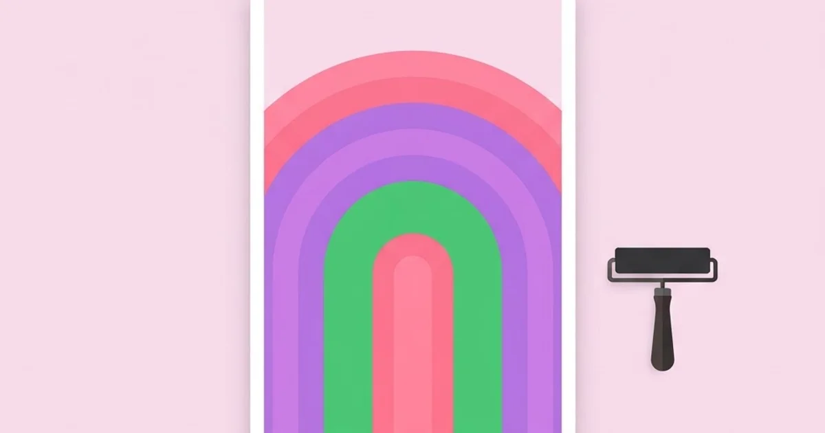
- Concentric arcs and rainbow stripes. Repeated bands following a curve, usually three to five, stepping through a warm palette. Often used to carry a horizon or frame a logotype.
- Flat spot color, no gradients. Solid fields with hard edges. Where a gradient appears, it is a stepped band, not a smooth blend.
- Heavy baseline discipline. Text locked to a visible modular grid, usually with generous outer margins and tight internal gutters.
- Oversized headline, minimal body copy. The headline is the image. Supporting text is small, set in a neutral grotesque, and pushed to one corner.
- Warm, slightly desaturated palettes. Colors are saturated but never neon. The eighties brought the neon; the seventies stayed earthy.
- Photographic halftone or duotone imagery. When photos appear they are coarsely screened or printed in two inks, not full color.
Notice what is absent: drop shadows, bevels, transparency, and soft glows. None of those were practical to produce. If your revival includes them, it will read as a later decade wearing 70s clothes.
70s Signatures and Their Modern Equivalents
The table below maps each era signature to the production method that created it and the modern tool that reproduces it, plus the mistake that most often ruins the effect.
| Era signature | Original production method | Modern equivalent | Common failure |
|---|---|---|---|
| Ultra-tight display kerning | Phototype set on film, letters overlapped manually | Negative tracking plus manual kern pairs | Applying global tracking and leaving collisions unresolved |
| Flat two or three color palette | Spot inks on offset press | Locked swatch set, no gradients | Adding a fourth and fifth accent until the palette loses its era |
| Coarse halftone imagery | Camera-made halftone screen | Halftone effect at a visible dot pitch | Dot size too fine to read as print |
| Concentric arc motif | Compass, ruling pen, cut masks | Offset concentric paths with equal stroke weights | Uneven band widths that break the rhythm |
| Paper warmth and ink texture | Uncoated stock absorbing ink | Subtle paper tint and light print grain | Heavy fake grain layered over everything |
What the Historical Record Actually Supports
It is worth separating documented history from the vague nostalgia that circulates online. Several anchor points are well established. The International Typeface Corporation was founded in 1970 by Herb Lubalin, Aaron Burns, and Ed Rondthaler, and ITC Avant Garde Gothic, derived from Lubalin's masthead work, was released that same year; its famous alternate ligatures are the single clearest artifact of the phototype mindset. Massimo Vignelli's diagrammatic New York City subway map was introduced in 1972. The AIGA and US Department of Transportation pictogram system, still the basis for wayfinding symbols in American transit, was published in 1974. Danne and Blackburn's NASA "worm" logotype was adopted in 1975. Milton Glaser's I Love New York mark dates to 1977.
What that timeline shows is that the decade was not primarily about nostalgia-friendly posters. It was the high-water mark of systematized public design, and the expressive poster work sits alongside it rather than replacing it. Anyone studying the period only through album covers gets half the story. The other half is signage, timetables, annual reports, and identity manuals, where the discipline lives.
Where I would resist making claims is in the numbers people invent about the era, share counts, engagement lifts, conversion figures for retro branding. No credible dataset supports those, and repeating them damages your authority. What I can say from practice is consistent: 70s-styled work tends to perform well where a brand needs warmth and confidence at small sizes, because flat color and heavy type survive compression and thumbnail scaling better than detailed gradient work. That same logic drives a lot of contemporary poster and packaging revivals, and it overlaps heavily with the way illustration and graphic design share responsibilities on a single surface.
Mistakes That Make a 70s Revival Look Fake
Most failed revivals fail in the same five ways, and all of them are fixable.
Treating one typeface as the whole style. Cooper Black is the usual shortcut. It is genuinely period-appropriate as a revival face, but the era's identity came from the setting, tight, large, locked to a grid, not from a single family. Set Cooper Black loosely on a centered layout and it reads as a coffee shop menu, not 1974.
Dumping grain and chromatic aberration over everything. Real print artifacts are localized and structural: slight misregistration on a spot color edge, ink spread on uncoated fibers, visible halftone rosettes. A uniform noise layer at forty percent opacity is a filter, not a texture, and experienced eyes read it immediately.
Mixing decades in the palette. Hot magenta and cyan on black is 1985. Harvest gold, rust, olive, and cream is 1974. If you pull colors from a Miami-pastel reference, the typography will fight the palette and neither will win.
Ignoring the grid. The seventies were rigorously modular. Elements aligned to columns and baselines, margins were generous and consistent, and asymmetry was deliberate rather than accidental. Free-floating elements break the illusion faster than any wrong color.
Over-detailing the illustration. Period illustration used limited ink counts, hard shapes, and simple gradation through stipple or line. Rendering a soft, fully shaded digital illustration and placing it on a 70s layout produces an immediate mismatch of fidelity.
Building a 70s Poster: A Working Walkthrough
Here is the sequence I use when a client asks for period-accurate 70s work rather than a generic retro vibe. It takes roughly a day for a single poster once references are gathered.
Step one, gather primary references, not Pinterest boards. Find scans of actual printed artifacts from the period: annual reports, transit maps, festival posters, packaging. Secondary references are already filtered through someone else's interpretation, and errors compound.
Step two, lock a three-ink palette before drawing anything. Pick one dominant warm color, one supporting color, and one near-neutral that stands in for paper. Three inks force the compositional decisions that make the style work. Adding a fourth should require justification.
Step three, build the grid first. A twelve-column grid with a generous outer margin and a fixed baseline is a safe starting structure. Set the baseline grid before you set a single word, and keep every text block on it.
Step four, set the headline as artwork. Type it, convert to outlines, and kern pair by pair. Close counters until they nearly touch, then back off one step. Where descenders and ascenders collide, redraw the joint rather than nudging the whole word. This is the step that separates convincing work from a font choice.
Step five, add the geometric motif last, and subtract. Arcs, stripes, and rules should support the headline's structure, following its baseline or framing its block. If the motif can be removed without the layout collapsing, it was decoration. If removing it destroys the composition, it was structure.
Step six, proof at print size and at thumbnail. Print it at full size on uncoated paper if you can. Then look at it as a 200-pixel-wide thumbnail. Authentic 70s work holds up at both extremes, because it was designed for posters seen from across a room and stamps seen from six inches.
Key Takeaways
- Phototypesetting, not taste alone, produced the decade's ultra-tight display type, which is why negative tracking plus manual kerning is the single highest-impact technique in any revival.
- The era's flat, warm, two or three color palettes were driven by offset spot-ink economics, so adding gradients or a fifth accent color breaks period accuracy immediately.
- 1970s design was dominated by systems, identity manuals, signage standards, and transit wayfinding, not just expressive posters, and the grid discipline from those systems is what holds the style together.
- Documented anchors like ITC's founding in 1970, the 1972 Vignelli subway map, the 1974 AIGA/DOT pictograms, and the 1975 NASA worm are reliable reference points; invented performance statistics about retro design are not.
- Authentic texture comes from structural print artifacts such as misregistration and visible halftone dots, not from a uniform grain overlay applied across the whole canvas.
Frequently Asked Questions
What fonts were most used in 70s graphic design?
Phototype-era display faces dominated, including ITC Avant Garde Gothic, ITC Serif Gothic, ITC Souvenir, and the Cooper Black revival, usually paired with a neutral grotesque such as Helvetica for body copy. The specific family matters less than the setting: very large, very tightly tracked, and locked to a grid.
What colors define the 1970s design palette?
Warm, earthy, and saturated without being neon. Harvest gold, burnt orange, rust, avocado green, brick red, chocolate brown, and cream appear constantly, usually printed as flat spot inks on uncoated stock. Limit yourself to three inks and one paper tone for the most accurate result.
How is 70s design different from 80s design?
The seventies were warm, earthy, grid-driven, and print-native. The eighties turned cooler and louder, with neon and pastel palettes, airbrush gradients, geometric confetti, and early digital influence. If your palette includes hot magenta on black with a gradient, you have crossed into the next decade.
Can I use 70s design for a modern brand?
Yes, and it works particularly well for food, beverage, hospitality, and community brands that need warmth and confidence. The practical advantage is legibility at small sizes: flat color and heavy display type survive thumbnail scaling and compression far better than detailed gradient-based identity work.
What software best reproduces the 70s look?
Any vector editor is sufficient, because the style is fundamentally flat and geometric. Do the headline kerning with outlines rather than live text, build arcs from offset paths with equal stroke weights, and apply halftone at a dot pitch coarse enough to be visible at final output size.
Why does so much 70s design look hand-made?
Because it was. Type was set on film, cut, and pasted onto mechanical boards, masks were cut by hand from rubylith, and lettering was often drawn or transferred sheet by sheet. Those processes rewarded bold, decisive shapes and left slight irregularities that digital tools remove unless you reintroduce them deliberately.
Conclusion
The most important decision in any 70s revival is made before you choose a typeface: commit to the production constraints of the era, three inks, flat color, a strict grid, and type set as artwork, and let those constraints drive every subsequent choice. Designers who start with constraints produce work that holds up; designers who start with a filter produce pastiche. Your next step is to build one poster end to end using only three spot colors and a locked baseline grid, then audit it against the failure list above. If you want the structural half of that skill sharpened first, study how contrast decides what a viewer sees first and apply it to your headline hierarchy before you add a single arc.