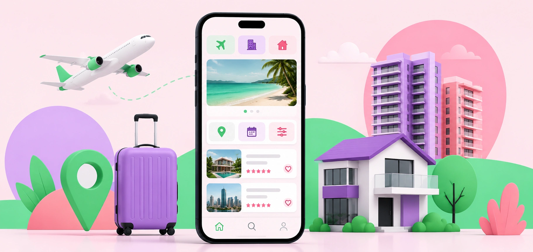
Why Mobile-First Design Is Critical for Travel and Property Searches
Mobile-first design helps travel and property websites deliver faster, smoother, and more user-friendly experiences that drive bookings and inquiries.
Why Mobile-First Design Is Critical for Travel and Property Searches
Travel and property searches rarely begin at a desk anymore. They happen on the couch, in the back of an Uber, during lunch breaks, or while someone is half-watching TV with 12 tabs open in their brain.
That matters.
When someone searches for a place to stay, a new home option, or an investment property, the mobile experience shapes their first impression. If the page loads slowly, the images jump around, or the filter button hides in a weird corner, people don’t wait around out of loyalty. They leave. Fast.
Mobile-first design isn’t just about making a desktop site “fit” on a smaller screen. That’s the old mistake. A proper mobile-first approach starts with the smallest screen and builds from there. It forces the design to focus on what users actually need first: clear images, fast filters, simple navigation, visible pricing, location details, and a quick path to inquire or book.
No clutter. No guessing. No digital treasure hunt.
Travel Users Want Answers Quickly
Travel search behavior is impatient by nature. People compare locations, dates, amenities, prices, reviews, cancellation rules, and transport options in a short window of time. On mobile, that window gets even shorter.
Imagine someone searching for holiday accommodation while planning a weekend away with family. They’re not calmly reading every line of copy. They’re checking photos, scanning the map, comparing bedroom counts, and wondering whether the place is close enough to the beach, shops, airport, or event they’re traveling for.
The design has to respect that behavior.
A strong mobile travel page should make the important details obvious without forcing users to pinch, zoom, scroll forever, or open five separate pages. Availability should be easy to check. Pricing should feel transparent. Photos should load smoothly. Reviews should sit where people expect them. The booking or inquiry button should be visible without being annoying.
There’s a fine line between helpful and pushy. Good design knows where that line is.
Property Searches Are Emotional and Practical
Property searches are more complicated than most digital journeys. They mix emotion, money, lifestyle, timing, and risk. A buyer might fall in love with a photo, then immediately panic about the floor plan, commute, financing, or build quality.
That’s a lot for one small screen.
For property websites, mobile-first design needs to support both dreaming and decision-making. Large visuals matter, but so does structure. Users need to compare listings, save favorites, inspect maps, review specifications, and contact an agent without losing their place.
This is where many property sites fall apart. They look impressive on a big desktop monitor in a presentation. Then someone opens the same page on a phone and the experience feels cramped, slow, or oddly stiff. Nice branding won’t save that.
The best mobile property experiences feel calm. They guide users from interest to action without making them work too hard. A simple floor plan viewer, sticky inquiry button, clear location summary, and fast-loading image gallery can do more for conversions than a flashy animation ever will.
Speed Is Part of the Brand Experience
Slow websites don’t feel premium. They feel broken.
That’s especially true for travel and property searches because both rely heavily on images. Big photos sell the view, the room, the layout, the finishes, and the feeling of the place. But if those images slow the site down, they create the opposite effect.
A mobile-first build has to treat performance as a design feature, not a technical afterthought. Compress images properly. Use modern formats. Load only what’s needed first. Keep scripts under control. Test on real devices, not just a perfect office Wi-Fi connection.
Tiny delays matter. A page that loads in two seconds feels smooth. A page that drags past five seconds feels like a chore. Users may not know the technical reason, but they know the feeling.
And they judge it.
For premium property categories like luxury modular homes, where buyers often expect refined visuals, architectural detail, and a smooth discovery process, the mobile experience has to match the product promise. If the site feels clunky, the offer can lose credibility before the user even reads the specifications.
Filters Can Make or Break the Journey
Search filters are one of the most underrated parts of travel and property design. They look simple. They are not.
People need filters that match how they think. Travel users may search by date, number of guests, pet-friendly options, parking, pool, Wi-Fi, or distance from a landmark. Property users may filter by price, suburb, bedrooms, land size, build type, availability, or inspection times.
Bad filters create friction. Too many options overwhelm people. Too few options make the search feel useless. Hidden filters frustrate users on mobile because every extra tap feels heavier on a small screen.
The trick is to prioritize. Put the most common filters upfront. Let advanced filters sit one tap away. Show active filters clearly, so users know what they’ve selected. Make it easy to reset without starting from scratch.
This sounds obvious, yet plenty of sites still get it wrong. A user applies three filters, taps into a listing, goes back, and everything resets. That’s not a small bug. That’s a rage-click machine.
Location Details Need to Be Easy to Understand
Travel and property decisions are deeply tied to location. Mobile users want to understand where something is, what surrounds it, and whether it fits their plans.
A map helps, but only if it works well on mobile. It should be responsive, easy to move, and not so aggressive that it traps the user when they’re trying to scroll. Nearby highlights also matter. Schools, cafes, beaches, transport links, hospitals, business districts, walking routes, and parking can all influence a decision.
For travel, location can decide whether someone books. For property, it can decide whether someone inquires.
A smart mobile layout gives users a quick location snapshot first, then lets them explore deeper. The first glance should answer the basics: where it is, what’s nearby, and why the location matters.
Simple. Useful. Done.
Trust Signals Must Appear Before Doubt Sets In
Mobile users make quick trust judgments. A dated layout, missing contact details, vague pricing, poor image quality, or confusing forms can all create doubt.
Travel and property searches also involve higher commitment than buying a low-cost product online. People may share personal details, request a quote, book dates, arrange inspections, or start a finance-related conversation. They need to feel safe.
Trust signals should appear naturally throughout the mobile journey. Reviews, secure booking indicators, clear contact options, professional photography, accurate descriptions, transparent fees, and easy-to-find policies all help. So does consistency. If the listing title says one thing and the details say another, users notice.
The small stuff counts.
A clean mobile experience tells users the business is organized. A messy one suggests the opposite, even when the actual service is excellent.
Forms Should Feel Effortless
A great mobile journey can still fail at the final step: the form.
Inquiry and booking forms need to be short, clear, and friendly to thumbs. Nobody wants to type a life story into tiny fields. Ask for what’s needed, not everything the sales team might possibly want someday.
Use clear labels. Avoid confusing dropdowns. Make date pickers easy. Allow autofill. Show helpful error messages. Keep the submit button visible and obvious.
And please, don’t make users re-enter information after an error. That’s how leads disappear.
For travel and property websites, the form is often where intent turns into revenue. Treat it like a key part of the experience, not a leftover box at the bottom of the page.
Mobile-First Is Really User-First
Mobile-first design wins because it starts with real behavior. People search quickly. They compare options. They get distracted. They care about speed, clarity, trust, and control.
Travel and property websites carry a heavier job than standard brochure sites. They need to inspire, inform, reassure, and convert, often within minutes. A mobile-first approach makes that possible by removing the friction that stops users from taking the next step.
The screen may be small, but the decision isn’t.
Related articles
 Web Development
Community Development Council News
Community Development Council News provides insights into development projects, funding programs, urban planning strategies, and community growth initiatives.
 Web Development
How to Create a Social Media Website
Learn how to create a social media website from planning and features to tech stack, security, and launch. A complete guide for building your own platform.
 Web Development
How to Choose a CMS System
A clear guide on how to choose a CMS system, covering key factors like ease of use, scalability, SEO, security, and cost to find your perfect platform.