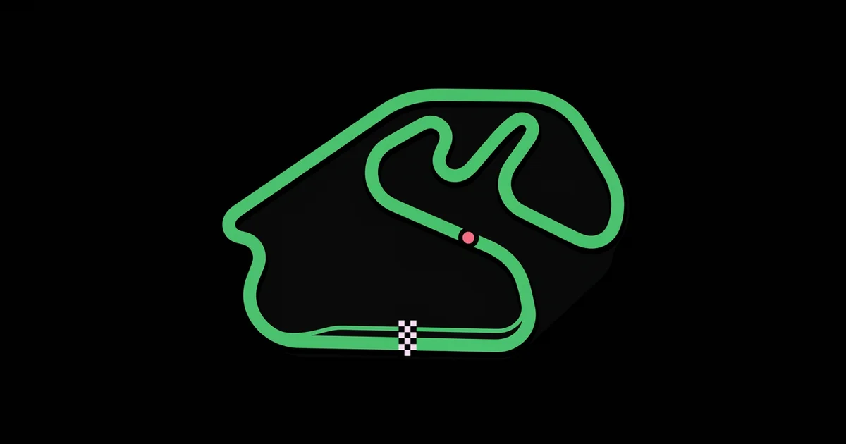
Interlagos Circuit Map Graphic Design: Poster Creation Guide
Few racetracks are as instantly recognizable in outline as Interlagos, which makes it a rewarding and unforgiving subject: every designer who knows the circuit will notice a misplaced curve. Interlagos circuit map graphic design is the process of turning the layout of the Autódromo José Carlos Pace in São Paulo, Brazil, into an accurate, stylized visual, typically a poster, print, or digital artwork, using vector tools and deliberate typography.
Quick Answer: To design an Interlagos circuit map poster, source an accurate, properly licensed reference of the layout, trace it as a single clean vector path, label key corners such as the Senna S and Junção, choose a restrained color and type system, avoid official logos, and prepare a high-resolution, print-ready file with bleed.
What Makes the Interlagos Circuit a Distinctive Design Subject?
Interlagos is distinctive because its compact, flowing layout packs dramatic shapes and elevation changes into a short lap. The circuit runs anticlockwise, which is unusual among Formula 1 venues, and its current configuration measures roughly 4.3 kilometers. Its name means "between lakes," a reference to the nearby reservoirs, and it was renamed in honor of Brazilian driver José Carlos Pace. Since 2021 it has hosted the Formula 1 event branded as the São Paulo Grand Prix, after many years as the home of the Brazilian Grand Prix.
For a designer, those facts translate into visual opportunities. The anticlockwise direction can be shown with directional arrows. The famous corners have evocative Portuguese names: the S do Senna (Senna S) at the start of the lap, Curva do Sol, the Reta Oposta back straight, Descida do Lago, Ferradura, Laranjinha, Pinheirinho, Bico de Pato, Mergulho, Junção, and the uphill run of Subida dos Boxes back toward the start-finish line. Labeling these well turns a simple outline into a piece fans want to study.
The core technical skill here is clean vector path work. If you are new to vector tools, anchor points, and curves, the beginner roadmap for learning graphic design covers the fundamentals that make a smooth track outline possible. Two terms matter immediately: a stroke is the visible line drawn along a path, and a bezier curve is a curve defined by anchor points and control handles. A circuit map lives or dies on how cleanly those curves flow.
How Do You Create an Interlagos Circuit Map Poster Step by Step?
A reliable workflow moves from accurate reference to clean geometry to typography and production. Rushing the tracing stage is the most common reason circuit posters look slightly wrong to knowledgeable viewers.
- Collect licensed references. Use reference material you are permitted to trace. OpenStreetMap data is published under the Open Database License, which allows reuse with attribution. Avoid tracing copyrighted illustrations or official maps directly.
- Set up your document. Choose your final poster size first, such as a standard A-series or inch-based poster format, and create the file with bleed. Set color mode according to whether the piece will be printed or shown on screen.
- Place and lock the reference. Put the reference on a locked, semi-transparent layer. Rotate it to your preferred orientation, keeping in mind that north-up is accurate but a rotated composition may fit the poster better.
- Trace with minimal anchor points. Use the pen tool to trace the centerline of the track with as few anchor points as possible. Fewer points produce smoother curves. Place anchors at the apex and transitions of each corner rather than randomly along the path.
- Refine curves. Adjust handles so curves flow without kinks. Zoom out frequently and compare the overall silhouette with your reference, because small errors are more visible at full view than up close.
- Apply the stroke. Give the path a consistent stroke weight with rounded joins. Consider a slightly thicker outer stroke in a contrasting color behind the main line to create depth.
- Add details. Mark the start-finish line, the pit lane as a thinner parallel path, sector divisions, and a direction-of-travel arrow.
- Label corners. Place corner names and numbers with consistent leader lines or offsets. Keep labels outside the track line so the silhouette stays clean.
- Build the composition. Add a title, location, and supporting facts such as lap length, arranged on a grid with generous margins.
- Prepare for output. Outline or embed fonts, check resolution of any raster elements, include bleed, and export a print-ready PDF.
Keep the reference layer in your working file but hidden and non-printing, so you can recheck accuracy whenever you adjust the design.
Which Poster Styles Work Best for an Interlagos Map?
Different visual styles serve different audiences and spaces, from minimalist living rooms to data-loving motorsport fans. Comparing them before you start helps you commit to a coherent direction.
| Style | Visual Approach | Best For | Design Challenge |
|---|---|---|---|
| Minimalist line | Single-weight track outline on a solid background with small type | Modern interiors, clean gift prints | Every curve must be perfect because nothing distracts |
| Technical blueprint | Fine lines, grids, corner numbers, measurements, sector markers | Engineering-minded fans and studios | Balancing density of information with readability |
| Elevation-focused | Track map paired with an elevation profile graph along the lap | Fans who love driving dynamics | Requires reliable elevation data and clear alignment |
| Bold color block | Thick track shape with flat colors inspired by Brazilian motifs | Statement wall art and event merchandise | Avoiding cliché and keeping colors harmonious |
| Historic comparison | Current layout overlaid on the longer original configuration | History enthusiasts and collectors | Sourcing accurate historic layouts and keeping overlays legible |
Whatever style you choose, keep the track the visual hero. Supporting elements such as grids, labels, and facts should never compete with the silhouette.
What Does Practitioner Experience Say About Great Circuit Map Design?
Designers who produce sports and map-based artwork tend to agree on a few principles that separate professional pieces from amateur ones. This is practitioner analysis, not a published study.
Accuracy is the foundation of credibility. Motorsport fans know these shapes intimately. A Senna S that is too wide or a Junção with the wrong angle undermines the entire piece. Overlay your finished path on the reference at multiple zoom levels before moving on to styling.
Restraint makes maps feel premium. Two or three colors, one type family, and a clear hierarchy usually outperform busy designs filled with flags, cars, and textures. The track outline itself is striking; let it breathe with ample negative space.
Typography carries the information design. Corner names in Portuguese include accented characters such as the "ç" in Junção, so choose a typeface with full Latin character support. Use one weight for corner names, another for numbers, and a clear title style, and align everything to a consistent grid.
Think about where the poster will hang. A map designed for a large wall must remain readable at a distance, while a small desk print can carry finer detail. The same principles of scale and viewing distance used in commercial spaces apply; this guide to interior graphic design for walls and signage explains how size, lighting, and placement affect large-format graphics.
Respect intellectual property. Official championship logos, team marks, and event branding are protected trademarks. Personal artwork of a circuit layout is common, but selling products that use official marks without a license can create legal risk. If you plan to sell, use your own typography and graphics, avoid official logos, and seek proper legal advice for your market.
What Mistakes Should You Avoid When Designing a Circuit Map?
Circuit map mistakes are often small in the file and obvious on the wall. Watch for these.
- Too many anchor points. Excess points create wobbly, uneven curves. Retrace problem sections with fewer, well-placed anchors.
- Tracing the outer edge instead of the centerline. Tracing track edges inconsistently distorts corner shapes. Trace the centerline and let stroke weight create the width.
- Wrong direction arrows. Interlagos runs anticlockwise. A clockwise arrow is an instant credibility killer for fans.
- Labels crossing the track. Text overlapping the outline clutters the silhouette. Place labels outside with consistent leader lines.
- Missing accented characters. Fonts without full Latin support may substitute or drop characters in names like Junção. Test all labels before finalizing.
- Using unlicensed references or logos. Tracing copyrighted maps or adding official logos can cause legal issues. Use openly licensed data and original graphics.
- Ignoring print specifications. Thin hairline strokes may disappear in print, and missing bleed causes white edges. Check minimum stroke weights with your printer and include bleed.
Walkthrough: A Minimalist Interlagos Poster From Start to Print
Here is a concrete project you can follow for a minimalist poster intended for framing at a common poster size.
Step 1: Reference. Export the circuit area from an openly licensed map source and note the attribution requirement for your credits line.
Step 2: Setup. Create the document at the chosen poster size with bleed on all sides, and define a margin grid with a generous top area for the title.
Step 3: Tracing. Trace the centerline with the pen tool, placing anchors at corner apexes and transitions. Trace the pit lane as a separate thinner path.
Step 4: Styling. Use a deep solid background, a single bright stroke for the track, and a subtle secondary color for the pit lane and start-finish marker.
Step 5: Labels and title. Add corner names in a clean sans serif with full Latin support, small corner numbers, a direction arrow, and a title block with the circuit name, city, and lap length.
Step 6: Proof. Print a scaled-down proof and a full-size crop of the densest label area. Check readability, stroke weight, and accuracy against the reference.
Final checklist:
- Track silhouette verified against the reference at multiple zoom levels
- Direction arrow shows anticlockwise travel
- All corner names render accented characters correctly
- No official logos or trademarked event branding used
- Attribution included where the reference license requires it
- Bleed included, fonts outlined or embedded, minimum stroke weights confirmed
Key Takeaways
- Interlagos circuit map graphic design depends first on an accurate, properly licensed reference of the roughly 4.3-kilometer anticlockwise layout.
- Tracing the centerline with minimal, well-placed anchor points produces smoother, more credible curves than tracing track edges.
- Corner labels such as the Senna S, Curva do Sol, and Junção add depth but require a typeface with full Latin character support.
- Restrained palettes and typography let the iconic track silhouette remain the visual hero of the poster.
- Avoid official logos and trademarked branding, especially for any artwork you plan to sell.
Frequently Asked Questions
How long is the Interlagos circuit?
The current Interlagos layout, officially the Autódromo José Carlos Pace in São Paulo, measures roughly 4.3 kilometers per lap and runs anticlockwise. The original configuration was considerably longer before being shortened. When stating lap length on a poster, verify the figure with an authoritative current source.
What are the famous corners at Interlagos?
Famous sections include the S do Senna at the start of the lap, Curva do Sol, the Reta Oposta back straight, Descida do Lago, Ferradura, Laranjinha, Pinheirinho, Bico de Pato, Mergulho, Junção, and the uphill Subida dos Boxes leading back to the start-finish line. These names make excellent poster labels.
Can I legally sell an Interlagos track map poster?
Many artists sell original circuit layout artwork, but legal risk depends on what you include and where you sell. Avoid official championship logos, event branding, and team marks, use openly licensed or self-created references, and consult a qualified legal professional before selling commercially in your market.
What software is best for designing a circuit map?
Vector illustration software is best, because track outlines need smooth, scalable curves. Any professional vector application with a reliable pen tool, stroke controls, and layer management will work. Free vector editors are also capable for personal projects, provided they support precise bezier editing and print-ready PDF export.
Where can I find an accurate Interlagos map to trace?
OpenStreetMap is a strong option because its data is openly licensed under the Open Database License, which permits reuse with attribution. Avoid tracing copyrighted illustrations or official circuit graphics. Always cross-check your traced shape against multiple references to confirm corner angles and proportions.
What resolution should a circuit map poster be for print?
Build the track and typography as vectors so they print sharply at any size. Any raster elements, such as textures, should generally be around 300 pixels per inch at final print size. Include bleed, confirm minimum stroke weights with your printer, and export a print-ready PDF.
Conclusion
The decision that matters most is committing to accuracy before style, because a beautifully colored but slightly wrong Interlagos outline will never satisfy the fans it is made for. Trace carefully, label thoughtfully, keep the design restrained, and respect licensing. Personal projects like this one sharpen skills and keep creative energy alive, so your next step is to explore how to channel that energy into professional growth with the guide on making graphic design passion a lasting career.