Iconography Graphic Design: Build Clear Icon Systems
An icon set fails long before anyone notices it looks inconsistent. It fails at the moment someone draws the second icon without writing down the rules used for the first. Iconography in graphic design is the practice of creating small symbolic graphics that communicate meaning at limited size, and the discipline is almost entirely about constraint definition rather than drawing skill.
Quick Answer: A usable icon system is built on a fixed pixel grid, a consistent stroke weight, shared corner and terminal rules, and tested metaphors. Define these constraints before drawing the second icon, because consistency is impossible to retrofit once a set grows past a handful of symbols.
What Makes an Icon Work at Small Size
An icon has one job: to be recognised faster than a word can be read. Everything else is subordinate to that.
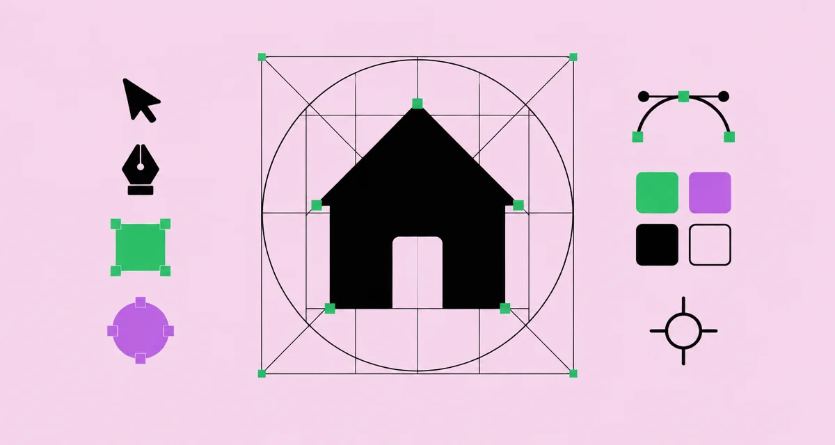
The essential vocabulary. The icon grid is the fixed canvas, commonly a square, on which every icon is constructed. Keylines are the shapes inside that grid, typically a square, circle and rectangles, that define how much area different icon forms may occupy so a circular icon appears the same visual size as a square one. Stroke weight is the line thickness used throughout the set. Optical alignment means adjusting position by eye rather than mathematically, because geometric centring often looks wrong. Metaphor is the real-world object or concept the icon references.
The constraint that governs everything is size. An icon rendered at sixteen or twenty-four pixels has very little room for detail, so each additional element competes for the same few pixels. This is why professional sets reduce objects to their most recognisable silhouette rather than depicting them accurately. A camera icon is not a drawing of a camera; it is the smallest set of shapes that reliably triggers the idea of one.
Recognition also depends on cultural familiarity rather than logic. The floppy disk save icon persists because it is learned, not because it makes sense to anyone under thirty. Replacing a learned metaphor with a more logical one usually reduces comprehension, which is a genuinely counterintuitive lesson. The same restraint-under-constraint thinking that governs grid-based layout, described in this guide to Swiss design principles, applies here at a much smaller scale.
The Rules You Must Define Before Drawing
- Grid size. Choose one base canvas, commonly twenty-four units square, and design everything on it. Multiples of it handle larger sizes.
- Live area and padding. Define how much of the grid icons may occupy. Padding prevents icons from touching adjacent interface elements.
- Keyline shapes. Establish the square, circle and rectangle boundaries so different shaped icons read at equal visual weight.
- Stroke weight. One weight across the set, aligned to the pixel grid so lines render crisply rather than blurred across half pixels.
- Corner radius. A single radius value for outer corners and a rule for inner corners. This is the detail that most visibly separates professional sets from amateur ones.
- Terminals and joins. Decide whether line ends are square or round and apply it universally, including where strokes meet.
- Angle discipline. Restrict diagonals to a small set of angles, typically forty-five degrees and one or two others, so the set feels drawn by one hand.
Write these down in a document before drawing icon number two. Icon systems degrade through accumulated small exceptions, and a written rule set is the only practical defence.
Icon Styles and Where Each Fits
| Style | Characteristics | Best Used For | Main Weakness |
|---|---|---|---|
| Outline or stroke | Consistent line weight, open forms | Interfaces with dense information | Can lose clarity at very small sizes |
| Solid or filled | Closed shapes, strong silhouette | Navigation and active states | Heavier visually, less refined in quantity |
| Duotone | Two tones separating primary and secondary forms | Marketing pages and feature sections | Requires careful contrast control |
| Rounded | Soft corners and terminals | Consumer products with a friendly tone | Can read as unserious for technical tools |
| Geometric flat | Constructed from basic primitives | Brand illustration and editorial support | Metaphors can become too abstract to read |
Choosing a style is a brand decision, but pairing outline icons for inactive states with solid versions for active states is a widely used, practical convention worth knowing.
Metaphor Testing: The Step Everyone Skips
The hardest part of icon design is not drawing, it is choosing what to draw. Here is where practitioner experience diverges most sharply from the tutorials.
Abstract concepts are where sets fail. Drawing a printer is trivial; drawing settings, sync, permissions or analytics is not, because those have no single physical referent. The usual outcome is a visually attractive symbol that nobody understands, which is worse than no icon at all because it occupies space and creates false confidence.
The test I use is simple and cheap. Show each icon at its real display size, with no label and no surrounding context, to five people who were not involved in making it. Ask what they think it does. If three or more get it wrong, the metaphor is broken, regardless of how well drawn it is. This takes fifteen minutes and prevents shipping symbols that quietly confuse users for years.
Two practical conclusions follow from running that test repeatedly. First, conventional metaphors beat original ones almost every time. Users recognise a learned symbol faster than a cleverer new one, so innovation in icon metaphor is usually a cost rather than a feature. Second, ambiguous icons should carry text labels. Research and practice in interface design consistently favour pairing icons with labels for anything beyond a small set of near-universal symbols such as search, close and play.
Accessibility follows directly from this. An icon used as a meaningful control needs an accessible name available to assistive technology, because a shape alone conveys nothing to a screen reader. Purely decorative icons should be hidden from that layer instead. This is a design specification decision, not merely an implementation detail, and it belongs in your documentation alongside the visual rules. The same specification discipline applied to broader interface work is covered in this guide to web design workflow.
Common Mistakes in Icon System Design
Drawing at the wrong size. Designing at large scale and shrinking produces icons that are illegible at display size. Design at the size of actual use and zoom in to work.
Mixing stroke weights. The most visible inconsistency in any set. One weight, applied universally, including inside enclosed shapes.
Ignoring pixel alignment. Strokes positioned on half pixels render soft. Align to whole units on the base grid so edges stay crisp.
Inconsistent visual weight. A detailed icon next to a sparse one looks wrong even when both follow the grid. Balance the amount of drawn material across the set.
Over-detailing. Every extra element reduces recognition speed. If removing a detail does not change comprehension, remove it.
No naming convention. Files called icon-final-2 make a set unusable in a codebase. Use predictable, semantic names and keep them stable.
Skipping the documentation. Without written rules, every future contributor will introduce their own defaults and the set will drift within months.
Building a Set From Scratch: A Worked Process
Step one: inventory the needs. List every concept requiring an icon, grouped by function. Do this before drawing, because the list determines whether your style choice can carry the whole set.
Step two: identify the hard ones. Mark the abstract concepts. Design three of these first, not last. If your style cannot express difficult concepts clearly, you need to discover that before drawing forty easy icons.
Step three: define the constraint document. Grid, live area, keylines, stroke weight, corner radius, terminals and permitted angles. One page, written down and shared.
Step four: build a reference trio. Design one simple icon, one medium and one hard. These three become the benchmark every later icon is compared against.
Step five: draw in batches by visual family. All circular icons together, all rectangular ones together. Batching maintains consistency far better than working through the list alphabetically.
Step six: review the full set at display size. Lay every icon out on a single board at actual size. Inconsistencies in weight and density become obvious immediately at this scale and are invisible when zoomed in.
Step seven: run the unlabelled comprehension test. Five people, no context, no labels. Redraw anything that fails and retest.
Step eight: name, export and document. Consistent semantic naming, scalable vector export with strokes converted appropriately, and a written guide covering usage, sizing, spacing and accessibility naming.
A worked example from a product set: the brief required forty icons including several abstract ones such as permissions, sync status and audit history. We designed those three first and immediately discovered that the chosen thin stroke weight could not carry the necessary detail at small size without becoming mush. Changing the weight at icon three cost an hour. Discovering it at icon thirty-five would have cost a week of redrawing, which is precisely why the hard concepts belong at the start of the process rather than the end.
Key Takeaways
- Define the grid, stroke weight, corner radius and terminal rules in writing before drawing the second icon, because consistency cannot be retrofitted.
- Design at the actual display size rather than large and scaled down, since detail that survives at large scale disappears at small size.
- Draw the abstract, difficult concepts first to verify your chosen style can express them before committing to the whole set.
- Test every icon unlabelled with people who did not make it, and treat conventional metaphors as safer than original ones.
- Accessible naming for meaningful icons is a design specification, not an implementation afterthought, and belongs in your documentation.
Frequently Asked Questions
What grid size should I use for icons?
A twenty-four unit square canvas is a widely used base that divides cleanly and supports common display sizes. What matters most is choosing one base grid and building the entire set on it, along with defined keyline shapes so differently shaped icons read at equal visual weight.
Should icons be outline or filled?
Outline icons suit dense interfaces and feel lighter, while filled icons have stronger silhouettes and work well for active or selected states. A common approach pairs both, using outline for the default state and the filled version to indicate selection.
How do I keep icons consistent across a large set?
Write the rules down, build a reference trio of easy, medium and hard icons as benchmarks, draw in batches by visual family, and review the full set at display size on one board regularly. Drift happens gradually, so periodic full-set review is essential.
Do icons always need text labels?
Anything beyond a small group of universally learned symbols benefits from a label. Icons alone are frequently misinterpreted, and a short text label costs little space while substantially improving comprehension, particularly for abstract functions.
How should icons be exported for a product?
Export as scalable vector graphics with consistent naming, appropriate stroke handling and no unnecessary transforms or hidden layers. Provide the base size and confirm that the file renders crisply at the smallest intended display size before handover.
How many icons should a set start with?
Start with only the icons you actually need now plus the three hardest concepts you anticipate. Large speculative sets waste effort on symbols that never ship and make consistency harder to maintain as the real requirements emerge.
Conclusion
The decision that determines whether an icon system succeeds is drawing the hardest, most abstract concepts first, because they reveal whether your constraints can carry the whole set while changing course is still cheap. Every drifting, inconsistent icon library began with someone drawing the easy symbols first and improvising later. Your next step is to write the one-page constraint document and design your three hardest icons against it this week. Then test how those constraints hold inside a full layout system using the grid approach in this guide to grid systems.