Graphic Design T Shirt Guide: Art That Survives the Press
A graphic design t shirt is not a poster printed on cotton. The substrate stretches, the ink sits on top of a textured surface rather than soaking into a smooth one, the garment is viewed on a moving three-dimensional body, and the whole thing has to survive fifty wash cycles. Designers who move from print to apparel usually produce their first unwearable design because they optimised for how the artwork looks flat on screen instead of how it behaves on fabric. Getting this right is mostly about understanding the printing method before drawing anything.
Quick Answer: Designing a t shirt graphic means building artwork around the printing method, garment colour, and print area. Screen printing rewards limited flat colours and bold shapes, direct-to-garment handles full-colour detail on cotton, and vinyl suits simple solid graphics. Design at full size, keep minimum line weights generous, and always test on the actual garment colour.
Printing Methods Decide Your Design, Not the Other Way Round
The single most useful habit in apparel design is choosing the print method first and designing within its constraints. Each method changes what artwork is possible, what it costs, and how it wears.
Screen printing pushes ink through a mesh stencil, one screen per colour. It gives the most durable, opaque result and the best hand-feel when done well, and it is the cheapest method at volume. Its constraint is colour count: every additional colour means another screen, another setup, and another registration risk. Screen printing rewards designs built from flat spot colours, bold shapes, and deliberate use of the garment colour as a design element. Halftones can simulate gradients, but coarse dots are part of the aesthetic rather than a defect to be hidden.
Direct-to-garment (DTG) sprays water-based ink directly onto the fabric like an inkjet printer. It handles unlimited colours, photographic detail, and gradients with no setup cost, which makes it ideal for one-offs and small runs. Its constraints are real: it performs best on high-cotton-content garments, requires a white underbase on dark shirts which changes the hand-feel, and typically produces less vivid, less durable results than screen printing over many washes.
Heat transfer vinyl (HTV) cuts solid shapes from coloured vinyl film and heat-presses them onto the garment. Excellent for names, numbers, simple logos, and very small quantities. It cannot do gradients or fine detail, and large solid areas sit on top of the fabric with a noticeable plastic feel and reduced breathability.
Sublimation dyes the fibres themselves, producing a graphic with zero hand-feel that will never crack or peel — but it only works on polyester and only on light garments, because the dye is translucent.
Embroidery is not printing at all, but it competes for the same brief. It carries premium perception and extreme durability, and it demands radical simplification: no gradients, no fine text, and stitch-count driven pricing.
The vocabulary here trips people up constantly — underbase, registration, halftone, hand-feel, bleed, spot colour. Being fluent in it changes how printers treat you, and it is worth a pass through the production vocabulary every designer is expected to know before your first quote conversation, because a printer explaining registration tolerance will not stop to define it.
Designing Artwork That Works on Fabric
These are the practical rules that separate printable apparel artwork from flat graphics that fail at the press.
- Design at 100 percent of final print size. A typical adult front print is roughly 280 to 300 mm wide. Designing small and scaling up hides detail problems. Raster elements should be 300 dpi at final size.
- Build in vector wherever possible. Vector artwork separates cleanly into spot colours for screen printing, scales across garment sizes, and converts to cut paths for vinyl. Keep a layered master with each colour on its own named layer.
- Respect minimum weights. Fine lines below roughly 0.5 to 1 point can break up or disappear, especially on textured or ribbed fabric. Small text under about 8 points fills in on screen printing. When in doubt, thicken it.
- Design for the garment colour, not white. Place your artwork on a swatch of the actual shirt colour from the first minute. A design that sings on white can vanish on heather grey. If the product comes in five colours, mock all five before finalising.
- Use the garment as a colour. Knocking out shapes so the fabric shows through reduces ink coverage, improves hand-feel, and often looks more considered than printing a background.
- Add a trap or choke when colours meet. Screen printing has registration tolerance, so adjacent colours need slight overlap or a keyline to prevent white gaps if a screen shifts a fraction.
- Convert all type to outlines before sending. This avoids font substitution disasters and is standard practice for every printer.
- Supply files correctly. Transparent background, actual print dimensions, colour separations if screen printing, spot colours specified by a recognised matching system, and a flat visual mockup so the printer can see the intent.
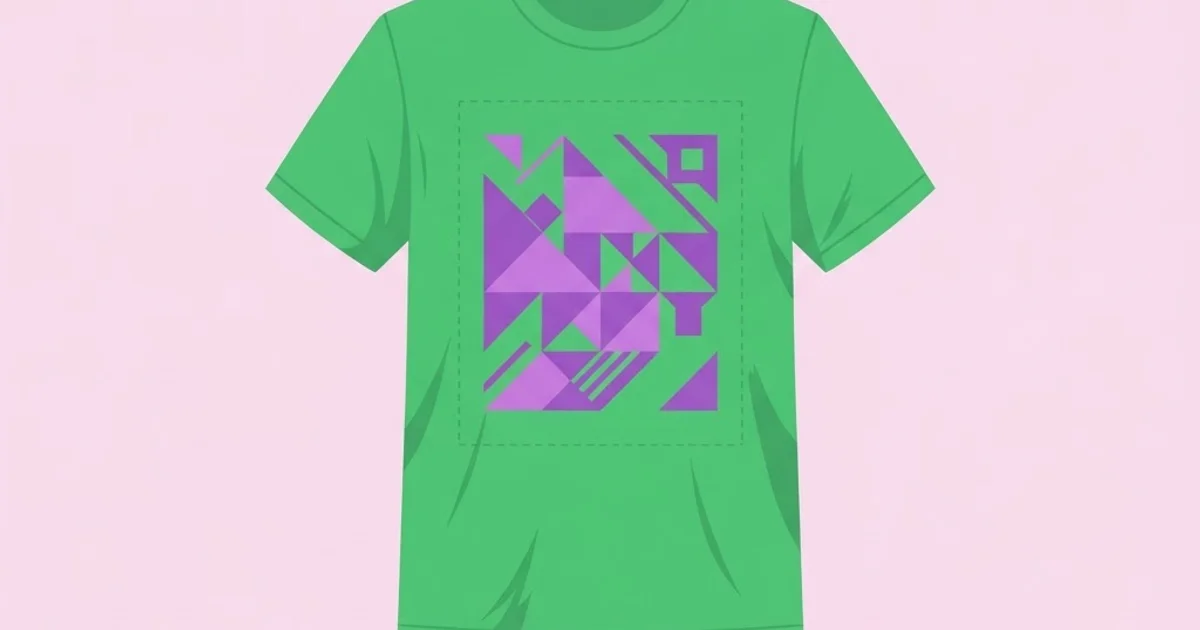
- Consider placement deliberately. Centre chest, left chest, oversized front, back print, sleeve, and hem all read differently on a body. Drop the print roughly 50 to 75 mm below the collar for a standard front placement — artwork sitting too high is the most common amateur tell.
Choosing a Print Method
Match the method to the run size, the artwork, and the garment.
| Method | Best run size | Artwork it suits | Main limitation |
|---|---|---|---|
| Screen printing | Medium to large | Flat spot colours, bold shapes | Cost rises with each colour |
| Direct-to-garment | One-off to small | Photographic, full colour, gradients | Needs high cotton content, softer durability |
| Heat transfer vinyl | One-off to small | Solid simple shapes, text, numbers | No gradients, plastic hand-feel |
| Sublimation | Any | All-over prints, vivid full colour | Polyester and light garments only |
| Embroidery | Small to medium | Simplified marks, limited thread colours | No fine detail, priced by stitch count |
A practical rule: below about twenty-five pieces, DTG or vinyl usually wins on cost. Above that, screen printing's per-unit economics take over quickly, and the durability advantage compounds.
What Separates Shirts People Wear From Shirts People Own
Here is the distinction that matters commercially, offered as practitioner analysis. A shirt that gets bought once is a graphic. A shirt that gets worn weekly is a piece of identity. The design decisions that produce the second are not the ones that produce the first.
Wearability beats cleverness. A design that is very funny the first time becomes embarrassing by the fourth wear. Designs with visual interest but lower literal specificity — a mark, a pattern, an abstracted reference — stay in rotation far longer. This is why band merchandise has moved steadily toward symbolic marks rather than tour-date backs.
Print size signals category. Small left-chest prints read as considered and wearable in professional-adjacent settings. Large front prints read as statement or streetwear. Oversized prints extending past the natural chest area read as fashion. None is better, but mismatching the size to the audience kills sales.
Hand-feel drives repeat wear more than appearance. A heavy plastisol slab across the whole chest is hot, stiff, and cracks. Water-based or discharge inks soak into the fibre and feel like nothing, which is why premium apparel leans on them. If your buyer will wear the shirt in summer, ink choice is a design decision, not a production afterthought.
The garment itself is half the product. Fabric weight, fit, shoulder construction, and collar quality determine whether someone reaches for the shirt. A brilliant graphic on a boxy, thin, poorly cut blank will underperform a modest graphic on a good one. Specify the blank as carefully as the artwork.
Systems outperform one-offs for brands. If you are designing apparel as part of an identity rather than a single product, build a small family — a primary mark, a secondary graphic, and a repeating element — with shared geometry. The same discipline that makes repeating brand graphics hold together across surfaces applies directly here, because a coherent apparel range sells better than five unrelated designs competing for the same buyer.
Mistakes That Ruin T Shirt Designs
Designing on a white canvas for a black shirt. Everything about contrast, ink opacity, and underbase changes. Always work on the real garment colour.
Too many colours for the budget. Six-colour screen print setups on a fifty-piece run destroy the economics. Ask the run size and budget before concepting, then design to a colour count.
Fine detail that cannot survive the mesh. Hairlines, tiny text, and delicate serifs fill in or break up. Test by printing your artwork at actual size on paper and viewing it from two metres.
Ignoring the wash test. Cracking, fading, and peeling happen after delivery, which is when your reputation is exposed. Ask the printer for a sample and wash it several times before approving a production run.
Placement guessed rather than measured. Prints too high, too low, or off-centre are immediately visible on a body and invisible on a flat mockup. Specify placement in millimetres from the collar seam.
Stretching artwork over a seam or pocket. Anything crossing a seam, zip, or pocket will print unevenly. Keep artwork within the flat printable area.
Using unlicensed fonts or imagery. Apparel is commercial merchandise, and many font licences and stock image licences explicitly exclude resale products. Check the licence terms before, not after, you print two hundred units.
Scaling one print size across all garment sizes. A print sized for XL looks enormous on XS. Most printers can run two or three artwork sizes across the size range; ask.
Taking a Design From Sketch to Delivered Shirts
Here is the end-to-end process, with the decisions in the order they actually need making.
Step 1 — Define the commercial constraints. Run size, budget per unit, garment colours, target audience, and where the shirt will be worn. These four answers eliminate most design directions before you waste time on them.
Step 2 — Pick the method and colour count. With the constraints known, choose screen, DTG, vinyl, or embroidery, and fix a maximum colour count. Write it at the top of your working file so you cannot drift.
Step 3 — Specify the blank. Choose the garment before finalising artwork. Weight in grams per square metre, fit, and fabric composition all affect what prints well. A 180 gsm ring-spun cotton behaves differently from a 150 gsm poly-cotton blend.
Step 4 — Concept in black and white first. If a design does not work as a single-colour silhouette, colour will not save it. This also gives you a free one-colour variant for cheaper runs and embroidery.
Step 5 — Build at final size on the garment colour. Vector master, colours on named layers, type outlined, minimum weights respected, traps added where colours meet.
Step 6 — Mock up on a real body. Not a flat lay. Apply the artwork to a photograph of someone wearing the actual garment, at the actual placement. Problems with scale and placement become obvious instantly.
Step 7 — Get a physical sample and wash it. Print one, wear it, wash it three or four times, and inspect for cracking, colour shift, and hand-feel. This step is skipped constantly and is the single best predictor of whether customers come back.
Step 8 — Approve production with written specifications. Garment code and colour, print method, ink type, colour references, print dimensions, placement measured from the collar seam, and artwork size variations by garment size. Anything left verbal will be interpreted, and interpretation is where two hundred wrong shirts come from.
A worked example. A coffee roaster wants 150 staff and retail shirts. Constraints: two garment colours, modest budget, worn daily in a warm environment. That points to screen printing with water-based ink for breathability, two colours maximum, small left-chest placement for staff wear, and a larger back print for retail. The artwork derives its geometry from the existing wordmark, the second colour is used only as a supporting accent, and the garment colour is knocked out through the mark to reduce coverage. A physical sample is washed five times before the run is approved. That is an unremarkable, professional process, and it produces shirts people actually wear.
Key Takeaways
- Choose the printing method before designing, because screen printing, DTG, vinyl, sublimation, and embroidery each impose different limits on colour, detail, and durability.
- Always design on the actual garment colour at full print size, since contrast, ink opacity, and underbase behaviour change completely between white and dark fabrics.
- Hand-feel and garment quality drive repeat wear more than the graphic itself, so ink type and blank specification are design decisions rather than production afterthoughts.
- Below roughly twenty-five pieces DTG or vinyl usually wins on cost, while screen printing's per-unit economics and durability take over quickly above that threshold.
- Wash a physical sample several times before approving a production run, as cracking and fading only appear after delivery when your reputation is already exposed.
Frequently Asked Questions
What size should a t shirt graphic be?
A standard adult front print is roughly 280 to 300 mm wide, with the top of the artwork sitting about 50 to 75 mm below the collar seam. Left-chest prints are typically 80 to 100 mm wide. Ask your printer for two or three artwork sizes across the garment size range.
What file format do t shirt printers need?
Vector files with outlined type are preferred, supplied at actual print size with a transparent background and colours separated onto named layers. For photographic artwork going to DTG, supply 300 dpi raster at final size. Always include a flat mockup showing intended placement.
Is screen printing better than DTG?
They solve different problems. Screen printing gives superior opacity, durability, and per-unit cost at volume, with a limited colour count. DTG handles unlimited colours and photographic detail with no setup cost, making it the right choice for one-offs and small runs on cotton garments.
How many colours should a t shirt design use?
For screen printing, two or three colours covers most strong designs and keeps setup costs sensible. Using the garment colour as one of your tones reduces ink coverage and improves hand-feel. Only go higher when the run size justifies the additional screens.
Why do printed t shirt graphics crack?
Cracking usually comes from thick plastisol ink layers that sit on top of the fabric and cannot flex with it, insufficient curing, or heavy coverage over a stiff underbase. Water-based and discharge inks penetrate the fibre and flex with the garment, which largely eliminates the problem.
Can I use any font on a t shirt I sell?
No. Many font licences restrict use on merchandise for resale, and the same applies to stock illustrations and photographs. Check the licence terms for commercial merchandise use before production, since discovering the restriction after printing a run is an expensive and avoidable problem.
Conclusion
The decision that determines whether an apparel graphic succeeds is made before the first shape is drawn: choosing the print method and colour count against a known run size and audience. Everything downstream — line weights, traps, placement, ink choice — follows from that decision, and designs made without it tend to be beautiful on screen and unprintable in practice.
Your next step is a single test: take an existing design of yours, place it on a dark garment colour at actual print size, and reduce it to two flat colours. What survives is the design. If you plan to do this regularly, make sure your setup supports it — knowing which vector and colour tools work best on a Mac matters here, because clean colour separation and accurate spot-colour handling are exactly where weaker software costs you a reprint.