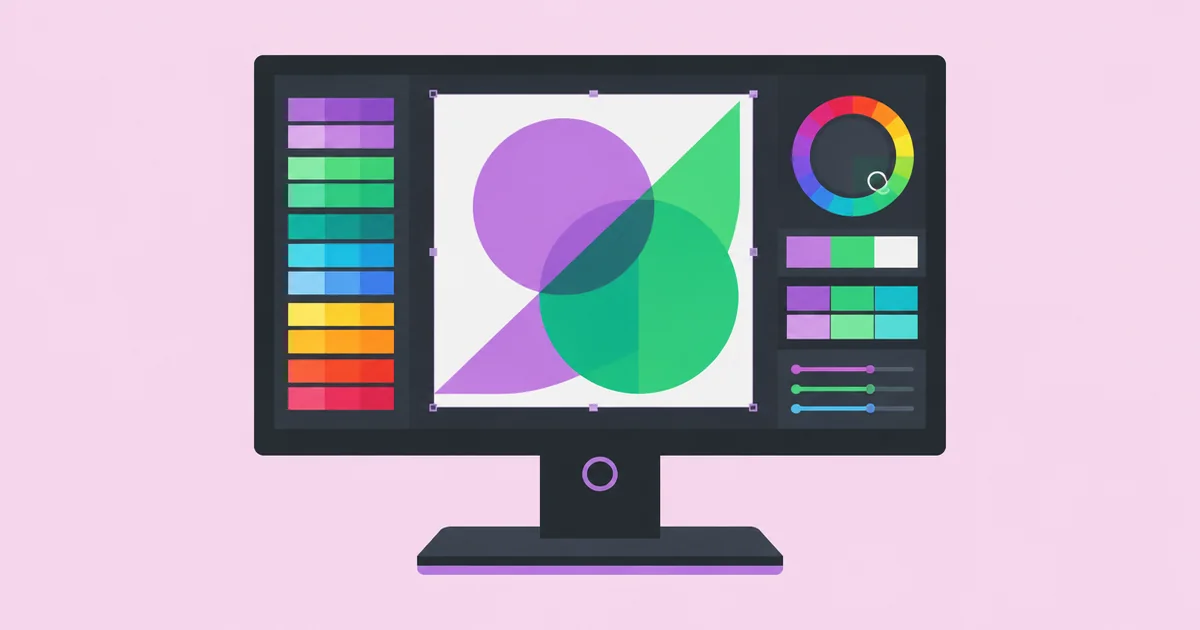
Graphic Design Monitor: How To Pick A Color-True Screen
A designer’s monitor acts as the primary lens through which every creative decision is filtered, making it the most critical hardware investment in a modern studio. A high-quality graphic design monitor is a professional-grade display engineered to reproduce colors with extreme accuracy, covering specific color spaces like sRGB and Adobe RGB while maintaining consistent brightness and contrast across the entire panel. When the screen lies about a shade of navy or hides a subtle gradient banding, the final print or digital hand-off will inevitably fail to meet professional standards.
Quick Answer: To select the best graphic design monitor, prioritize an IPS panel with at least 99% sRGB coverage and a Delta E value below 2.0. Aim for a 4K resolution at 27 to 32 inches to ensure pixel density, and verify the display supports hardware calibration to maintain long-term color fidelity for professional client work.
The Foundation of Color Fidelity and Display Terminology
Understanding the vocabulary of display technology is the first step toward making an informed purchase that will last for years of professional use. The core of any graphic design monitor is its panel type, which dictates how light and color are transmitted to your eyes. In the professional design world, In-Plane Switching (IPS) is the undisputed standard because it offers the widest viewing angles and the most stable color reproduction. If you tilt your head or move slightly to the side on a cheaper TN (Twisted Nematic) or VA (Vertical Alignment) panel, the colors will shift or wash out, leading to critical errors during the retouching process.
Color gamut is the next pillar of monitor selection, representing the range of colors a screen can actually display. Most consumer screens focus on sRGB, which is the standard for web content. However, designers working in print need monitors that can handle the broader Adobe RGB spectrum, which includes more saturated greens and cyans that are achievable in high-end CMYK printing. Professionals who manage complex branding projects often find that when they delegate design tasks to external partners, having a shared standard for color gamut is the only way to ensure the final assets remain consistent across different studios and production houses.
Delta E (dE) is a metric that every designer should memorize. It measures the difference between a displayed color and the "true" mathematical color value. A Delta E of less than 1.0 is generally considered invisible to the human eye, while a value between 1.0 and 2.0 is the professional benchmark for design work. Anything higher than 3.0 becomes noticeable to clients and can lead to expensive reprints or brand inconsistencies. When reviewing monitor specifications, always look for a factory calibration report that guarantees a low Delta E out of the box.
Essential Features for Professional Design Workflows
Building a workstation requires more than just high resolution; it requires a toolset that supports the physical and technical demands of long-form creative production. A professional display must provide a stable environment where environmental factors like glare and flicker are minimized to prevent eye strain and color misinterpretation. Below are the functional requirements that separate a gaming or office screen from a true creative powerhouse:
- Bit Depth (8-bit vs. 10-bit): Standard monitors are 8-bit, displaying roughly 16.7 million colors. A true professional monitor is 10-bit, capable of displaying over 1 billion colors, which eliminates "banding" in soft gradients and sky highlights.
- Contrast Ratio and Black Levels: While OLEDs offer infinite contrast, high-end IPS panels with local dimming zones provide the best balance for static graphic design, ensuring that dark charcoal tones don't just disappear into a muddy black.
- Connectivity and Power Delivery: Modern monitors often use a single USB-C or Thunderbolt cable to transmit video data, USB hub connectivity, and laptop charging (Power Delivery), which reduces clutter and simplifies the setup.
- Screen Uniformity: Professional monitors include internal compensation logic to ensure that the brightness and color at the far corners of the screen are identical to the center, preventing "hot spots" that ruin layout balance.
- Matte vs. Glossy Finishes: A matte coating with anti-reflective properties is generally preferred for design to diffuse reflections from studio lighting, though it must be high-quality to avoid a "grainy" appearance on the white canvas.
Resolution also plays a vital role in the ergonomics of design. While 1080p is sufficient for basic office tasks, a 4K (3840 x 2160) resolution on a 27-inch screen provides the pixel density required to see fine typography details and sharp vector paths. This allows you to view a full-sized A4 layout alongside your software panels without constantly zooming in and out, which significantly improves the speed and flow of your creative process.
Comparison of Professional Monitor Categories
Choosing a monitor often involves balancing budget against specific technical requirements like color space and panel size. The following table outlines how different tiers of displays serve different professional needs within the design industry.
| Monitor Tier | Primary User | Color Accuracy | Standard Size |
|---|---|---|---|
| Entry-Level Pro | Junior Web Designers | 99% sRGB / Delta E < 3.0 | 24-inch 1440p |
| Mid-Range Workhorse | Brand & UI Designers | 100% sRGB / 90% DCI-P3 | 27-inch 4K |
| High-End Production | Print & Photo Specialists | 99% Adobe RGB / 10-bit | 32-inch 4K |
| Reference Grade | Colorists & Art Directors | Hardware Calibrated / 3D LUT | 32-inch 6K |
Practitioner Analysis: The Reality of Hardware Calibration
In my experience managing creative teams, the biggest misconception is that a high-end monitor stays "color-true" forever. In reality, all monitors drift over time as the backlighting components age and the liquid crystals respond differently to heat and usage. This is why hardware calibration is not an optional luxury but a fundamental requirement for anyone providing professional design services in a competitive market. Relying solely on the factory calibration is a risk that increases every month the monitor is in use.
Hardware calibration involves using a colorimeter—a small device that hangs over the screen—to measure the output and compare it against known color values. The crucial distinction for designers is whether the calibration results are stored in the computer's graphics card (software calibration) or directly in the monitor's internal hardware (hardware calibration via a Look-Up Table or LUT). Hardware-based calibration is superior because it provides a more precise adjustment without sacrificing the monitor's dynamic range or bit depth. It ensures that the white point and gamma remain locked, regardless of which computer is plugged into the screen.
Furthermore, the environment surrounding the monitor is just as important as the screen itself. A common mistake is placing a color-accurate monitor next to a bright window with changing natural light or under warm, yellow household bulbs. Professional studios often use "neutral gray" walls and controlled 5000K lighting to ensure the eye isn't tricked by the surrounding environment. If your room lighting changes throughout the day, your perception of the colors on the screen will change too, leading to inconsistent edits between morning and afternoon sessions.
Common Mistakes When Choosing a Graphic Design Monitor
The most frequent error I see designers make is chasing high refresh rates—like 144Hz or 240Hz—at the expense of color accuracy. While these high refresh rates are excellent for gaming and video playback, they offer almost no benefit for static graphic design. In fact, many high-refresh panels use technology that sacrifices color depth or uniformity to achieve that speed. A designer is almost always better off with a stable 60Hz panel that offers 10-bit color and 100% Adobe RGB coverage than a fast gaming monitor that struggles with green-to-yellow transitions.
Another mistake is ignoring the "Pixel Per Inch" (PPI) ratio. A 32-inch monitor with only 1080p resolution will result in blurry text and visible pixels, which makes it impossible to judge the sharpness of a logo or the kerning of a font. For a 27-inch monitor, 1440p (QHD) is the minimum acceptable resolution, while 4K is the ideal. If you move up to a 32-inch screen, 4K becomes the absolute minimum. When the PPI is too low, you end up over-sharpening your images because they look soft on your screen, only to find they look harsh and brittle on a client's high-resolution mobile device.
Finally, many practitioners overlook the importance of the monitor's stand and ergonomic adjustments. Designing is a sedentary, long-hour profession. A monitor that cannot be adjusted for height, tilt, and swivel forces the designer into awkward postures, leading to neck strain and fatigue. A professional monitor should also offer a "portrait mode" (90-degree rotation), which is incredibly useful for designing long-form mobile interfaces, posters, or skyscraper web banners. If the monitor you want has a static stand, ensure it has a VESA mount so you can attach it to a high-quality articulating arm.
Implementation Walkthrough: Setting Up Your Design Display
Once you have selected and unboxed your monitor, the setup process determines whether you actually see the colors the manufacturer promised. Follow this sequence to ensure your workspace is technically sound and ready for production-level work.
First, connect your monitor using the highest bandwidth cable available. For 4K 10-bit color, you should use DisplayPort 1.4 or Thunderbolt 3/4. Avoid older HDMI cables, as they may limit your refresh rate to 30Hz or compress the color signal, leading to a "washed out" look. Once connected, go into your operating system settings and ensure the resolution is set to "Native" and the refresh rate is at least 60Hz. If you are on a Mac, ensure that "True Tone" and "Night Shift" are disabled, as these features intentionally distort colors to make the screen easier on the eyes, which is catastrophic for design work.
Next, perform an initial calibration. If your monitor comes with proprietary calibration software, use that in conjunction with your colorimeter. Set your target white point to D65 (6500K), which is the standard for web and most digital design, or D50 (5000K) if you are working exclusively for high-end offset printing. Set your brightness (luminance) between 100 and 120 cd/m2. Most designers keep their screens far too bright, which makes their designs look dark and muddy when viewed on other devices or when printed. Calibrating to a lower, standardized brightness ensures your "whites" are realistic.
Lastly, create a viewing environment that supports your hardware. Use a monitor hood if you have light spilling from the side, which prevents glare and improves perceived contrast. When working on critical color grading or brand identity projects, try to work in a room with dimmed, neutral lighting. Regularly clean the screen with a dry microfiber cloth; oil and dust build-up can create a "haze" that affects your perception of fine detail and subtle textures in your artwork.
Key Takeaways
- Prioritize IPS Panels: Only In-Plane Switching technology provides the viewing angles and color stability required for professional-grade design work.
- Target 10-Bit Color: Avoid 8-bit panels to prevent gradient banding and ensure you can visualize the full depth of high-resolution photography and complex illustrations.
- Understand Your Gamut: If you work in print, 99% Adobe RGB is mandatory; for web-only work, a perfect 100% sRGB coverage is the baseline.
- Invest in Calibration: Hardware-level calibration is the only way to counteract the natural color drift of a monitor over its lifespan.
- Balance Size and Resolution: Maintain a high PPI by choosing 4K resolution for screens 27 inches and larger to ensure crisp typography and UI elements.
Frequently Asked Questions
Is a curved monitor good for graphic design?
Curved monitors are generally not recommended for graphic design because the physical curve distorts straight lines, making it difficult to judge perspective and geometric alignment. While they are immersive for gaming, designers need a flat plane to ensure that vertical and horizontal lines appear perfectly straight and undistorted.
Do I really need a 4K monitor for design?
While you can design on a 1440p screen, a 4K monitor provides a significant advantage in pixel density. It allows you to see the fine details of your work and provides more screen real estate for software toolbars, which increases productivity and reduces the need for constant zooming.
What is the difference between sRGB and Adobe RGB?
sRGB is the standard color space for the web and most consumer electronics. Adobe RGB is a wider color space that includes more tones in the green and cyan spectrum, making it essential for designers who prepare files for professional printing and need to see colors that sRGB cannot represent.
Should I use a glossy or matte screen?
Matte screens are preferred by most designers because they reduce reflections and glare from office lights. However, a high-quality glossy screen can offer deeper blacks and more vibrant colors. If you choose glossy, you must have complete control over the lighting in your workspace to avoid distracting reflections.
Is an OLED monitor worth it for graphic designers?
OLED monitors offer incredible contrast and true blacks, but they carry a risk of "burn-in" where static UI elements like Photoshop menus can become permanently ghosted on the screen. For most graphic designers, a high-end IPS panel remains the safer and more durable choice for daily production work.
How often should I calibrate my design monitor?
For professional work, you should calibrate your monitor at least once a month. Over time, the backlight and color filters shift slightly. Regular calibration ensures that the colors you see remain consistent and that your monitor continues to meet the Delta E standards required for client projects.
Conclusion
Selecting a graphic design monitor is a decision that impacts every pixel you produce and every client approval you seek. The single most important factor is color accuracy—specifically an IPS panel with high gamut coverage and low Delta E. While resolution and size contribute to your comfort and efficiency, they cannot compensate for a screen that misrepresents the truth of your work. As you look to advance your career or perhaps seek out professional design opportunities in major creative hubs, your ability to trust your eyes will be your greatest asset. Your next step should be to audit your current lighting environment and invest in a dedicated hardware calibration tool to ensure your current or future screen is performing at its absolute peak.