Graphic Design Magazine Design: Grid and Layout Mastery
Magazine design is the discipline of making hundreds of pages feel like one object while every spread still surprises the reader. It is editorial architecture: a repeatable grid, a typographic hierarchy that survives long copy, and a rhythm of pacing that carries someone from cover to back page. Most designers who try it for the first time build a beautiful opening spread and then watch the system collapse by page fourteen, because they designed a page instead of a publication.
Quick Answer: Magazine design is the systematic layout of an editorial publication using a consistent baseline grid, a defined type hierarchy, and deliberate page pacing. Start by setting a column and baseline grid, define four text styles, design the templates for repeating page types, and only then art-direct individual feature spreads.
The Grid Is the Publication, Not a Guide Layer
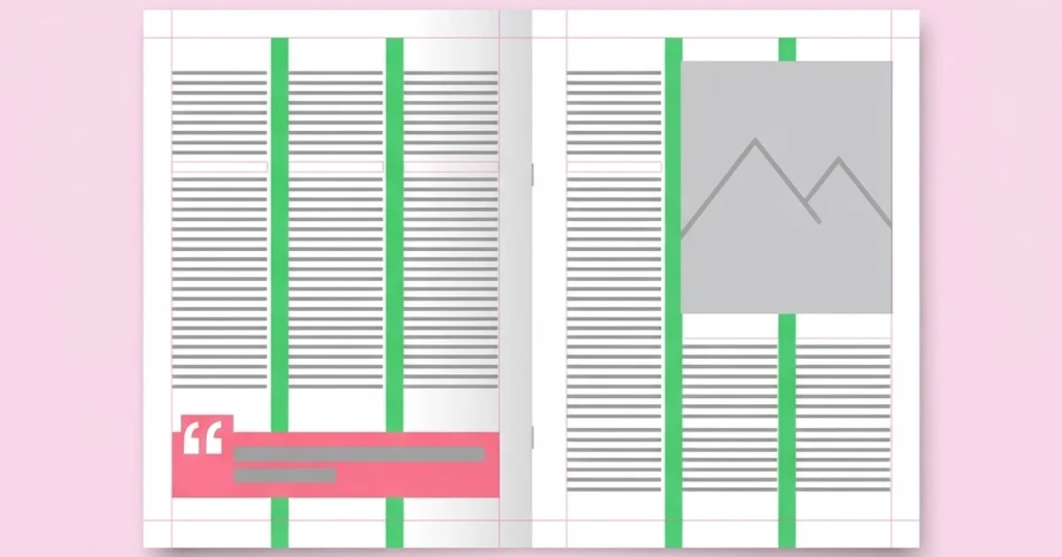
A grid in magazine design is not a convenience, it is the contract that makes a 96-page issue feel intentional. Two systems operate at once. The column grid divides horizontal space and governs where text and images may start and stop. The baseline grid divides vertical space into equal increments so that body text on facing pages aligns line for line, even when one page carries a heading and the other does not.
Column counts are a strategic choice, not a default. A 12-column grid is the workhorse because it divides cleanly into halves, thirds, quarters and sixths, giving you a wide editorial measure for essays and narrow sidebars for captions without ever inventing an off-grid width. A 6-column grid produces calmer, more classical pages and suits long-form reading. A 3-column grid reads as newsprint or trade publication. Designers who pick 5 or 7 columns usually do it for a reason — they want asymmetry that resists easy division — and that is legitimate as long as it is deliberate.
Baseline grids cause the most frustration and deliver the most value. Set your body text leading first, then make the baseline increment equal to that leading. Every other vertical measurement in the publication — space above a subhead, caption leading, the gap between an image and its cutline — must be a whole multiple of that increment. When you do this, spreads lock together optically and the reader stops noticing the page. When you skip it, every spread is a small negotiation and the issue feels stitched together. The same logic governs repeating visual systems generally; if you have ever built a seamless repeat you already understand it, and the reasoning behind designing repeatable visual systems transfers directly to editorial grids.
Margins deserve their own decision. Inside margins must account for the binding. A perfect-bound 200-page magazine loses visible area at the gutter because the spine will not lie flat, so inner margins typically run wider than outer ones. A saddle-stitched 48-page issue suffers from creep instead: inner pages push outward as the fold thickens, so the printer trims content from the outer edge of the centre spread. Ask your printer for the creep allowance before you design, not after.
Building the System: Order of Operations
The order in which you make decisions determines how much rework you do later. This sequence keeps the system stable.
- Fix the trim size and paper stock. Everything else is relative to physical dimensions. A 210 x 280 mm European trim behaves differently from a 8.375 x 10.875 inch US format, and uncoated stock changes your minimum type size because ink spreads.
- Set body type first. Choose the text face, size, and leading before touching headlines. The body is 80 percent of the ink in the magazine; headlines are decoration on top of it. A 9.5/13 setting is a sane starting point for most trims.
- Derive the baseline grid from the body leading. If body leading is 13 pt, the baseline increment is 13 pt. No exceptions in running text.
- Build the column grid and margins. Test the measure by flowing real copy: 55 to 75 characters per line is the readable band for continuous prose.
- Define exactly four core paragraph styles. Body, body-first (no indent), subhead, and caption. Add display styles later. Four is enough to prototype the whole magazine.
- Template the repeating pages. Contents, masthead, front-of-book shorts, review grid, back page. These consume most of the issue and should never be designed twice.
- Art-direct the features last. Features are where you break the grid intentionally, and you can only break a grid you have already established.
- Run a paper dummy. Print at actual size, fold, and flip through it. Screens hide pacing problems that a physical mockup exposes in thirty seconds.
The discipline in this list lives in steps 5 and 6. Junior designers rush to step 7 because features are the fun part, then discover their feature typography has nothing to do with the front of book, and the issue reads as two magazines glued together.
Choosing a Grid Structure for Your Publication Type
Different editorial products want different underlying structures. This table maps common publication types to a sensible starting configuration.
| Publication type | Suggested columns | Body size / leading | Dominant pacing |
|---|---|---|---|
| Long-form literary journal | 6 (often set as 1-2 text columns) | 10 / 14 pt | Slow, text-led, few images |
| Design or culture magazine | 12 | 9 / 12.5 pt | Alternating image spreads and dense text |
| Trade or B2B title | 3 to 4 | 9.5 / 12 pt | Modular, scannable, chart-heavy |
| Fashion or photography book-azine | 8 with wide margins | 8.5 / 13 pt | Image-dominant, minimal captions |
| University or annual report style | 12 with a hanging sidebar | 9.5 / 13 pt | Data blocks plus narrative |
Treat these as starting positions rather than rules. The number that matters most is characters per line in the final flowed copy; if a 12-column grid gives you a 95-character measure at your chosen size, the grid is wrong for the trim, not the copy.
Pacing: The Skill Nobody Teaches in a Software Class
Pacing is the deliberate variation of visual density across a sequence of spreads, and it is what separates a designed magazine from a collection of pages. Software tutorials teach you tools; pacing has to be learned by looking at printed issues and by making paper dummies.
The practical technique is the flatplan — a miniature map of every spread in the issue, laid out in order, viewed all at once. Print thumbnails of all spreads on one sheet. Squint. You should see a rhythm: dense, dense, open, full-bleed image, dense, quiet. If every spread has identical density, the issue is monotonous regardless of how good each page is individually. If density jumps randomly, the issue feels chaotic.
Three pacing devices do most of the work. The full-bleed opener resets the reader's attention and signals a new section. The white-space page — a page holding a single pull quote or a small image — functions as a breath and is the hardest sell to editors, who see it as wasted inventory. The dense modular spread, packed with short items, creates contrast that makes the next open spread feel generous. A strong issue alternates these intentionally rather than letting the copy fit dictate everything.
Studying finished work is the fastest route to fluency here. Keep a shelf of printed issues you admire and dissect their flatplans page by page; a curated reading list of design publications worth studying is more useful to a layout designer than another software tutorial, because you are training pattern recognition rather than tool recall.
Cover design follows separate rules and deserves a note. The cover is not a spread, it is a product package competing at arm's length. Its hierarchy is masthead, primary cover line, image, then everything else — and on newsstand titles the top-left third must survive being overlapped by neighbouring copies in a rack. Even for a digital-first title, designing the cover at thumbnail size first will save you from a beautiful cover that vanishes in a feed.
Seven Mistakes That Ruin Otherwise Good Layouts
Designing spreads in isolation. Always work with facing pages visible. A page that looks balanced alone can be catastrophically lopsided against its partner.
Ignoring the baseline grid for "just this one" element. One exception becomes ten. If an element genuinely cannot sit on the baseline — a boxed sidebar, say — give it its own internal grid and align its top and bottom edges to the main baseline.
Too many typefaces. Two families, used across their full weight range, will out-perform five families every time. The variety readers perceive comes from scale contrast and weight contrast, not from family count.
Captions treated as an afterthought. Captions are among the most-read text in any magazine, second only to headlines. Style them deliberately, place them consistently, and never let them float unanchored to their image.
Rivers, orphans, and stacked hyphens in justified text. Justified columns demand hyphenation and justification settings that have actually been tuned. Leaving defaults on in a narrow measure produces word spacing that reads as amateur at a glance.
Colour chosen on screen only. RGB brilliance becomes muddy in CMYK on uncoated stock. Proof your accent colours on the actual paper before the design depends on them.
Forgetting folios and section furniture. Page numbers, running heads, and section markers are navigation. Designing them late means squeezing them into space that no longer exists.
A Real Workflow: Designing a 64-Page Issue
Here is how a compact issue actually comes together when the process is running well.
Week one — structure. The editor delivers a flatplan with section allocations: 8 pages front of book, 32 pages features, 12 pages reviews, 12 pages back matter and ads. You set trim, margins, grid, and the four core styles. You typeset one full feature with real copy to stress-test the body setting, not lorem ipsum. Lorem hides every problem that real copy reveals — long names, awkward line breaks, a subhead every 200 words.
Week two — templates. You build master pages for each repeating type, including the ugly ones nobody wants to design: the contents page with variable item counts, the review grid that must hold anywhere from four to nine entries, and the letters page. Templating these removes roughly half the total layout hours from the schedule.
Week three — features. With templates locked, feature art direction can be genuinely expressive because the rest of the issue holds the system. This is where you break the grid: a headline crossing the gutter, an image bleeding on three sides, a rotated pull quote. Each break should be a decision you could defend in a sentence.
Week four — production. Preflight is a checklist, not a vibe: image resolution at final placed size, colour space conversion, black text set to 100 percent K rather than a four-colour build, bleed on every edge that needs it, spot colours either deliberate or removed, and fonts embedded. Export a proof PDF, print the paper dummy, and read the whole issue as a reader would.
One scenario worth planning for: the editor cuts 400 words from a feature the day before deadline. If your layout depends on exact copy length, you rebuild the spread. If your templates use flexible text frames anchored to a grid with defined minimum and maximum image sizes, you reflow in ten minutes. Designing for editorial change is not pessimism, it is professional experience.
Key Takeaways
- Set body type and leading before anything else, then derive the baseline grid from that leading so every vertical measurement in the publication is a multiple of one number.
- A 12-column grid divides cleanly into halves, thirds, quarters and sixths, which is why it handles the widest range of editorial layouts without inventing off-grid widths.
- Template every repeating page type before art-directing features, because repeating pages consume most of the issue and should never be designed twice.
- Pacing is managed at the flatplan level by alternating dense spreads, open spreads, and full-bleed resets, not by perfecting individual pages in isolation.
- Binding method changes your margins: perfect binding loses area at the gutter, while saddle stitching causes creep that trims the outer edge of centre spreads.
Frequently Asked Questions
What is the best grid for magazine design?
A 12-column grid is the most versatile starting point because it subdivides into two, three, four, and six equal parts, letting you run wide text measures and narrow sidebars from the same structure. Long-form literary titles often do better with six columns, and dense trade publications frequently work fine with three or four.
What is a baseline grid and do I really need one?
A baseline grid is a set of evenly spaced horizontal lines, matched to your body leading, that all running text sits on. You need one for any publication with substantial text. It makes facing pages align line for line and turns vertical spacing decisions into simple multiples instead of repeated eyeballing.
How many typefaces should a magazine use?
Two families is the practical sweet spot: one for display and one for text, each used across multiple weights and widths. Perceived variety comes from contrast in scale and weight rather than from the number of families. A third face is justifiable only if it serves a distinct, repeating function such as data tables.
How do I decide where to break the grid?
Break the grid only in feature openers and only when the break communicates something — a change of pace, a shift in voice, a moment of emphasis. If you cannot defend the break in one sentence, it is decoration. Front-of-book and back-matter pages should almost never break the system.
What is a flatplan and why does it matter?
A flatplan is a miniature map showing every spread of the issue in sequence, usually printed on a single sheet. It lets you judge pacing, section balance, and ad placement at a glance. Most rhythm problems are invisible at full size and obvious the moment you view the whole issue as thumbnails.
How should captions be handled in editorial layouts?
Give captions their own paragraph style, anchor them consistently to their images, and keep placement predictable across the issue. Captions are heavily read, so they deserve deliberate type treatment rather than a smaller version of body text dropped wherever there is space left over.
Conclusion
The single decision that shapes a magazine more than any other is whether you build the system before you design the pages. Designers who set body type, derive a baseline grid, and template the repeating spreads first end up with issues that feel authored. Designers who start with a gorgeous feature opener end up rebuilding the front of book three times and still shipping something that reads as disconnected.
Your next step is concrete: take whatever editorial project is on your desk, throw away the current layout for one afternoon, and rebuild it starting from body type and a baseline grid. Once the structure holds, sharpen the vocabulary you use to describe it — a working command of the language production teams use will make your conversations with editors and printers dramatically shorter and your files far less likely to come back with corrections.