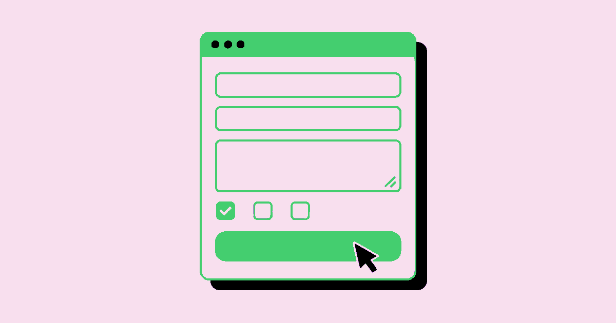
Graphic Design Forms: Clear, Usable Interfaces
Forms are where visual communication becomes a working interface. Someone must understand a request, decide what information belongs there, and submit it without losing confidence. A polished surface cannot compensate for an ambiguous label or an error that erases an answer. Good graphic design forms make the task feel understandable before the first field receives focus. That requires more than attractive boxes: it requires a deliberate relationship between content, sequence, typography, interaction, and feedback. This guide treats form design as a practical production discipline, from defining the task to checking the implemented result.
Quick Answer: Effective graphic design forms use clear labels, logical grouping, predictable controls, accessible contrast, and specific feedback. Start with the information people genuinely need to provide, then design the visual hierarchy around that task. Test empty, completed, error, and success states before approving the interface, not just its ideal screenshot.
Section 2: What Graphic Design Forms Actually Include
Graphic design forms are structured interfaces that use visual hierarchy and interaction cues to collect information for a defined purpose. They include registration screens, booking requests, checkout details, applications, and printable intake documents. Their success depends on whether people can supply accurate information and understand what happens afterward.
A field is an individual input, while a label names the information it requests. Helper text explains a constraint or an unfamiliar requirement. Validation checks whether an answer meets the relevant rules. Feedback communicates the result of an action. These elements have different jobs, so their appearance and placement should keep those jobs distinct.
Do forms belong to graphic design or user experience design? They belong to both. Graphic design establishes readable relationships, emphasis, and visual consistency. User experience design establishes the sequence, requirements, and response behavior. Frontend engineering turns those decisions into controls that work with keyboards, assistive technology, and actual data.
For a commissioned project, confirm that the supplier covers interaction states and implementation review rather than delivering only static layouts. The same distinction matters when choosing a graphic design company in Dallas: relevant form experience should be demonstrated through decisions and deliverables, not visual style alone.
Define the finish line before drawing anything. A successful enquiry form might create a usable lead and explain the response process. A successful application might save progress and provide a receipt. Those outcomes determine which information is necessary.
Section 3: Build Hierarchy Around the User’s Task
A usable form places questions in the order people can reasonably answer them. Internal database order rarely provides the best sequence. Begin with familiar information, group related requests, and introduce sensitive or demanding questions only when their purpose is clear.
- Remove unnecessary requests. Give every field an operational reason. If nobody uses an answer to deliver the service, route the request, or meet a legitimate requirement, challenge its inclusion.
- Use persistent labels. Keep the field name visible after entry. Placeholder examples can support a label, but they should not replace the only explanation of what belongs in the field.
- Create meaningful groups. Separate contact details from project requirements using headings and spacing. Within a group, keep related elements closer together than unrelated ones.
- Establish a reading path. Prefer a single column unless a compact relationship genuinely benefits from sharing a row. Test that any paired fields stack in a sensible order on smaller screens.
- Make the next action explicit. Use button text that describes the consequence, such as “Request an estimate.” Distinguish submitting information from saving a draft or continuing to another step.
Typography should reinforce this structure without turning every element into a competing headline. Use a restrained scale, readable input text, and consistent label treatment. Width can suggest an expected answer length, but it should not become an arbitrary restriction. A short postal code field and a generous project description area communicate different expectations before anyone reads the instructions.
Section 4: Specify Controls and Their States
Control selection should match the kind of answer required, and every selected control needs defined behavior beyond its empty appearance. A dropdown is not automatically more organized than a visible choice list. Hiding options may save space while making comparison harder.
Use native controls where practical, then style them without removing familiar behavior. A custom checkbox that cannot receive keyboard focus is not a finished component, regardless of its visual quality. Document the default, focus, populated, error, and unavailable states as part of the design specification.
| Information needed | Suitable starting control | Design and behavior check |
|---|---|---|
| Short, open answer | Labeled text input | Allow realistic lengths and preserve entered content after errors. |
| One choice from a short set | Radio group | Show all options and give the group a clear shared label. |
| Several independent choices | Checkbox group | Explain whether multiple selections are allowed or required. |
| Long contextual response | Textarea | Provide enough visible writing space and explain any necessary limit. |
For accessibility, associate labels programmatically with inputs and connect helper text to the relevant control. Use a fieldset and legend for related choices where appropriate. Keep focus indicators visible, and communicate errors with words rather than color alone.
Input formats deserve equal attention. Accept harmless variations when the underlying service permits them, such as spaces in a phone number. Where a rigid format is unavoidable, explain it before submission. A visual example is useful only when it matches what the implemented system actually accepts.
Section 5: Balance Brand Expression with Reliable Behavior
Brand expression works best in forms when it supports orientation rather than competing with completion. Distinctive typography, restrained color, and a recognizable voice can establish confidence. Unfamiliar controls and decorative movement can instead make a routine task feel uncertain.
In practice, I separate identity decisions from task decisions. The surrounding page can carry expressive art direction, while the form uses a stable spacing system, readable labels, and predictable controls. This separation is especially useful when a campaign aesthetic changes frequently but the underlying enquiry process stays the same.
The hardest tradeoffs often involve stakeholder preferences rather than visual craft. A sales team may want more qualifying questions; a legal reviewer may require consent language; a brand team may prefer unusually faint borders. Resolve each request against its purpose. Ask what the information enables, what obligation the wording addresses, and whether the visual treatment remains perceivable in realistic conditions.
Record these decisions in the handoff. Specify ownership of field copy, validation rules, privacy wording, and final implementation checks. The practical guidance in graphic design contract clauses that protect the work is relevant when defining review responsibilities, revision boundaries, and approval requirements.
Do not let a component library become a substitute for judgment. Reuse gives people consistency and teams efficiency, but the chosen component still has to fit the question. If a standard pattern creates confusion, document the exception and test the revised behavior rather than quietly improvising a one-off style.
Section 6: Avoid Mistakes That Hide Until Submission
The most damaging form mistakes often remain invisible in a polished, empty mockup. They appear when someone enters an unexpected value, skips a required answer, uses a keyboard, or submits over an unreliable connection.
One frequent mistake is validating too early. Showing an error while a person is still constructing a valid answer can feel like interruption rather than help. Choose validation timing deliberately: some feedback belongs after leaving a field, while submission should catch unresolved problems across the form.
Another mistake is making people hunt for the problem. Place a specific message near the affected field and consider an error summary for longer forms. Explain the correction, not merely the failure. “Enter an email address with a domain, such as name@example.com” gives more direction than “Invalid input.” Preserve other answers while the person fixes it.
Disabled submit buttons can also conceal the next step. If a button is unavailable, the reason must be apparent. An enabled button with clear validation feedback may be more understandable than a silent control that never responds.
Finally, avoid treating success as an afterthought. Confirm that the request was received, state what happens next, and distinguish a completed submission from a saved draft. Handle failure honestly: if the connection drops, retain the entered information where feasible and provide a safe retry path. Never show a success message merely because the button was clicked.
Section 7: Implement and Review a Real Form
A practical implementation walkthrough starts with a small, real task and follows it through every state. Consider a design studio’s project enquiry form. Its purpose is to collect enough context for a useful first response, not to replace a discovery conversation.
First, write the content without styling. Ask for a contact name, email address, project type, and a short description. Add timing or budget questions only if those answers influence routing or the initial reply. Mark optional information clearly and explain sensitive requests in plain language.
Second, sketch the sequence and create a component inventory. Define label placement, helper text, group spacing, input heights, button hierarchy, and responsive stacking. Include realistic long names, detailed descriptions, and translated labels rather than relying entirely on short sample content.
Third, build the behavior specification alongside the layout. List required fields, accepted formats, character limits where justified, validation timing, and submission outcomes. Specify how focus moves after errors and how status messages are announced without unexpectedly moving the user away from their current task.
Fourth, review the working version with a keyboard, touch input, zoom, and a screen reader. Check the reading order and accessible names. Submit incomplete data, trigger a server failure, and try submitting twice. Confirm that repeated actions cannot unintentionally create duplicate requests.
Finally, ask representative users to complete the task without coaching. Watch where they pause or reinterpret a label. Prioritize changes that remove uncertainty, then record unresolved constraints. Approval should cover the functioning interface and its edge cases, not simply the visual match to a design file.
Key Takeaways
Clear forms emerge from coordinated decisions about content, presentation, behavior, and implementation.
- Give every field a defined purpose before choosing its visual treatment.
- Use persistent labels, meaningful groups, and a predictable reading order.
- Specify focus, validation, failure, and success states alongside the default layout.
- Preserve entered information and make corrections understandable without relying on color.
- Review the implemented form with realistic content, assistive technology, and unsuccessful submissions.
Frequently Asked Questions
These form design questions address common decisions that arise between the first layout and production approval.
Should form labels sit above or beside inputs?
Labels above inputs are a dependable starting point because they support narrow screens and varying label lengths. Side labels can work in carefully controlled layouts, but require more responsive planning. Choose the arrangement based on reading order, language, and available space rather than visual neatness alone.
How many fields should a form contain?
A form should contain the fields needed to complete its specific job, with no arbitrary target count. A complex application may legitimately require substantial information. A simple callback request usually does not. Review each field against a real operational need, then separate optional context from mandatory answers.
Is placeholder text enough to explain a field?
Placeholder text is not a reliable replacement for a persistent label because it disappears during entry and may have insufficient contrast. Use it sparingly for examples when those examples help. Put essential instructions in visible helper text that remains available while the person types and reviews the answer.
When should a long form use multiple steps?
Multiple steps help when the task contains distinct stages that make sense to users. They are less useful when they merely hide a short list of unrelated questions. Provide understandable progress, preserve previous answers, and allow review before commitment. Check whether branching can remove irrelevant questions first.
How can a form look branded without becoming confusing?
A form can express a brand through typography, color, tone, and surrounding composition while keeping controls conventional. Reserve expressive treatments for places that do not obscure instructions or status. Test whether primary actions, errors, and focus remain distinguishable when the interface is viewed at different sizes.
What belongs in a form design handoff?
A complete handoff includes field definitions, copy, grouping, component states, responsive behavior, validation rules, and submission outcomes. It also identifies who approves privacy or consent wording. Include realistic examples and acceptance checks so developers and reviewers can verify behavior instead of guessing from a static screen.
Conclusion
Effective graphic design forms make information requests understandable and recovery from mistakes straightforward. Their quality comes from matching the visual system to the task and checking what happens beyond the ideal state. As your next step, audit one live form from first focus to confirmed submission, recording every point of uncertainty. For a complementary perspective on legibility, constraints, and final output checks, read the practical graphic design signs production guide.