
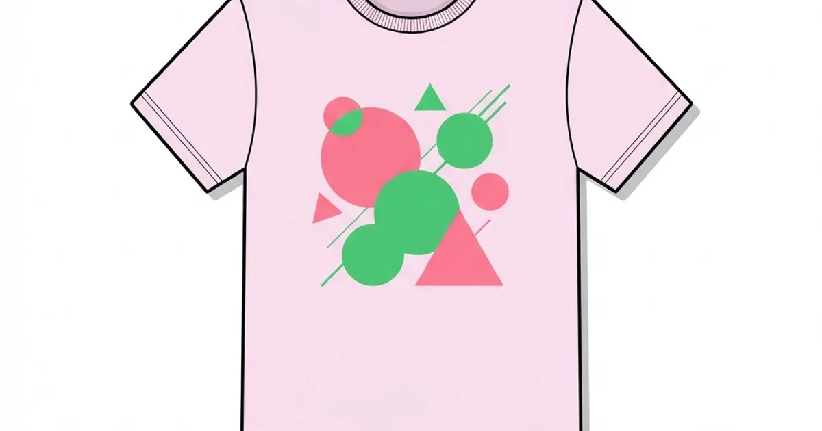
Designer Graphic Tee: How to Spot Quality Before You Buy
Two t-shirts can carry the same artwork and cost wildly different amounts, and the difference is almost never the design itself. It is the blank, the print method, and how the artwork was prepared for fabric. A designer graphic tee is a shirt where the garment construction and printing decisions were made with the same care as the illustration on the front — and once you know which five details to check, you can tell the difference in a shop in under a minute.
Quick Answer: A quality designer graphic tee uses ring-spun or combed cotton around 5 to 6 ounces per square yard, side seams rather than tubular construction, shoulder-to-shoulder taping, a ribbed collar that recovers its shape, and a print method matched to the artwork — screen printing for bold flat color, DTG for detailed full-color work.
What Actually Makes a Tee Feel Expensive
Start with the yarn. Open-end cotton is spun quickly from shorter fibres and produces a rougher, heavier-feeling fabric found in budget blanks. Ring-spun cotton twists and thins the fibres continuously, creating a softer, finer yarn. Combed ring-spun adds a step that removes short fibres and impurities, which is why those shirts feel smooth and resist pilling. Long-staple varieties such as pima or Supima go further still, offering more durability and a subtle sheen.
Next is fabric weight, usually expressed in ounces per square yard or grams per square metre. Lightweight fashion tees sit around 3.5 to 4.5 ounces and drape closely; standard weights around 5 to 6 ounces balance durability with comfort; heavyweight tees above 6.5 ounces feel structured and hold their shape but run warm. None of these is objectively best, but the weight should match the intended silhouette. A boxy heavyweight tee in a lightweight fabric will look limp within a week.
Then construction. Side-seamed shirts are cut and sewn from panels, which allows a tapered shape; tubular shirts are knit as a cylinder and tend to twist in the wash. Look also for shoulder-to-shoulder taping, which stops the neckline sagging, and double-needle stitching at the hem and sleeves. Finally, examine the graphic itself: strong apparel artwork uses a limited, deliberate palette, and the same restraint that governs how designers build controlled color palettes applies directly to what survives on fabric.
The Five-Point Inspection Before You Buy
Run these checks in order. They take about a minute and catch nearly every quality shortcut.
- Read the tag for yarn and weight. Look for "ring-spun" or "combed ring-spun" and a stated weight. Vague descriptions such as "100% cotton" with no further detail usually indicate a budget blank.
- Check the side seams. Run your fingers down both sides. A seam means a shaped garment; a smooth tube means a basic blank that will likely twist after washing.
- Stretch the collar gently. A well-made ribbed collar snaps back to shape. One that stays stretched will look worn within a month, and no print quality compensates for a slumped neckline.
- Inspect the print edge. Look closely at where ink meets fabric. Crisp edges and even coverage indicate careful screen work; fuzzy edges, visible pixel stepping, or a plastic-feeling slab suggest low-resolution artwork or a cheap transfer.
- Flex the printed area. Fold the print in half and release. Quality prints flex with the fabric; brittle prints show micro-cracks immediately and will flake after a handful of washes.
One additional test if you can: check the shoulder seam placement against your own shoulder. A designer tee is graded properly across sizes, so the seam should land near the edge of your shoulder rather than halfway down your arm, unless the drop shoulder is an intentional part of the cut.
Print Methods and What Each One Does Well
Print method determines how the artwork feels, how long it lasts, and what it costs to produce. Matching the method to the artwork is the core production decision.
| Print method | Best for | Hand feel | Durability characteristics |
|---|---|---|---|
| Screen printing | Bold flat colors and limited palettes at volume | Slight raised layer, softer with water-based ink | Excellent when cured correctly; the industry benchmark |
| Direct to garment (DTG) | Photographic and highly detailed full-color art | Very soft, ink absorbed into fibres | Good on cotton; colors can fade gradually with washing |
| Direct to film (DTF) transfer | Small runs and complex art on blends | Noticeable film layer on the surface | Strong adhesion; edges can lift if applied poorly |
| Embroidery | Small marks, crests, and logos | Raised thread, substantial | Outlasts the garment; unsuitable for fine detail |
| Discharge or water-based | Vintage soft prints on dark cotton | Almost no hand feel, dyed into fabric | Very durable; color results vary by garment dye |
The practical takeaway is that a thick, plastic-feeling rectangle around the artwork is a signal worth heeding. It usually means a transfer was applied to art that was never separated for screen printing, which is the fastest route to a cracked graphic after ten washes.
Why Most Graphic Tees Fail, From a Production Standpoint
Having prepared artwork for apparel, I can tell you that most failures trace back to file preparation rather than printing equipment. Art designed for screen at 72 pixels per inch and then scaled to a twelve-inch chest print will show soft, stepped edges no matter how good the printer is. Apparel artwork should be built as vector or at a minimum 300 pixels per inch at final print size, with a deliberate decision about how many colors are used.
The second common failure is ignoring fabric color in the separation. A design that looks vivid on white needs an underbase layer to appear the same on black, and that underbase changes the hand feel and cost. Designers who hand over a full-color file without considering the garment force the printer to make those decisions, which is how palettes drift from the intended look.
The third is over-detailing. Fabric is a textured, flexible substrate; thin hairlines, one-point rules, and small text below roughly eight points tend to break up or fill in. The strongest apparel graphics use bold shapes and generous internal spacing, which is a different discipline from poster or screen work — one of many reasons it helps to understand the wider family of design disciplines and how their technical constraints differ.
Common Mistakes Buyers and Designers Make
Judging quality by price alone. Plenty of expensive tees are premium blanks with a mediocre transfer applied. Inspect the construction and print, not the label.
Ignoring shrinkage. Untreated cotton can shrink noticeably on the first hot wash. Look for pre-shrunk or ring-spun garments and wash cold, or buy with shrinkage in mind if the tag says nothing.
Buying oversized to get length. Sizing up adds width faster than length and ruins the shoulder line. Look for a longer body cut instead of a larger size.
Designing without a print area template. Artwork built without the garment's printable dimensions frequently gets scaled down at production, throwing off the intended proportion on the body.
Using unlicensed artwork or fonts. Commercial apparel carries real licensing obligations for typefaces and illustrations. This catches small brands out regularly and can force an entire run to be destroyed.
Tumble drying on high. Heat is the main enemy of both print and fit. Cold wash inside out and low or air dry adds years to a graphic tee's usable life.
Approving artwork on a screen instead of a garment. Colors shift noticeably when ink sits on dyed cotton, and a hue that looked rich in the file can read muddy on a heather blank. Always request a printed proof on the exact garment color you intend to sell.
Placing the print by eye rather than by measurement. "Centered chest" means different things to different printers, and a graphic sitting two inches too low reads as sloppy even when the artwork is strong. Specify the distance from the collar seam and the print width in inches.
Ordering a full run without washing a sample. Shrinkage, collar recovery, and ink cure only reveal themselves after laundering. Two wash cycles on a single sample costs a few days and routinely saves an entire production run from being unsellable.
Choosing a Tee for a Real Situation
Imagine you are producing two hundred shirts for a studio launch, and you want something people actually keep. Start with the blank: a combed ring-spun cotton at around 5.3 ounces, side-seamed, with shoulder taping, gives you a garment that feels considered without the cost of a heavyweight. Order samples in two or three sizes and wash them twice before committing, because shrinkage and collar recovery only reveal themselves after laundering.
Then design to the method. If your artwork is two or three flat colors, screen printing with water-based ink gives the softest result and the best longevity, and the per-unit cost drops sharply at your quantity. Prepare the file as vector, separate the colors yourself or confirm the printer will, and specify an exact print width and placement measured from the collar seam rather than "centered."
Finally, plan for the whole run. Ask the printer for a press proof on the actual garment color before the full run starts, check ink cure with a stretch test on that proof, and keep one sample from the run as your reference for reorders. Treating a merchandise run with this level of documentation is the same discipline as any other client project, and buyers notice when it is absent, because the shortcuts always show up on the garment itself.
Key Takeaways
- Combed ring-spun cotton around 5 to 6 ounces per square yard is the practical sweet spot for a quality graphic tee.
- Side seams and shoulder-to-shoulder taping indicate a shaped, durable garment rather than a basic tubular blank.
- Print method should match the artwork: screen printing for flat color, DTG for photographic detail, embroidery for small marks.
- A thick plastic-feeling rectangle around a graphic usually signals a transfer applied to unprepared artwork.
- Most apparel print failures originate in file preparation, not printing equipment, particularly low resolution and over-detailed line work.
Frequently Asked Questions
What fabric weight is best for a graphic tee?
Around 5 to 6 ounces per square yard suits most purposes, balancing durability with comfort. Lighter fabrics near 4 ounces drape closely and suit fitted styles, while heavyweight options above 6.5 ounces hold structure for boxy cuts but feel warm in hot conditions.
Is screen printing better than DTG?
Neither is universally better; they solve different problems. Screen printing excels with bold flat colors, produces excellent durability, and becomes cheaper per unit at volume. DTG handles photographic and highly detailed artwork that screen printing cannot reproduce economically, with a very soft hand feel but more gradual fading.
Why do graphic tee prints crack?
Cracking usually results from ink that was not cured to the correct temperature, an overly thick plastisol layer, or a transfer with poor adhesion. Washing hot and tumble drying on high accelerates the process. Turning shirts inside out and drying on low significantly extends print life.
How should I wash a designer graphic tee?
Turn it inside out, wash cold on a gentle cycle with similar colors, and avoid bleach and fabric softener. Air dry where possible, or tumble on low. Heat is the primary cause of both print degradation and fit distortion, so minimizing it preserves the garment considerably longer.
What resolution should apparel artwork be?
Vector artwork is ideal because it scales without loss. If working with raster files, build at 300 pixels per inch at the final printed size, and avoid hairlines or text below roughly eight points, since fabric texture causes fine detail to break up or fill in during printing.
Are heavyweight tees always higher quality?
No. Weight indicates density, not construction quality. A heavyweight open-end cotton shirt with tubular construction will feel rough and twist after washing, while a 5-ounce combed ring-spun side-seamed tee will feel far better and last longer. Judge yarn type and construction alongside weight.
Conclusion
The decision that matters most is matching the print method to the artwork before anything is produced, because that single choice determines hand feel, longevity, and whether the graphic still looks intentional after twenty washes. Everything else — yarn, weight, fit — sets the baseline, but a mismatched print undoes a premium blank instantly.
Next time you shop, run the five-point inspection: tag, side seams, collar recovery, print edge, and flex test. It takes a minute and will change what you are willing to pay for. If you are producing your own run, pressure-test the artwork first against the design mistakes that appear most often in printed merchandise.


