
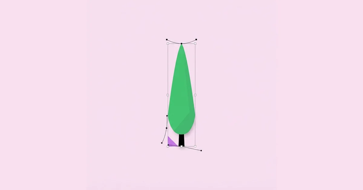
Cypress Tree Graphic Design: Vector Styles That Convert
A cypress tree is one of the few natural forms that already behaves like a logo before a designer touches it: a single tall vertical mass, almost no branch noise, and a silhouette readable from a hundred metres away. Cypress tree graphic design is the practice of translating that narrow, flame-shaped conifer into vector artwork — logo marks, illustration systems, packaging motifs, map icons and pattern fills — while keeping the proportions that make it recognisable. The whole craft lives in two decisions: how narrow the trunk column is relative to the canopy, and how much texture the edge carries.
Quick Answer: Cypress tree graphic design means building the tree as a single tall vertical silhouette, roughly three to five times taller than it is wide, with a soft point at the top and a short visible trunk at the base. Keep edge detail minimal, use two greens maximum, and test the mark at 32 pixels before approving any version.
How WebPeak Approaches a Cypress Mark Brief
When a winery, landscape studio, spa or Mediterranean property brand asks for a cypress identity, the failure mode is predictable: a pretty illustration that dies the moment it is stamped on a bottle neck or a map pin. The team at WebPeak works the problem in the opposite direction — they draw the 32-pixel version first, agree the silhouette there, then scale up and add the detail the large sizes can carry. Their logo design process pairs each cypress mark with a stripped primary, a detailed secondary and a single-colour stamp, so the brand never has to improvise a version at print time. Because a cypress rarely appears alone in brand work, they also build the repeat elements — grove patterns, section dividers, badge frames — through their infographic and illustration work, and extend the same silhouette into launch assets via social media post and banner design so the tree reads identically in a story frame and on a label.
What Actually Makes a Cypress Tree Read as a Cypress
A cypress reads as a cypress because of aspect ratio, not because of leaf detail. The Mediterranean cypress that most briefs refer to grows as a tight vertical column, typically three to five times taller than its widest point, with the widest point sitting slightly below the vertical centre. Move that widest point to the middle and the shape reads as a generic conifer. Move it to the lower third and it reads as a pine. Keep the bulge just under centre and the eye names the tree instantly, even in pure black.
The second identifier is the apex. A cypress tip is soft and slightly rounded or gently curved, never the sharp isosceles point of a spruce. Designers who draw the tree as a triangle with rounded corners always end up with something Christmassy. Draw it instead as a stretched teardrop — a vertical ellipse pinched at the top — and the species reads correctly.
The third identifier is the trunk gap. Real cypress foliage starts low but not at ground level, so a short bare trunk of roughly five to eight percent of the total height anchors the shape and stops it from floating. Remove the trunk and the mark becomes a leaf or a flame. It is worth naming these three variables explicitly in a design brief — canopy ratio, apex softness and trunk exposure — because they are the only levers that matter and they give the client concrete language instead of vague feedback.
Seven Steps to Build a Clean Cypress Vector
Building the shape in a predictable order saves the redraw cycle that most cypress projects suffer through. The sequence below works in Figma, Illustrator or any pen-tool environment and produces a mark that scales without manual cleanup.
- Set the bounding box first. Draw an empty rectangle at the target ratio — 1:4 is a safe starting point — and treat it as a hard constraint. Every curve stays inside it.
- Draw an ellipse, not a triangle. Place a vertical ellipse filling the box, then pull the top anchor upward until the apex tapers. Four anchor points is enough for the whole canopy.
- Break the symmetry by two percent. Nudge one side handle slightly outward. Perfect mirror symmetry reads as clip art; a small asymmetry reads as drawn.
- Add the trunk as a separate rectangle. Keep it narrow, keep it short, and union it with the canopy only after both shapes are approved. Separate shapes stay editable.
- Introduce edge rhythm last. If the style calls for foliage texture, cut shallow notches along one side only. Notching both sides doubles the visual noise for no added realism.
- Flatten and reduce anchors. Aim for under twenty anchor points in the final path. Anything above forty will render soft at icon sizes and bloat the SVG.
- Test at 32, 64 and 512 pixels. Export all three, view them at actual size on a real screen, and only then decide whether the detail survives.
The order matters because each step constrains the next. Designers who start with texture almost always end up with proportions that cannot be fixed without redrawing the whole path.
Choosing a Cypress Style for the Right Medium
Not every cypress style survives every medium. The table below maps the four styles that come up most often in commercial work against where they hold up and where they break down.
| Style | Best Use | Minimum Legible Size | Main Risk |
|---|---|---|---|
| Solid silhouette | Logo marks, favicons, map pins, embroidery | 16 px | Reads generic if the aspect ratio drifts below 1:3 |
| Line art / single stroke | Packaging, letterpress, editorial dividers | 48 px | Stroke weight collapses when scaled non-proportionally |
| Layered flat shapes | Website heroes, illustration systems, decks | 96 px | Colour banding looks muddy if the two greens are too close |
| Textured / grain fill | Posters, labels, merchandise prints | 256 px | Grain turns to mush in print below 300 DPI |
The practical rule that falls out of this table: pick the style for the smallest place the mark will ever appear, not the largest. Scaling a silhouette up is trivial. Scaling a textured poster illustration down to a browser tab never works.
What Repeated Client Work Teaches About Cypress Palettes
There is no public dataset on cypress logo performance, so the honest framing here is practitioner analysis rather than statistics. In practice, cypress marks that use two greens outperform those using four or more, because the species itself has very low internal contrast — the foliage is dense and shadow falls as a soft single band rather than as distinct highlights. Teams that add a third and fourth green in pursuit of realism tend to end up with a mark that looks blurry at medium sizes, since the eye blends adjacent low-contrast values before it resolves the silhouette.
A second pattern shows up in colour choice. Cypress greens that lean cool and desaturated read as Mediterranean, coastal and premium; greens that lean bright and saturated read as generic eco or recycling iconography. Brands in wine, hospitality, architecture and wellness almost always want the former, and a designer can move the mark there simply by pulling saturation down and nudging hue toward blue-green, without touching the drawing at all.
The third pattern concerns background. Because a cypress is a tall dark mass, it needs a light or mid-tone ground to hold its shape. Marks placed on dark backgrounds usually need a knockout version — the tree rendered in the background colour inside a light container — rather than a simple colour inversion, which tends to make the canopy look hollow. Building that knockout during the original design pass, rather than after the first real-world failure, saves an entire revision round.
Common Cypress Design Mistakes and How to Fix Them
Most cypress projects fail in the same five ways, and all five are cheap to avoid once named.
Mistake one: drawing a triangle. A cone with rounded corners is a fir, not a cypress. Fix it by starting from an ellipse and tapering upward, so the widest point stays below centre and the sides curve inward rather than running straight.
Mistake two: over-detailing the edge. Designers add dozens of foliage notches to convey texture, then watch the whole outline turn to static at small sizes. Fix it by capping the notch count and applying notches to one side only, which suggests light direction and keeps the opposite edge clean.
Mistake three: non-proportional scaling. Stretching a cypress horizontally to fill a layout gap destroys the one ratio the species depends on. Lock the aspect ratio in the source file and supply the client with pre-sized exports so there is no temptation to drag a corner.
Mistake four: floating the tree. Without a trunk or a grounding element, the canopy reads as a leaf, a flame or a water droplet. Fix it with a short trunk, a thin baseline, or a subtle shadow ellipse — one of the three, never all three.
Mistake five: shipping a single file. One SVG is not a deliverable. A cypress mark needs at minimum a full-colour version, a single-colour version, a knockout version and a simplified icon version with detail removed, each tested at its intended size before handoff.
A Real Implementation Walkthrough: Cypress Mark for a Boutique Vineyard
Consider a common brief: a small vineyard needs an identity that works on a bottle label, a wooden entrance sign, a website header and a delivery van. Here is how the cypress gets built and deployed without a second revision cycle.
The designer begins at the hardest constraint, which is the bottle neck foil at roughly 18 millimetres wide. At that size only a solid silhouette survives, so the silhouette becomes the primary mark and everything else becomes a derivative. The aspect ratio is locked at 1:4, the trunk is set at six percent of total height, and the apex is drawn with a single soft curve.
Next comes the sign. Carved or painted wood cannot hold fine notches, so the same silhouette is used with the notch count reduced to zero — proving the value of building the simplified version as a real file rather than an afterthought. The website header can carry more, so a layered flat version is created by cloning the silhouette, offsetting a duplicate by a few percent, and filling it with a second, slightly cooler green to imply a shadow side. No new path is drawn, which guarantees the two versions stay visually identical.
The van needs the mark at distance and in motion, so contrast is king: the tree is rendered as a single dark green on a light cream panel, with a generous clear space margin equal to half the tree width on every side. That clear space rule is documented in the brand sheet so a print vendor cannot crowd the mark with a phone number.
Finally, the file set is exported: SVG for web, EPS for print vendors, a 512-pixel PNG for marketplaces, a 32-pixel favicon, and a one-colour black version for invoices and stamps. Total drawing time is small; the value is in the constraint order. Every downstream asset came from a shape validated at the smallest size the brand would ever need.
Key Takeaways
- A cypress silhouette reads correctly when it is three to five times taller than wide, with its widest point sitting just below the vertical centre.
- The apex must be soft and tapered rather than sharply pointed, otherwise the mark reads as a fir or a generic conifer.
- A short exposed trunk of five to eight percent of total height prevents the canopy from reading as a leaf or a flame.
- Two greens produce a cleaner cypress than four, because the species has naturally low internal contrast and extra values blur the silhouette.
- Always design the smallest required size first; silhouettes scale up cleanly, but detailed illustrations never scale down cleanly.
Frequently Asked Questions
What is the ideal aspect ratio for a cypress tree logo?
Between 1:3 and 1:5, height to width, with 1:4 being the safest default for commercial work. Narrower than 1:5 the mark becomes hard to place in horizontal layouts, and wider than 1:3 it stops reading as a cypress and starts reading as a generic evergreen shape.
Should a cypress tree graphic include a visible trunk?
Yes, in almost every case. A short trunk of roughly five to eight percent of the total height grounds the shape and confirms the viewer is looking at a tree. Without it, the tapered canopy is frequently misread as a leaf, a flame, a feather or a water droplet.
Which file format works best for cypress tree artwork?
SVG for anything on screen, because the silhouette is a small number of paths and compresses extremely well. EPS or PDF for print vendors, plus PNG exports at fixed sizes for marketplaces and app stores. Keep the master file editable with the trunk and canopy as separate shapes.
How many colours should a cypress illustration use?
Two greens plus one neutral covers nearly every requirement. A base green defines the mass, a slightly cooler or darker green implies the shadow side, and a neutral handles the trunk or background. Adding more greens reduces legibility because the values sit too close together.
How do I stop a cypress logo from looking like a Christmas tree?
Avoid straight triangular sides, sharp apex points and any horizontal tiering. Draw from an ellipse so the sides curve inward, soften the tip, and keep the outline continuous rather than stepped. Cool, desaturated greens also push the mark away from holiday associations.
Can the same cypress design work for both a logo and a pattern?
Yes, if the simplified silhouette is built first. Patterns need the lowest-detail version repeated at varying scales and spacings, so a mark designed for small sizes tiles cleanly. A detailed illustration, by contrast, produces visual noise the moment it is repeated across a surface.
Conclusion
The single decision that determines whether a cypress tree graphic succeeds is where the design starts. Beginning with the smallest, most constrained placement — a favicon, a foil stamp, a map pin — forces the proportions, apex softness and trunk exposure to be correct before any texture, palette or layering enters the file. Every richer version can then be derived from that validated silhouette without redrawing a single path. The next step is concrete: open a blank canvas, set a 1:4 bounding box, export the shape at 32 pixels, and only continue if the tree is still unmistakably a cypress at that size.


