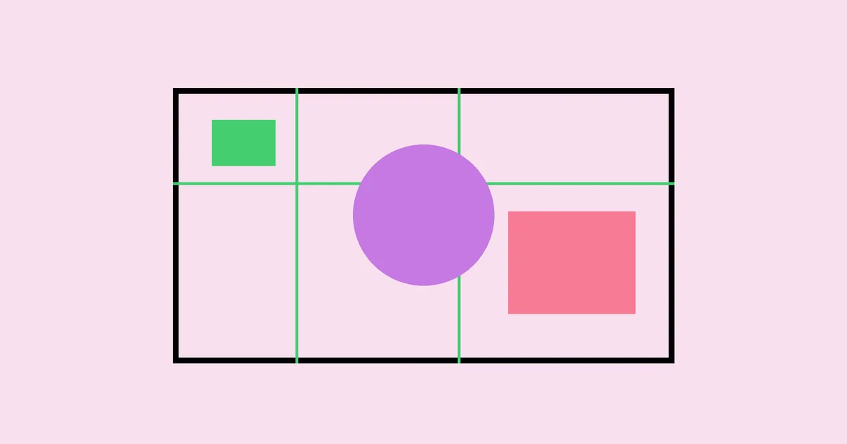
Composition in Graphic Design: Rules That Work
Composition in Graphic Design: Rules That Work matters when the work has to survive real clients, real deadlines, and real production constraints. Composition in graphic design is the deliberate arrangement of elements so the viewer understands priority, movement, and meaning. The useful question is not whether the topic looks attractive in a mockup; it is whether the choices hold together when files are revised, exported, handed to another person, and judged by an audience that gives the work only a brief moment of attention.
Quick Answer: Composition In Graphic Design works best when the designer connects purpose, audience, constraints, and execution before polishing the surface. Start with the job the visual must do, choose only the elements that support that job, then test the result against context, production, and usability.
Why does composition in graphic design control whether a layout feels professional?
Why does composition in graphic design control whether a layout feels professional? The short answer is that successful work gives every visible choice a job. For designers who need stronger layout decisions across posters, pages, ads, and interfaces, the important decisions happen before polish: what must be noticed first, what can be quiet, what must be technically accurate, and what the final format will tolerate. If those decisions are vague, the finished design may look busy even when the individual pieces are attractive.
Hierarchy, balance, alignment, proximity, contrast, rhythm, scale, and focal point are the operating terms. These terms are not academic labels; they are working controls. A designer uses them to decide whether an element should grow, move, disappear, or change role. When a project connects those controls to business purpose, emphasis graphic design from this angle becomes easier to judge because the layout, tools, and deliverables are no longer treated as isolated choices.
The most reliable way to define the work is to write a plain-language success condition before opening the design file. For example, the condition might be that a viewer understands the offer before noticing the texture, that an installer can see all cut lines without guessing, or that a hiring manager can understand the designer’s role in a project within a few seconds. That condition becomes the test for every revision.
How should you build composition in graphic design from the first brief?
A disciplined process keeps composition in graphic design from becoming a taste debate. The sequence below is simple enough for a solo designer and strict enough for a studio team. It protects the work from late surprises because each stage checks meaning, structure, and production before the next stage adds complexity.
- Clarify the outcome: Define the action or understanding the audience should leave with. For composition in graphic design, this prevents decorative decisions from leading the project and gives the client a concrete standard for feedback.
- Map the context: List where the work will appear, who will approve it, what files are needed, and which physical or digital constraints will affect the final result.
- Choose the primary hierarchy: Decide what deserves first attention, second attention, and background status. Do this before choosing details, because hierarchy determines whether the composition can be understood quickly.
- Build a rough structure: Use simple blocks, shapes, or notes to arrange the idea without styling it. This exposes weak relationships while changes are still cheap and unemotional.
- Add style deliberately: Apply color, shape, image treatment, typography, or tool choices only when they support the structure. Style should sharpen the idea, not hide a weak decision.
- Test against production: Check dimensions, file formats, accessibility, installation, print behavior, or export requirements. Many attractive concepts fail because this step happens after approval.
- Document the handoff: Record key decisions, final assets, usage notes, and known limits. A clear handoff reduces rework and proves that the design was made for use, not just presentation.
The process also makes feedback more useful. Instead of asking whether someone likes a direction, ask which success condition the direction supports or violates. That framing turns subjective comments into actionable changes and helps keep composition in graphic design aligned with the reason the project exists.
Which decisions matter most in composition in graphic design?
The most important decisions in composition in graphic design are the ones that change comprehension, production risk, or long-term usefulness. The table below organizes those decisions so they can be reviewed without drifting into personal preference.
| Decision Area | What to Check | Practical Standard |
|---|---|---|
| Purpose | The main job of the design | A viewer can explain the intended message without extra context. |
| Hierarchy | The order in which elements are noticed | The first focal point supports the most important business or communication goal. |
| Production | The final files, materials, or platform needs | Nothing essential depends on a fragile export, missing asset, or unclear specification. |
| Consistency | How the work fits the wider system | The design can extend to related formats without being rebuilt from scratch. |
A table like this is useful because it separates design judgment from decoration. If a direction fails the production standard, it is not ready no matter how attractive it looks. If it passes production but fails hierarchy, the next revision should change structure before anyone changes style.
What practitioner analysis improves composition in graphic design?
Practitioner analysis starts by watching where the work will be used. A portfolio image, storefront decal, social post, conference sign, product screen, or printed shirt each creates a different viewing distance and attention span. The designer’s job is to remove ambiguity from that situation. The strongest work usually has fewer competing moves than the first draft, but each remaining move is more specific.
One reliable review method is to temporarily remove the most decorative layer and ask whether the idea still communicates. If it does, the decoration can return as support. If the idea collapses, the design is leaning on surface treatment instead of structure. That is where design graphic layout from this angle can be useful, because related design disciplines often reveal whether the problem is hierarchy, format, specialization, or production planning.
Another practical test is to show the work at the size and context closest to its final use. Do not judge a vehicle graphic only on a laptop, a shirt graphic only in a close crop, or a job portfolio only as a single polished case-study image. Reduce the work, step back from it, or place it beside competing visuals. If the intended signal disappears, the design needs stronger structure rather than more effects.
Experienced designers also protect the boring parts of the project: file names, revision labels, linked assets, export folders, proof notes, and approval records. Those details rarely appear in awards or screenshots, but they determine whether the design survives collaboration. A clean process makes the visible work feel calmer because the designer is not solving avoidable technical problems under pressure.
What mistakes weaken composition in graphic design, and how can you avoid them?
The most common mistake in composition in graphic design is treating the visible style as the whole job. Style matters, but it cannot compensate for unclear priority, weak constraints, or missing production logic. Avoid that mistake by writing the message, audience, format, and approval path before exploring visual directions.
- Starting with trends: Trends can inspire a direction, but they should not decide it. Filter every style choice through the project’s audience, lifespan, and required formats.
- Ignoring edge cases: Check the smallest size, longest content, tightest crop, most awkward surface, or least experienced user. Edge cases reveal whether the system is sturdy.
- Overloading the focal point: A focal area cannot carry every message at once. Separate primary information from supporting detail and give the viewer a clear path.
- Leaving production until the end: Build with final dimensions, materials, exports, or platform rules in mind. Late production checks create rushed compromises.
- Accepting vague feedback: Ask reviewers to connect comments to the goal. Replace broad reactions with specific observations about clarity, accuracy, or usefulness.
None of these mistakes require unusual talent to fix. They require a habit of pausing before polish, naming the problem accurately, and checking the work against reality. That habit is what separates dependable design from attractive drafts.
How can you apply composition in graphic design in a real project?
Use this walkthrough for fixing a layout that has all the right assets but still feels weak. Begin with a one-page brief that names the audience, the primary message, the final formats, and the decision maker. Add examples only after the goal is clear; otherwise references become a collage of preferences rather than a map for the project.
Next, create two rough routes. One route should be conservative and easy to produce. The other should stretch the visual idea while still respecting the constraints. Present both with the same explanation: goal, hierarchy, production notes, and known trade-offs. This keeps the discussion focused on consequences instead of personal taste.
- Confirm the final environment for composition in graphic design before detailed styling begins.
- Define the primary focal point and remove anything that competes without adding meaning.
- Check alignment, spacing, and scale at the final viewing size, not only in the design file.
- Export a proof and review it like a user, installer, hiring manager, or client would experience it.
- Package final files with clear naming, source assets, and notes that explain practical limits.
Finally, archive the reasoning. A short note explaining why choices were made is often more valuable than a large presentation deck. It helps future designers extend the work, helps clients remember what was approved, and helps you defend good decisions when late-stage requests threaten clarity.
Key Takeaways
- Composition In Graphic Design is strongest when every visible element is tied to a named communication or production job.
- Hierarchy should be decided before style, because style cannot rescue an unclear viewing order.
- Production constraints are design inputs, not final checks to perform after approval.
- Useful feedback connects a visual choice to clarity, audience fit, accuracy, or delivery risk.
- A simple documented process makes creative work easier to extend, revise, and defend.
Frequently Asked Questions
What is composition in graphic design in simple terms?
Composition In Graphic Design is the practical use of design decisions to solve a specific visual communication problem. It includes planning, hierarchy, format awareness, and production judgment. The final result may look simple, but the value comes from choosing what belongs, what should be quiet, and what must be technically dependable.
How do beginners get better at composition in graphic design?
Beginners improve fastest by studying finished work, rebuilding small examples, and asking why each decision was made. Keep projects narrow, get critique early, and compare drafts against a written goal. Skill grows when you connect visual choices to outcomes instead of collecting disconnected techniques.
What tools are needed for composition in graphic design?
The right tools depend on the final format, but the tool choice matters less than the decision process. Designers usually need software for layout, vector editing, image preparation, and proofing. A dependable folder structure, naming habit, and review checklist are just as important as the application itself.
How do you judge whether composition in graphic design is working?
Judge the work in context. Ask whether the intended audience understands the main message, notices the right element first, and can use the result without confusion. Then check whether the files, dimensions, and handoff details support real production. Attractive work that fails those tests is not finished.
What should clients provide before starting composition in graphic design?
Clients should provide the goal, audience, required formats, brand assets, deadlines, approval process, and any production restrictions. They should also explain what has failed before. Clear input does not limit creativity; it gives the designer enough information to make stronger decisions with fewer revisions.
How long does composition in graphic design take to learn?
The basics can be learned through focused practice, but professional judgment develops through repeated projects and critique. A designer must learn not only how to make something look good, but how to prepare it for use, explain decisions, handle constraints, and improve the work without losing the core idea.
Conclusion
The most important decision in composition in graphic design is deciding what the work must prove before deciding how it should look. Once that standard is clear, the designer can use style, tools, layout, and production methods with purpose. Your next step is to write a one-sentence success condition for the project, then review the first draft against it before adding polish. For a related next move, study geometric graphic design from this angle and compare how the same discipline shows up in another design context.