Why Mobile-Friendly Websites Are Critical for Student and Training Enquiries
Discover why mobile-friendly websites are essential for student and training enquiries. Learn how speed, usability, content, and trust signals boost conversions.
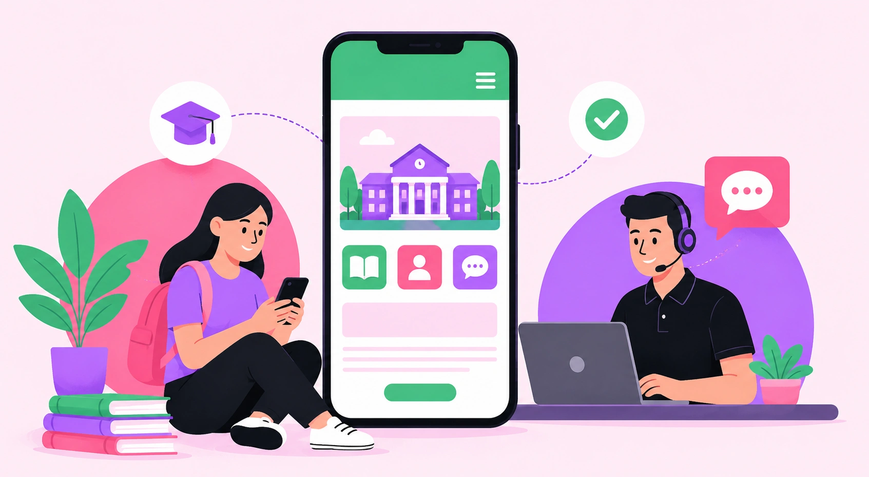
Why Mobile-Friendly Websites Are Critical for Student and Training Enquiries
Students don’t wait until they’re sitting at a desk to search for courses, compare providers, or ask questions. They do it between shifts, on the bus, during lunch breaks, or while half-watching TV with a phone in one hand. That tiny screen is often the first real contact they have with a training provider.
And it matters fast.
If a website loads slowly, buttons are hard to tap, or course details are buried behind clunky menus, the enquiry may never happen. Not because the course isn’t good. Not because the student isn’t interested. Because the website got in the way.
For education and training providers, mobile-friendly design isn’t a nice extra. It’s part of the enrolment pathway. A weak mobile experience can quietly drain leads before the admissions team even knows they existed.
Student Decisions Are Often Made in Small Moments
Training enquiries don’t always come from one long research session. They come from quick, messy moments. Someone searches a course name after a friend mentions it. Another person compares options while commuting. A parent checks fees after dinner. A worker looks up upskilling options during a short break.
These moments are short. Sometimes only a few minutes.
That means a mobile site needs to answer the obvious questions quickly. What is the course? Who is it for? How long does it take? Is it online, in-person, or blended? What are the entry requirements? What happens after completion?
When a student searches for something specific, such as Cert IV in Electrical Instrumentation, they’re usually not browsing for fun. They may be weighing up career progression, licensing pathways, or practical skills for work in industries like mining, manufacturing, energy, or maintenance. A mobile page that gives clear answers can turn that interest into an enquiry before the moment passes.
Speed Is Part of the Brand Experience
Nobody loves a slow website. Students especially don’t have much patience for one.
A mobile page that takes too long to load sends the wrong message before a single word gets read. It can make a provider feel outdated, under-resourced, or careless, even when the team behind the business is excellent. Harsh? Maybe. True? Absolutely.
Performance should be treated as part of credibility, not just a technical metric. A fast site feels more trustworthy. It gives the user confidence that the organization is organized, modern, and ready to help.
There’s a small detail many teams miss here. Speed isn’t only about the homepage. Course pages, enquiry forms, pricing pages, location pages, and blog articles all need to perform well on mobile. If the homepage is polished but the course page crawls, the lead can still disappear.
Tiny delays add friction. Friction kills enquiries.
Forms Should Be Built for Real People
A mobile enquiry form should feel simple. Almost boring. That’s the goal.
Too many education websites ask for too much too soon. Full name, phone number, email, course interest, location, study mode, preferred intake, message field, referral source, and five other things that probably could’ve waited. On desktop, that may feel mildly annoying. On mobile, it can feel like admin homework.
A better form asks for what’s needed to start the conversation. The rest can come later.
There’s also the thumb test. Can a person fill out the form with one hand? Are the fields easy to tap? Does the phone number keyboard appear when asking for a phone number? Is the submit button visible without awkward scrolling? These details seem small, but they shape conversion.
Simple wins.
Clear Content Beats Clever Content
Training providers sometimes try to sound impressive by adding layers of formal language. Accreditation details, compliance wording, career outcomes, payment options, and eligibility notes all matter, but they need structure.
On mobile, dense paragraphs become walls. And walls don’t convert.
Strong mobile content uses short sections, direct headings, plain language, and easy pathways to more detail. It doesn’t dumb things down. It respects the reader’s time.
A student looking at a training option may already feel unsure. They might be changing careers, returning to study, or trying to improve their income. Clear content reduces anxiety. It tells them, “Yes, this is the right place. Here’s what to do next.”
That’s not fluff. That’s user experience doing its job.
Location and Context Still Matter
Mobile search often has local intent, even when the user doesn’t type a location. People want to know whether a provider serves their area, offers online delivery, has nearby campuses, or understands the market they’re in.
This matters across the wider student journey too. A person comparing course options may also be thinking about where they’ll live, how far they’ll travel, or whether a provider connects with support services. For example, an international student researching education pathways may also come across a student housing company while comparing study destinations, accommodation support, and practical next steps in a new city.
That kind of context helps a website feel useful, not just promotional. It connects the course decision to real life.
And real life is what students are planning around.
Trust Signals Need to Be Easy to Find
Students want reassurance before they enquire. They want proof that the provider is legitimate, responsive, and worth their time.
On mobile, trust signals need to sit where users naturally look. Reviews, student outcomes, industry partnerships, accreditation details, trainer experience, FAQs, and contact options should be easy to find without making the visitor hunt.
A phone number that works when tapped helps. So does live chat, if it’s staffed properly. So does a clear email address. So does a simple “request course guide” button that doesn’t feel like a trap.
Trust isn’t built with one big statement. It’s built through small signals that say, “This provider has thought about the student experience.”
Mobile Design Supports Better Marketing Performance
A strong mobile website doesn’t just help organic visitors. It improves the performance of almost every marketing channel.
Paid ads need landing pages that load quickly and match search intent. SEO needs pages that are structured, useful, and easy to navigate. Social campaigns need mobile-first pages because most social traffic comes from mobile. Email campaigns need landing pages that work when someone taps from their inbox.
If the website fails on mobile, the marketing budget works harder than it should. It’s like pouring water into a bucket with a small hole. Annoying. Expensive too.
For training providers trying to grow enquiries, the website should act like a reliable admissions assistant. It should answer questions, reduce hesitation, capture interest, and guide users toward the next step without drama.
The Best Mobile Sites Feel Effortless
A great mobile-friendly website doesn’t call attention to itself. It just works.
Pages load quickly. The layout feels natural. The course information is easy to scan. Forms don’t fight the user. Calls to action appear at the right time. Content feels helpful, not bloated. The design looks professional without getting in the way.
That’s the standard students now expect.
For education and training brands, mobile experience directly affects enquiry volume, lead quality, and brand perception. Students are ready to act in short windows of attention. The website has to meet them there, with speed, clarity, and confidence.
Anything less leaves good enquiries on the table.
Related articles
 Web Development
How to Choose Social Media Share Buttons for Your Website
Learn how to choose social media share buttons that boost shares without slowing your site, with placement, performance, and platform selection best practices.
 Web Development
Community Development Council News
Community Development Council News provides insights into development projects, funding programs, urban planning strategies, and community growth initiatives.
 Web Development
Why Mobile-First Design Is Critical for Travel and Property Searches
Mobile-first design helps travel and property websites deliver faster, smoother, and more user-friendly experiences that drive bookings and inquiries.