How to Create Responsive UI Illustrations (new angle)
A complete guide to building responsive UI illustrations that adapt across screen sizes, boost engagement, and improve your site’s overall design impact.
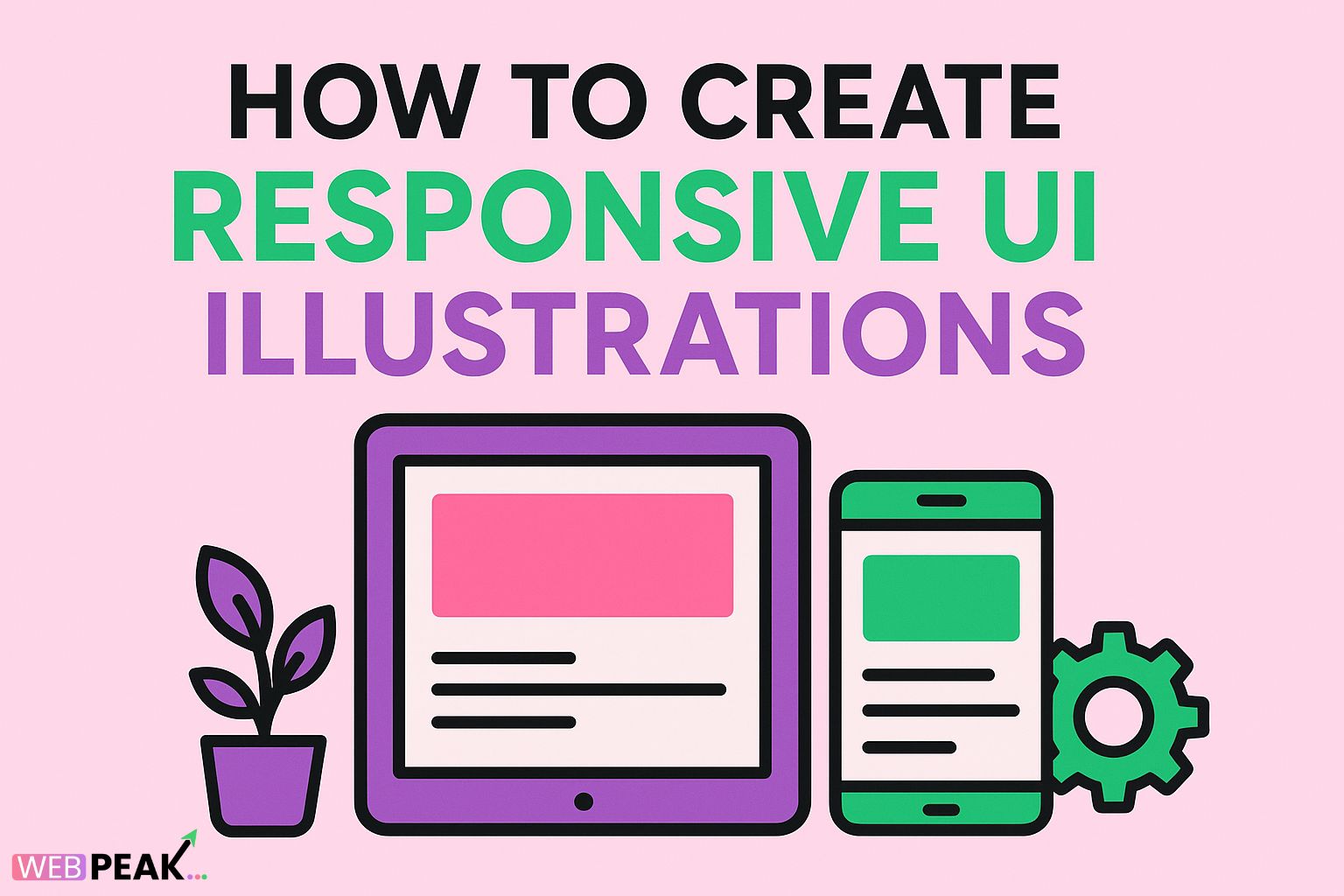
How to Create Responsive UI Illustrations: A Modern Guide for Web Designers
Responsive UI illustrations have become an essential component of modern web design. They do more than decorate a webpage — they communicate brand identity, enhance user experience, and ensure visual harmony across devices. In a design world where screens come in all shapes and sizes, knowing how to create responsive UI illustrations can set your work apart and elevate user engagement. This comprehensive guide will explore the techniques, tools, and principles behind crafting scalable and flexible illustrations that adapt seamlessly to any layout.
Why Responsive Illustrations Matter in Modern UI Design
As websites and apps evolve, users expect flawless experiences regardless of their device — be it a smartphone, tablet, or desktop. Static images that distort or crop poorly can break that experience, making responsive illustrations crucial for visual consistency and performance.
Responsive UI illustrations not only adapt visually but also load efficiently, support accessibility, and reinforce the product’s visual hierarchy. Designers who integrate responsive visuals into UI frameworks contribute to faster page loads, better scalability, and more engaging interactions.
Benefits of Responsive Illustrations
- Consistent Branding: Maintain design integrity across all screen sizes.
- Improved Accessibility: Ensure visuals remain readable and meaningful on smaller screens.
- Optimized Performance: Use vector graphics and SVGs to reduce load times.
- Enhanced Engagement: Adapt animations and interactions for touch and hover interfaces.
Understanding the Core Principles of Responsive UI Illustration
Before diving into the technical creation process, it’s vital to understand the core design principles that make illustrations responsive. These foundational ideas ensure that your artwork feels cohesive and functional across all environments.
1. Scalability Through Vectors
The backbone of responsive illustrations lies in vector graphics. Unlike raster images (JPGs or PNGs), vectors can scale infinitely without losing quality. Formats like SVG (Scalable Vector Graphics) are ideal for web use because they’re resolution-independent and editable via code.
When designing, prioritize vector-based tools such as Adobe Illustrator, Figma, or Sketch. Keep shapes simple, use minimal gradients, and avoid raster textures that can pixelate when scaled down.
2. Flexible Composition
A responsive illustration should maintain visual balance regardless of screen size. That means designing with modular elements that can rearrange gracefully. For instance, an illustration that spans the full width of a desktop banner should be able to collapse or crop intelligently for mobile without losing meaning.
3. Adaptive Color and Contrast
Color contrast plays a huge role in accessibility. As devices differ in brightness and color rendering, responsive illustrations must retain clarity under various light modes (dark or light themes). Use relative color values (like HSL) and ensure contrast ratios meet accessibility guidelines.
4. Contextual Adaptation
Responsive illustrations aren’t just about scaling — they should adapt to context. For example, a hero image on desktop might feature detailed scenes, while on mobile, a simplified version ensures faster rendering and better readability.
How to Create Responsive UI Illustrations: A Step-by-Step Approach
Step 1: Define Your Breakpoints
Just like responsive layouts, illustrations should account for device breakpoints — the specific screen widths where the design shifts. Common breakpoints include:
- Mobile: 320–480px
- Tablet: 768–1024px
- Desktop: 1280px and above
At each breakpoint, decide whether the illustration needs resizing, repositioning, or simplification. This planning ensures smoother transitions between devices.
Step 2: Design in Layers
Organize your artwork into distinct, editable layers. Keep background, midground, and foreground elements separated. This allows you to control what appears or disappears at different resolutions.
For instance, a detailed skyline might display fully on desktops but show only a few core buildings on mobile. Tools like Figma’s “Variants” and Adobe XD’s “Component States” help automate these adaptations.
Step 3: Use SVG for Implementation
The SVG format is the cornerstone of responsive illustration on the web. It’s XML-based, meaning developers can manipulate its attributes using CSS and JavaScript. You can adjust sizes, colors, and even animate components directly through code.
<svg viewBox="0 0 800 400" width="100%" height="auto">
  <circle cx="100" cy="100" r="80" fill="#4285f4"/>
</svg>
This snippet ensures the SVG scales proportionally with the container, maintaining visual fidelity at all resolutions.
Step 4: Optimize for Load Performance
Performance is a critical aspect of responsive design. Heavy illustration files can slow down page loads, especially on mobile. Here’s how to optimize:
- Use SVG minifiers (like SVGO) to reduce file size.
- Remove unnecessary metadata, comments, or hidden paths.
- Lazy-load illustrations below the fold using the
loading="lazy"attribute. - Convert static SVGs into inline code for faster rendering.
Step 5: Test Responsiveness Across Devices
Use browser developer tools to preview how your illustration behaves at different screen sizes. Pay attention to:
- Aspect ratio distortions
- Overlapping text or components
- Visibility on light/dark themes
- Loading speed and animation timing
Step 6: Integrate Animations Responsively
Subtle motion can make UI illustrations more engaging. However, animation must also respond to user context and device capability. Use CSS animations or Lottie files for lightweight vector motion.
Example CSS animation for responsive SVG:
@keyframes float {"{"}{"\n"}{" "}0% {"{"} transform: translateY(0); {"}"}{"\n"}{" "}50% {"{"} transform: translateY(-10px); {"}"}{"\n"}{" "}100% {"{"} transform: translateY(0); {"}"}{"\n"}{"}"}{"\n"}svg:hover circle {"{"}{"\n"}{" "}animation: float 3s ease-in-out infinite;{"\n"}{"}"}This ensures fluid motion without overloading mobile processors.
Tools and Resources for Creating Responsive UI Illustrations
Having the right tools can dramatically improve your workflow and output quality. Here are some top resources:
- Figma: Ideal for designing and testing scalable illustrations with responsive resizing features.
- Adobe Illustrator: Industry standard for creating clean vector-based illustrations.
- Sketch: Great for UI-integrated artwork with adaptive components.
- LottieFiles: For creating responsive motion graphics optimized for web and mobile.
- SVGO: A must-have tool for SVG optimization and compression.
SEO Checklist for Responsive UI Illustrations
Illustrations can boost SEO when implemented correctly. Follow this actionable checklist to ensure your visuals are search-friendly and performance-optimized:
- Use Descriptive Filenames: Example:
responsive-ui-illustration-dashboard.svg. - Add Alt Text: Include descriptive, keyword-rich alt attributes to improve accessibility and image SEO.
- Optimize SVGs: Compress using SVGO or similar tools to reduce file size.
- Use Lazy Loading: Implement
loading="lazy"for below-the-fold illustrations. - Leverage Caching: Cache static illustration files to improve repeat visit speed.
- Ensure Mobile-Friendliness: Test scaling behavior across all breakpoints.
- Integrate Structured Data: Add schema markup for enhanced visual search results.
Common Mistakes to Avoid When Designing Responsive Illustrations
- Overcomplicating Details: Intricate illustrations can clutter small screens.
- Ignoring Contrast: Poor contrast affects accessibility and visibility.
- Using Raster Elements: Avoid PNG/JPG for scalable elements — stick with SVG.
- Skipping Testing: Always preview on actual devices, not just browser simulators.
- Not Accounting for Dark Mode: Design variants that remain visually consistent across themes.
Responsive UI Illustrations and Brand Consistency
Illustrations play a vital role in reinforcing brand identity. When done responsively, they ensure that visual storytelling remains coherent and memorable across touchpoints. Consistent illustration styles — line weight, color palettes, and motion tone — build recognition and trust with users.
Collaborate with developers to document guidelines for using illustrations within design systems. This alignment ensures cohesive implementation across your site or product ecosystem.
Partner with Professionals
If you’re building a modern web presence and want visually stunning, responsive UI illustrations that also perform well in SEO, you can collaborate with professionals like WEBPEAK — a full-service digital marketing company offering Web Development, Digital Marketing, and SEO services tailored for modern businesses.
FAQs About Creating Responsive UI Illustrations
1. What’s the best format for responsive illustrations?
SVG is the best format. It’s scalable, lightweight, and supports animations. It also allows manipulation through CSS and JavaScript, making it ideal for responsive environments.
2. How can I make sure my illustration looks good on all screens?
Design at multiple breakpoints, test on different devices, and use flexible layouts. Avoid fixed pixel dimensions and prioritize percentage-based scaling with the viewBox attribute in SVGs.
3. Are responsive illustrations SEO-friendly?
Yes — when optimized properly. Include descriptive filenames, alt text, and lightweight SVG code. They can even improve engagement metrics, indirectly supporting SEO performance.
4. Can I animate responsive illustrations?
Absolutely. Tools like Lottie and CSS animations allow you to add motion while maintaining responsiveness. Just ensure that animations don’t impact performance on mobile devices.
5. How do I maintain brand consistency across illustrations?
Develop an illustration style guide that defines color, line, shape, and tone standards. Use shared libraries or components in design tools like Figma to ensure uniformity.
Conclusion
Creating responsive UI illustrations is both an art and a technical craft. By embracing scalable design principles, using the right tools, and following performance and SEO best practices, designers can deliver visuals that enhance usability and branding across every device. As digital experiences become increasingly dynamic, the ability to design adaptable, efficient, and visually compelling illustrations will define the next generation of web design excellence.