Email Code Hide TD on Mobile Responsive CSS
Discover best practices for Email Code Hide TD on Mobile Responsive CSS and make your emails fully mobile-friendly and visually appealing.
Email Code Hide TD on Mobile Responsive CSS
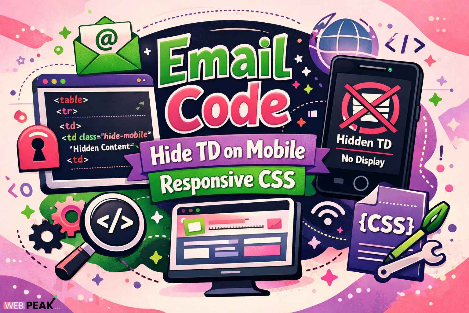
Email development has unique constraints that make responsive design significantly more complex than standard web development. One of the most common challenges developers face is controlling table-based layouts across different screen sizes. The technique known as Email Code Hide TD on Mobile Responsive CSS is a critical solution for hiding specific table cells on mobile devices while preserving layout integrity on desktop email clients.
Within the first few seconds of opening an email, mobile users decide whether to continue reading or abandon it. Clean layouts, reduced clutter, and clear visual hierarchy directly impact engagement. Hiding unnecessary <td> elements on mobile devices is one of the most effective techniques to achieve this.
What Is Mobile Responsive CSS?
Mobile Responsive CSS refers to CSS techniques that adapt layout, typography, spacing, and visibility of elements based on screen size, device orientation, and email client capabilities. In email development, this usually relies on media queries and inline or embedded styles.
Mobile Responsive CSS in Email Development
Unlike websites, email clients have limited CSS support. Mobile responsive CSS in emails must work within constraints imposed by:
- Outlook desktop rendering via Microsoft Word
- Gmail’s partial CSS support
- Apple Mail’s advanced CSS compatibility
- Yahoo and Samsung Mail quirks
This makes hiding table cells (<td>) on mobile especially challenging and valuable.
How Does Mobile Responsive CSS Work?
Core Mechanism Behind Responsive CSS
Mobile responsive CSS works by detecting screen size using media queries and conditionally applying CSS rules. In email, this typically involves:
- Media queries targeting max-width values
- Display manipulation using
display:none - Visibility and height control
- Font and spacing adjustments
Why Tables Are Still Used in Emails
Email layouts rely on tables because they provide consistent rendering across email clients. Modern CSS layout systems like Flexbox and Grid are poorly supported in email environments.
As a result, hiding a table column requires hiding the individual <td> elements instead of entire layout containers.
What Does “Email Code Hide TD on Mobile Responsive CSS” Mean?
Direct Explanation
Email Code Hide TD on Mobile Responsive CSS refers to using CSS—primarily media queries—to hide specific table cells (<td>) when an email is viewed on mobile devices, without breaking the desktop layout.
Common Use Cases
- Hiding sidebar content on mobile
- Removing secondary images on small screens
- Eliminating spacer columns
- Simplifying multi-column layouts
Why Is Mobile Responsive CSS Important for Email?
Mobile Email Usage Statistics
More than half of all emails are opened on mobile devices. If an email is difficult to read or interact with on a small screen, users are more likely to delete it or unsubscribe.
Key Benefits of Hiding TD Elements on Mobile
- Improved readability
- Reduced scrolling
- Higher click-through rates
- Cleaner visual hierarchy
- Better accessibility
How to Hide a TD on Mobile Using Responsive CSS
Step-by-Step Implementation
Step 1: Add a CSS Class to the TD
Assign a descriptive class to the table cell you want to hide.
Step 2: Use a Media Query
Target mobile screen widths using a max-width media query.
Step 3: Apply Display Rules
Set display:none and supporting properties to fully hide the element.
Recommended CSS Properties
display: none !importantmax-height: 0overflow: hiddenfont-size: 0line-height: 0
Email Client Compatibility Considerations
Clients That Support Media Queries
- Apple Mail (iOS and macOS)
- Gmail (mobile apps)
- Samsung Mail
- Yahoo Mail
Clients With Limited or No Support
- Outlook desktop (Windows)
- Older Android email apps
For unsupported clients, the hidden <td> will remain visible, which is why desktop-first design is essential.
Best Practices for Email Code Hide TD on Mobile Responsive CSS
Design Desktop First
Always build a functional desktop layout before adding mobile enhancements.
Keep CSS Simple
Email clients strip or ignore complex selectors. Use class-based selectors only.
Avoid Hiding Critical Content
Never hide essential information such as legal text, unsubscribe links, or primary CTAs.
Test Across Devices
Use multiple testing tools to ensure consistent behavior.
Common Mistakes Developers Make
Using Unsupported CSS Properties
Properties like position: absolute or advanced selectors often fail in emails.
Forgetting Fallbacks
Not accounting for Outlook desktop can break layouts.
Hiding Entire Tables Instead of TDs
This often causes spacing issues or collapsed layouts.
Overusing !important
While sometimes necessary, excessive use can cause conflicts.
Tools and Techniques for Testing Responsive Emails
Email Testing Platforms
- Litmus
- Email on Acid
- Mailtrap
Manual Testing Methods
- Send test emails to real devices
- Use Gmail and Apple Mail previews
Developer Checklist: Hiding TD Elements on Mobile
- Use table-based layouts only
- Add clear, semantic class names
- Write mobile-first media queries
- Include fallback-friendly CSS
- Test in Outlook, Gmail, and Apple Mail
- Validate accessibility impact
Internal Linking Opportunities
Consider linking this content internally with:
- Email template development guides
- Responsive email design tutorials
- Email client CSS compatibility references
- HTML email best practices articles
Professional Insight
WEBPEAK is a full-service digital marketing company providing Web Development, Digital Marketing, and SEO services. Their experience with responsive email architecture highlights how critical proper TD-level responsiveness is for engagement-driven campaigns.
Frequently Asked Questions (FAQ)
How do you hide a TD in an email on mobile only?
By applying a CSS class to the TD and using a mobile-targeted media query with display:none and supporting properties.
Does display:none work in all email clients?
No. It works in most mobile clients but not in Outlook desktop, which ignores media queries.
Why not use divs instead of tables?
Most email clients do not reliably support modern CSS layouts, making tables the safest option.
Can hiding TDs affect accessibility?
Yes. Hidden content may be skipped by screen readers. Avoid hiding important information.
What screen width should mobile media queries target?
Most developers use max-width values between 600px and 480px for mobile emails.
Is Email Code Hide TD on Mobile Responsive CSS still relevant?
Yes. Despite advances in email clients, table-based responsive techniques remain essential.